Custom technical indicators
This article shows how to create custom technical indicators, in this case, linear regression. To read more about technical indicators offered by Highcharts click here.
Be sure to have at least the Highcharts version 6, as previous Highcharts versions don’t support technical indicators.
TECHNICAL INDICATOR SERIES
There are two main steps to create a technical indicator series:
- Set up the technical indicator structure.
- Create the technical indicator functionality.
1. Set up the structure
Each technical indicator requires the method getValues() to be implemented. This method takes two arguments and returns an object. The arguments are the main series and the parameters. The parameters are specific to a technical indicator. Check the structure of the method getValues():
function getValues(series, params) {// calculations...// end of calculationsreturn {xData: [...], // array of x-valuesyData: [...] // array of y-valuesvalues: [...], // array of points};}
All technical indicators are series types, and to create a new series, in Highcharts, the following method Highcharts.seriesType() is used.
<script type="text/javascript" src="https://code.highcharts.com/stock/indicators/indicators.js"></script>Highcharts.seriesType('linearregression','sma',{name: 'Linear Regression',params: {} // linear regression doesn’t need params},{getValues: function (series, params) {return this.getLinearRegression(series.xData, series.yData);},getLinearRegression: getLinearRegression});
The method getLinearRegression() includes the technical indicator functionality (mathematical calculation). Notice that the indicators module indicators.js is included when creating technical indicators, as it includes the core-logic for all indicators.
Now the structure is set, the next step is to create the main indicator functionality.
2. Technical indicator functionality
The technical indicator functionality is represented by the following method getLinearRegression(), that calculates the regression points according to xData and yData.
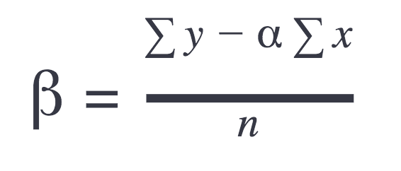
Here is a simple mathematical representation of the linear regression:
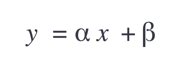
Where the slope is:
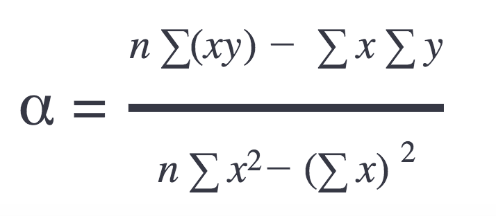
And offset:
The JavaScript representation of the formulas above is as follows:
function getLinearRegression(xData, yData) {var sumX = (xValLength - 1) * xValLength / 2,sumY = 0,sumXY = 0,sumX2 = ((xValLength - 1) * (xValLength) * (2 * xValLength - 1)) / 6,linearData = [],linearXData = [],linearYData = [],n = xData.length,alpha, beta, i, x, y;// Get sums:for (i = 0; i < n; i++) {y = yData[i];sumY += y;sumXY += i * y;}// Get slope and offset:alpha = (n * sumXY - sumX * sumY) / (n * sumX2 - sumX * sumX);if (isNaN(alpha)) {alpha = 0;}beta = (sumY - alpha * sumX)/ n;// Calculate linear regression:for (i = 0; i < n; i++) {y = alpha * i + beta;// Prepare arrays required for getValues() methodlinearData[i] = [xData[i], y];linearXData[i] = xData[i];linearYData[i] = y;}return {xData: linearXData,yData: linearYData,values: linearData};}
Notice that Linear regression series in this example is still a line series, and that means data has to be sorted ascending by x-values.
That’s it; the technical indicator is ready to be used. Keep in mind that the technical indicator is connected to the main series by the linkedTo option:
series: [{id: 'main',type: 'scatter',data: [ ... ]}, {type: 'linearregression',linkedTo: 'main'}]
For live demos check the links below:
Remark
To improve the user experience when using the linear regression series, try to disable tooltip and/or markers. Go to the seriesType() and set the default options as follows:
Highcharts.seriesType('linearregression','sma',{name: 'Linear Regression',enableMouseTracking: false, // default optionsmarker: {enabled: false}params: {} // linear regression doesn’t need params},{getValues: ... ,getLinearRegression: ...});
Module The indicator is available as a indicators/trendline.js main module.
3. Indicator with multiple lines
Highcharts Stock offers many already implemented ready-to-use indicators. Some of them are drawn using multiple lines (e.g. Bollinger Bands). In this section, you will learn how to build a custom indicator consisting of 5 lines.
Let's assume we would like to build an indicator with a linear regression main line from the previous example, but this time with the four additional range lines that help to visualize the difference between the main series line and our regression line. For that, we'll add 4 additional lines that will be treated as zones. Those lines' values will be multiplied accordingly by 90%, 95%, 105%, and 110% of the regression line values (step ratio would be possible to change in series.params).
Of course, the data from the previous example has to be modified:
// ...var zoneDistance = this.options.params.zoneDistance / 100;// ...// Calculate linear regression:for (i = 0; i < n; i++) {x = xData[i];y = alpha * x + beta;// Prepare arrays required for getValues() methodlinearData[i] = [x, y * (1 - 2 * zoneDistance), y * (1 - zoneDistance), y, y * (1 + zoneDistance), y * (1 + 2 * zoneDistance)];linearXData[i] = x;linearYData[i] = [y * (1 - 2 * zoneDistance), y * (1 - zoneDistance), y, y * (1 + zoneDistance), y * (1 + 2 * zoneDistance)];}return {xData: linearXData,yData: linearYData,values: linearData};
To draw an indicator with multiple lines, we can use the Highcharts MultipleLines mixin that can be accessed after we add any of the Highcharts indicators implementing multiple lines, e.g. Bollinger Bands:
<script type="text/javascript" src="https://code.highcharts.com/stock/indicators/bollinger-bands.js"></script>
Now, when having access to the MultipleLines mixin, we can prepare Highcharts to draw multiple lines by overwriting the default series prototype methods. We can also name each additional line and define its own styles. Inside the Highcharts.seriesType method we can define the following properties (* - required):
params* - indicator's parameters. In our case, we set the default difference between the lines to5%. This can be changed in the indicator's series options.closeRangeBottomLine,highRangeBottomLine,closeRangeTopLine,highRangeTopLine- separate default styles for each additional line. This can be changed in the indicator's series options.linesApiNames* - an array containing the names of the additional lines.nameBase- the name of the indicator displayed in the legend.nameComponents- an array containing the names of the properties that values should be displayed in parenthesis in the legend next to the indicator's name.pointArrayMap* - an array containing the keys of the points' values.pointValKey* - default value for pointValKeydrawGraph,getTranslatedLinesNames,translate,toYData- overwrite the Highcharts core methods responsible for drawing multiple lines.
Here is how the seriesType method's arguments should look like:
var multipleLinesMixin = Highcharts._modules['Mixins/MultipleLines.js'];Highcharts.seriesType('linearregressionzones','sma',{color: '#00ff00',params: {zoneDistance: 5},tooltip: {pointFormat: '<span style="color:{point.color}">\u25CF</span> {series.name}:<br/>' +'110%: <b>{point.y4}</b><br/>' +'105%: <b>{point.y3}</b><br/>' +'100%: <b>{point.y}</b><br/>' +'95%: <b>{point.y2}</b><br/>' +'90%: <b>{point.y1}</b>'},closeRangeBottomLine: {styles: {lineWidth: 1,lineColor: '#ffa500'}},highRangeBottomLine: {styles: {lineWidth: 1,lineColor: '#ff0000'}},closeRangeTopLine: {styles: {lineWidth: 1,lineColor: '#ffa500'}},highRangeTopLine: {styles: {lineWidth: 1,lineColor: '#ff0000'}}},{getValues: function (series) {return this.getLinearRegressionZones(series.xData, series.yData);},getLinearRegressionZones: getLinearRegressionZones,linesApiNames: ['highRangeBottomLine', 'closeRangeBottomLine', 'closeRangeTopLine', 'highRangeTopLine'],nameBase: 'Linear regression zones',nameComponents: ['zoneDistance'],nameSuffixes: ['%'],parallelArrays: ['x', 'y', 'y1', 'y2', 'y3', 'y4'],pointArrayMap: ['y1', 'y2', 'y', 'y3', 'y4'],pointValKey: 'y'});var multipleLinesMixin = Highcharts._modules['Mixins/MultipleLines.js'];if (multipleLinesMixin) {Highcharts.extend(Highcharts.seriesTypes.linearregressionzones.prototype,{drawGraph: multipleLinesMixin.drawGraph,getTranslatedLinesNames: multipleLinesMixin.getTranslatedLinesNames,translate: multipleLinesMixin.translate,toYData: multipleLinesMixin.toYData});} else { // Highcharts v9.2.3+Highcharts._modules['Stock/Indicators/MultipleLinesComposition.js'].compose(Highcharts.seriesTypes.linearregressionzones);}
A live demo of the above multiline indicator can be found here.
For more detailed samples and documentation check the API.
4. Indicators calculated on events.
The idea behind creating a custom indicator that is calculated after some chart event (for example afterSetExtremes) is similar to the ones previously mentioned with a few additions.
The most important object to add while creating the indicators is calculateOn where inside are specified two properties:
chart- on which chart's event the indicator should be calculated, mainly you can choose frominit(before the linked series is processed) andrender(after processing the linked series).xAxis- on which xAxis' event the indicator should be recalculated (e.g.afterSetExtremes),
Example configuration should look like:
Highcharts.seriesType('customIndicator', 'sma', {}, {getValues: function (series) {return this.getSum(series.getColumn('x', true) || series.xData,series.getColumn('y', true) || series.yData);},calculateOn: {chart: 'init',xAxis: 'afterSetExtremes'},getSum: getSum});
A live demo of the example above can be found here.
5. Custom column indicator.
The principle of creating a custom column indicator is similar to the ordinary one.
Still, the getValues method for calculating points position is required.
Along with that, in order to render the column, some other methods like crispCol, drawPoints, getColumnMetrics, translate
need to be inherited from the column series prototype and the markerAttribs, drawGraph need to be overwritten with an empty function as shown in the code snippet below.
Additionally, to correctly render that indicator, the threshold, groupPadding and pointPadding
properties need to be defined.
Example configuration should look like:
- JavaScript
- React
- Next
A live demo of the example (vanilla JS) here.
Highcharts.seriesType('customIndicator','sma', {name: 'Sum of previous 2 points',threshold: 0,groupPadding: 0.2,pointPadding: 0.2}, {getValues: function(series) {return this.getSum(series.xData, series.yData);},getSum: getSum,markerAttribs: Highcharts.noop,drawGraph: Highcharts.noop,crispCol: Highcharts.seriesTypes.column.prototype.crispCol,drawPoints: Highcharts.seriesTypes.column.prototype.drawPoints,getColumnMetrics: Highcharts.seriesTypes.column.prototype.getColumnMetrics,translate: Highcharts.seriesTypes.column.prototype.translate});
A live demo of the example (React) here.
import React from 'react';import { useMemo } from 'react';import { StockChart, setHighcharts } from '@highcharts/react/Stock';import { Accessibility } from "@highcharts/react/options/Accessibility";import Highcharts from 'highcharts/esm/highstock.src.js';import 'highcharts/esm/indicators/indicators.src.js';import ColumnSeries from 'highcharts/es-modules/Series/Column/ColumnSeries.js';type ColumnSeriesConstructor = typeof ColumnSeries;type PointTuple = [number, number];function getSum(xData: number[], yData: number[]) {const data: PointTuple[] = [],xDataSum: number[] = [],yDataSum: number[] = [],dataLength = xData.length;// Iterate over points and calculate the sum.for (let i = 0; i < dataLength; i++) {const x = xData[i];let y;// Special case for the first point.if (i === 0) {y = yData[i];} else {y = yData[i] + yData[i - 1];}data[i] = [x, y];xDataSum[i] = x;yDataSum[i] = y;}return {xData: xDataSum,yData: yDataSum,values: data};}const ColumnSeriesClass = Highcharts.Series.types.column as ColumnSeriesConstructor;Highcharts.seriesType('customindicator','sma',{name: 'Sum of previous 2 points',params: {},threshold: 0,groupPadding: 0.2,pointPadding: 0.2},{getValues: function (series: { xData: number[]; yData: number[] }) {return this.getSum(series.xData, series.yData);},getSum: getSum,markerAttribs: (() => {}),drawGraph: (() => {}),crispCol: ColumnSeriesClass.prototype.crispCol,drawPoints: ColumnSeriesClass.prototype.drawPoints,getColumnMetrics: ColumnSeriesClass.prototype.getColumnMetrics,translate: ColumnSeriesClass.prototype.translate});setHighcharts(Highcharts);function App() {const options = useMemo(() => ({yAxis: [{height: '60%'}, {top: '65%',height: '25%'}],series: [{id: 'main',name: 'Data',data: [1, 2, 3, 1, 2, 3, 1, 2, 3, 1, 2, 3, 1, 2, 3]},{type: 'customindicator',linkedTo: 'main',name: 'Custom Indicator',yAxis: 1}]}), []);return (<StockChart options={options}><Accessibility series={{ describeSingleSeries: true }} /></StockChart>)}export default App
A live demo of the example (Next) here.
'use client';import { StockChart } from '@highcharts/react/Stock';import { Accessibility } from '@highcharts/react/modules/Accessibility';import { useMemo } from 'react';import Highcharts from 'highcharts/es-modules/masters/highstock.src.js';import 'highcharts/es-modules/masters/indicators/indicators.src.js';import ColumnSeries from 'highcharts/es-modules/Series/Column/ColumnSeries.js';type ColumnSeriesConstructor = typeof ColumnSeries;type PointTuple = [number, number];const getSum = (xData: number[], yData: number[]) => {const data: PointTuple[] = [];const xDataSum: number[] = [];const yDataSum: number[] = [];const dataLength = xData.length;for (let i = 0; i < dataLength; i++) {const x = xData[i];const y = i === 0 ? yData[i] : yData[i] + yData[i - 1];data[i] = [x, y];xDataSum[i] = x;yDataSum[i] = y;}return {xData: xDataSum,yData: yDataSum,values: data,};};const ColumnSeriesClass = Highcharts.Series.types.column as ColumnSeriesConstructor;Highcharts.seriesType('customindicator','sma',{name: 'Sum of previous 2 points',params: {},threshold: 0,groupPadding: 0.2,pointPadding: 0.2,},{getValues: function (series: { xData: number[]; yData: number[] }) {return this.getSum(series.xData, series.yData);},getSum,markerAttribs: () => {},drawGraph: () => {},crispCol: ColumnSeriesClass.prototype.crispCol,drawPoints: ColumnSeriesClass.prototype.drawPoints,getColumnMetrics: ColumnSeriesClass.prototype.getColumnMetrics,translate: ColumnSeriesClass.prototype.translate,});export default function Home() {const options = useMemo(() => ({yAxis: [{height: '60%',},{top: '65%',height: '25%',},],series: [{id: 'main',name: 'Data',data: [1, 2, 3, 1, 2, 3, 1, 2, 3, 1, 2, 3, 1, 2, 3],},{type: 'customindicator',linkedTo: 'main',name: 'Custom Indicator',yAxis: 1,},],}),[]);return (<div><StockChart options={options}><Accessibility series={{ describeSingleSeries: true }} /></StockChart></div>);}