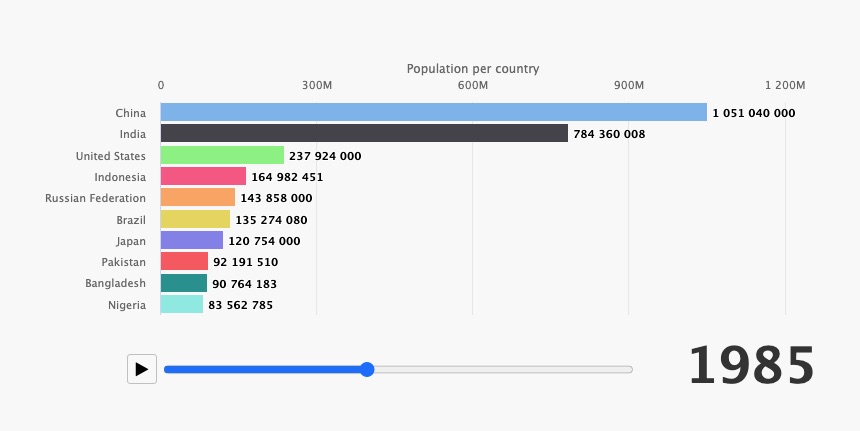
Have you heard of a Bar Chart Race? No? Well, it’s not a board game for data scientists, but, actually, a useful way to display time series in a bar chart format via animation.
Here is an example, and below we’ll show how to create this chart.
Creating a bar chart race with Highcharts library is easy and straightforward, thanks to the dataSorting feature. And in this tutorial, we will show you how to create a world population bar chart race.
Let’s get started!
The data used in this tutorial is the world population from 1960 to 2018. Here is the link to the data used in this demo. Now, we have the data; let’s make a function that processes the data for a particular year.
/**
 * Calculate the data output
 */
function getData(year) {

  let output = initialData.map(data => {
    return [data["Country Name"], data[year]]
  }).sort((a, b) => b[1] - a[1]);

  return ([output[0], output.slice(1, 11)]);
}
The first result is in this demo that shows the data related to the year 1960:
The next step is to add animation to the chart. To achieve this we need to add the following HTML elements: play/stop button and the <input> element with type=”range” for the interactive progress-bar. We have also to add the styling effect! (see CSS below):
@import "https://maxcdn.bootstrapcdn.com/font-awesome/4.3.0/css/font-awesome.min.css";

#parentContainer {
  min-width: 400px;
  max-width: 800px;
}

#play-controls {
  position: absolute;
  left: 100px;
  top: 350px;
}

#play-pause-button {
  width: 30px;
  height: 30px;
  cursor: pointer;
  border: 1px solid silver;
  border-radius: 3px;
  background: #f8f8f8;
}

#play-range {
  transform: translateY(2.5px);
}
We will add this the function to fit the range width after the window resize:
 events: {
   render() {
     let chart = this;

     // Responsive input
     input.style.width = chart.plotWidth - chart.legend.legendWidth + 'px'
   }
 },
The result of the previous changes are in this demo:
So far, we have a button and a range bar element, let’s create the function of the button to update the chart using the series.update feature:
/**
 * Update the chart. This happens either on updating (moving) the range input,
 * or from a timer when the timeline is playing.
 */
function update(increment) {
  if (increment) {
    input.value = parseInt(input.value) + increment;
  }
  if (input.value >= endYear) { // Auto-pause
    pause(btn);
  }

  chart.update({
    title: {
      useHTML: true,
      text: `<div>World population - overall: <b>${getData(input.value)[0][1]}<b></span></div>`
    },
  }, false, false, false)

  chart.series[0].update({
    name: input.value,
    data: getData(input.value)[1]
  })
}
And here, we link the function above to the button elements:
/**
 * Play the timeline.
 */
function play(button) {
  button.title = 'pause';
  button.className = 'fa fa-pause';
  chart.sequenceTimer = setInterval(function() {
    update(1);
  }, 500);
}

/**
 * Pause the timeline, either when the range is ended, or when clicking the pause button.
 * Pausing stops the timer and resets the button to play mode.
 */
function pause(button) {
  button.title = 'play';
  button.className = 'fa fa-play';
  clearTimeout(chart.sequenceTimer);
  chart.sequenceTimer = undefined;
}

btn.addEventListener('click', function() {
  if (chart.sequenceTimer) {
    pause(this)
  } else {
    play(this)
  }
})

/**
 * Trigger the update on the range bar click.
 */
input.addEventListener('click', function() {
  update()
})
Now, we have a fully worked race bar chart:
As a final step, we can attach a custom functionality to tweak the data-labels changing effect:
/**
 * Animate dataLabels functionality
 */
(function(H) {
  const FLOAT = /^-?\d+\.?\d*$/;
  // Add animated textSetter, just like fill/strokeSetters
  H.Fx.prototype.textSetter = function(proceed) {
    var startValue = this.start.replace(/ /g, ''),
      endValue = this.end.replace(/ /g, ''),
      currentValue = this.end.replace(/ /g, '');
    if ((startValue || '').match(FLOAT)) {
      startValue = parseInt(startValue, 10);
      endValue = parseInt(endValue, 10);

      // No support for float
      currentValue = Highcharts.numberFormat(
        Math.round(startValue + (endValue - startValue) * this.pos), 0);
    }
    this.elem.endText = this.end;
    this.elem.attr(
      this.prop,
      currentValue,
      null,
      true
    );
  };

  // Add textGetter, not supported at all at this moment:
  H.SVGElement.prototype.textGetter = function(hash, elem) {
    var ct = this.text.element.textContent || '';
    return this.endText ? this.endText : ct.substring(0, ct.length / 2);
  }

  // Temporary change label.attr() with label.animate():
  // In core it's simple change attr(...) => animate(...) for text prop
  H.wrap(H.Series.prototype, 'drawDataLabels', function(proceed) {
    var ret,
      attr = H.SVGElement.prototype.attr,
      chart = this.chart;

    if (chart.sequenceTimer) {
      this.points.forEach(
        point => (point.dataLabels || []).forEach(
          label => label.attr = function(hash, val) {
            if (hash && hash.text !== undefined) {
              var text = hash.text;
              delete hash.text;
              this.attr(hash);
              this.animate({
                text: text
              });
              return this;
            } else {
              return attr.apply(this, arguments);
            }
          }
        )
      );
    }
    ret = proceed.apply(this, Array.prototype.slice.call(arguments, 1));
    this.points.forEach(
      p => (p.dataLabels || []).forEach(d => d.attr = attr)
    );
    return ret;
  });
})(Highcharts);
The final result is in the demo below:
As we promised, it is easy and straightforward to create a bar chart race with Highcharts.


Leave a Reply