
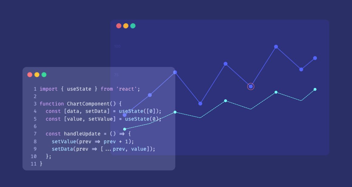
In this article, I will show you how to create a deviation chart using Highcharts and Angular.
If you are not familiar with a deviation chart, here is some information: The chart is designed with two or more aligned bar charts. A graph displays a deviation relationship to feature how one or more sets of quantitative values differ from a reference set of values. A deviation chart is mainly used for quality measures.
To create a deviation chart using Angular and Highcharts, follow these step-by-step instructions:
Step 1
Make sure you have Node.js installed. If not, download and install it from the following URL: https://nodejs.org/en/download.
Step 2
Create a new folder to store the code, and open it in the command prompt terminal.
Step 3
Now, let’s create a new Angular app. Type the following command:
npm install -g @angular/cli.
After the installation is complete, run the following command:
ng new myHighchartApp
cd myHighchartApp
npm install highcharts-angular --save
Step 4
Create a new component for the deviation chart, to do that run the following command:
ng generate component deviationchart
Step 5
To create a deviation chart, I am using a bell curve, so I need to install the required package. Run the following command:
npm install highcharts-histogram-bellcurve --save
The project is divided into three files:
- deviation-chart.component.ts: This file contains the main logic and Highchart code.
- deviation-chart.component.html: This file is used for the view to convert the chart in the browser.
- app.module.ts: This one is for adding dependencies to the module.
Before checking the code, let me walk you through some explanations:
It is important to add the module histogram-bellcurve.js, as it is necessary for creating the range. Additionally, I declare the variable Highcharts: typeof Highcharts = Highcharts. This declaration is essential for the HTML page and the chartOptions. I specify the minimum and maximum range for the xAxis. In the series section, I define the chart type as a histogram, which allows to create step charts. To achieve the desired appearance of a step chart, you have to set the color as transparent. Finally, don’t forget to define your data series as scatter.
Now, feel free to explore the code below for each file (link to Github project):
deviation-chart.component.ts code
import { Component, OnInit } from "@angular/core";
import * as Highcharts from "highcharts/highcharts";
import Bellcurve from "highcharts/modules/histogram-bellcurve";
Bellcurve(Highcharts);
@Component({
  selector: "app-deviation-chart",
  templateUrl: "./deviation-chart.component.html",
  styleUrls: ["./deviation-chart.component.css"]
})
export class DeviationChartComponent {
  title = "myHighChartsApp";
  Highcharts: typeof Highcharts = Highcharts;
  chartOptions: Highcharts.Options = {
    title: {
      text: "Sample Count by Range"
    },
    xAxis: {
      min: 0,
      max: 4,
      tickInterval: 1
    },
    series: [
      {
        type: "histogram",
        baseSeries: "s1",
        zIndex: -1,
        binsNumber: 5,
        color: "transparent",
        borderWidth: 2,
        borderColor: "green"
      },
      {
        type: "scatter",
        data: [0.17, 0.17, 0.18, 0.22, 0.26, 0.67, 0.98, 2.8, 2.92, 3.3],
        id: "s1",
        visible: false,
        showInLegend: false
      }
    ]
  };
}
app.module.ts code:
import { NgModule } from "@angular/core";
import { BrowserModule } from "@angular/platform-browser";
import { HighchartsChartModule } from "highcharts-angular";
import { AppRoutingModule } from "./app-routing.module";
import { AppComponent } from "./app.component";
import { DeviationchartComponent } from "./deviationchart/deviationchart.component";

@NgModule({
  declarations: [AppComponent, DeviationchartComponent],
  imports: [BrowserModule, HighchartsChartModule, AppRoutingModule],
  providers: [],
  bootstrap: [AppComponent]
})
export class AppModule {}
deviation-chart.component.html code
<div class="content" role="main">
  <highcharts-chart [Highcharts]="Highcharts" [options]="chartOptions" style="width: 100%; height: 400px; display: block;">
  </highcharts-chart>
</div>
To use this application, you need to run ng-Serve. Once you do that, you will see the following result displayed (see below).
The code shows that the xAxis ranges from 0 to 4, with the chart type being a histogram. Additionally, the base series is connected to s1,
which in turn connects to a scatter data series. Finally, the chart is made visible, but the legend is set not to show using
showInLegend as false.

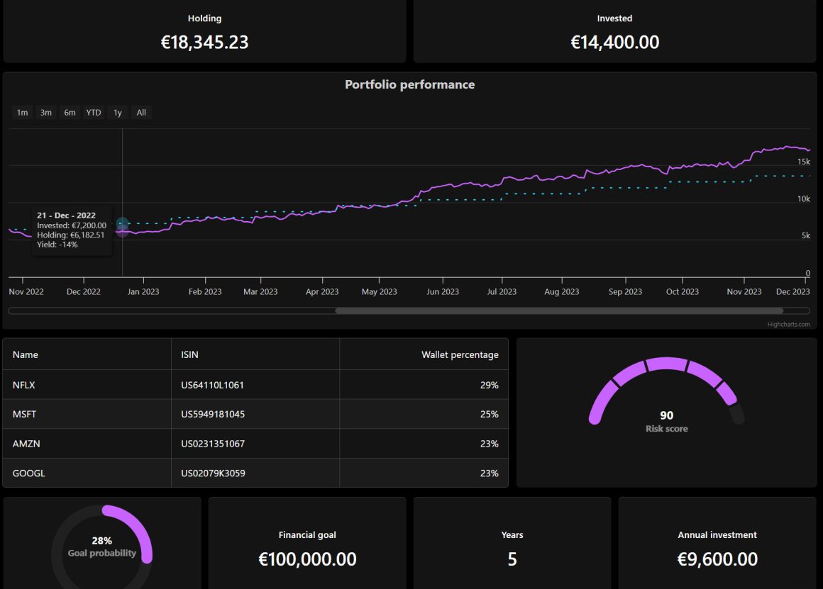
Highcharts is a great tool for building interactive real time dashboard, with angular you can build faster applications. For more learning regarding Highcharts with angular you can read Practical Highcharts with angular book.
Related posts
- Line chart vs bar chart: choosing the right one for your objectives and data
- Pareto chart: what is it and what does it suggest
- Real-time data visualization using Highcharts
- Big data visualization using Highcharts
- Maps with latitude longitude using Highcharts
- Visualizing geospatial data with Highcharts Maps


Leave a Reply