
Choosing the right visualization for your data is a critical step in delivering insights effectively. Among the most widely used types of visualizations are line charts and bar charts. While both are effective visualization tools, they tend to highlight different aspects of data and serve different analytical objectives.
In this guide, we will delve into the key characteristics, use cases, and practical applications of line and bar charts, including insights on how to implement them using Highcharts.
Highcharts integrates seamlessly with popular languages such as Python, R, PHP, and Java, as well as mobile platforms like iOS and Android. Additional support for frameworks like Svelte, Angular, and Vue, makes it a versatile tool for various development environments.
To see more examples and get an even better understanding of the opportunities Highcharts offers, please head over to the demo section of our website or read up on the technical documentation on how to get started. Once you get the hang of it, the API reference will help you customize your charts in no time.
What are line charts?
A line chart connects a series of data points with a continuous line, emphasizing the relationship between the points. It is commonly used to represent changes over time, making it a go-to choice for time-series data.
When to use line charts:
- Visualizing trends over time: Line charts are perfect for showing data progression, such as daily temperatures, monthly revenues, or stock price movements.
- Highlighting changes and patterns: They excel in revealing patterns, such as growth, seasonal fluctuations, or anomalies.
- Presenting continuous data: If your data represents an ongoing phenomenon without distinct intervals, a line chart offers a smooth representation.
Benefits of line charts:
- Ease of comparison: Multiple datasets can be overlaid on the same axis using different colored lines, simplifying comparisons.
- Clarity of trends: The smooth lines help emphasize overall trends, even with minor variations in data points.
- Minimal visual clutter: Line charts are clean and concise, making them suitable for presentations and dashboards.
Example use case:
Suppose you want to average rainfall for two different cities over a year. By examining these side by side, you can easily spot similarities, differences, and anomalies. This insight helps inform decisions, plan seasonal events, or guide resource allocation.
What are bar charts?
Bar charts use rectangular bars to compare quantities across categories. The length or height of each bar corresponds to its value, making them highly effective for comparing discrete data.
When to use bar charts:
- Comparing categories: Bar charts excel when you need to compare different groups or segments, such as sales by region, product, or department.
- Analyzing proportions: Stacked bar charts are particularly useful for breaking down overall totals into components.
- Highlighting ranking: Whether ranking sales representatives by performance or cities by population, bar charts offer a clear visual hierarchy.
Benefits of bar charts:
- Straightforward interpretation: The length of the bars provides an intuitive visual cue for comparison.
- Versatility: They can handle both positive and negative values, as well as large datasets.
- Adaptability: Bar charts can be displayed horizontally or vertically, depending on the dataset and space constraints.
Example use case:
Suppose you want to compare monthly sales trends. Using a bar chart to display each month’s revenue side by side helps you quickly spot which month was the best. This insight informs resource allocation, planning, and more.
Key differences between line and bar charts
While both chart types are versatile and widely used, their specific use cases differ significantly. Here’s a detailed comparison:
| Aspect | Line Chart | Bar Chart |
|---|---|---|
| Data type | Continuous (time-series, trends) | Categorical (distinct groups) |
| Visual style | Smooth, flowing lines | Blocky, segmented bars |
| Best for | Trends, progression, seasonal patterns | Comparisons, rankings, proportions |
| Readability | Ideal for showing changes over time | Clear for comparing discrete values |
| Complexity | Great for multiple series | Can become cluttered with too many categories |
| Orientation | Typically horizontal | Horizontal or vertical |
Advanced use cases for line charts and bar charts
Line chart extensions:
- Dual-axis line charts: Compare two datasets with different scales on the same chart.
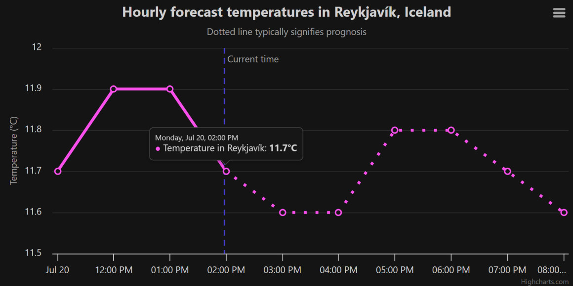
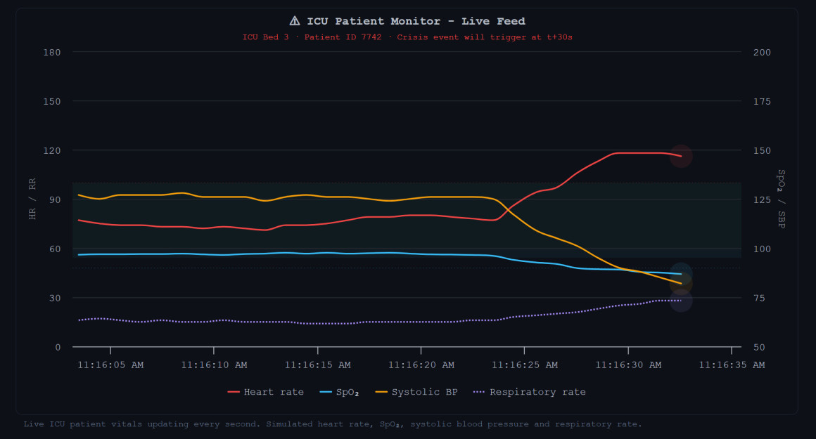
- Real-time updates: Monitor live data like stock market trends or server performance.
Check out this blog post for more on real-time data visualization with Highcharts. - Area charts: Fill the space below the line to show cumulative totals.
Bar chart extensions:
- Stacked bar charts: Represent subcategories within each category.
- Grouped bar charts: Compare multiple variables across categories.
- 100% stacked bar charts: Show proportions contributing to a total.
Creating line and bar charts with Highcharts
Here’s how you can create basic and advanced line and bar charts using Highcharts.
Note that these examples in addition to the base Highchart script also includes some additional scripts, namely the Export modules (docs) and Accessibility module (docs).
Line chart example
1. Load the required files and create a container to hold the chart
<script src="https://code.highcharts.com/highcharts.js"></script>
<script src="https://code.highcharts.com/modules/exporting.js"></script>
<script src="https://code.highcharts.com/modules/accessibility.js"></script>
<div id="container"></div>
2. Add some CSS to control the dimensions of the container
#container {
    min-width: 310px;
    max-width: 800px;
    height: 400px;
    margin: 0 auto;
}
3. Implement the JavaScript
 Highcharts.chart('container', {
    title: {
        text: 'Average Rainfall'
    },
    subtitle: {
        useHTML: true,
        text: 'Source: worldclimate '
    },
    xAxis: {

        categories: [
            'Jan', 'Feb', 'Mar', 'Apr', 'May', 'Jun', 'Jul', 'Aug', 'Sep',
            'Oct', 'Nov', 'Dec'
        ]
    },
    yAxis: {
        title: {
            text: 'mm'
        }
    },
    tooltip: {
        pointFormat: '{series.name}: {point.y}
',
        valueSuffix: ' mm',
        shared: true
    },
    series: [{
        name: 'London',
        data: [
            48.9, 38.8, 39.3, 41.4, 47,
            48.3, 59, 59.6, 52.4, 65.2, 59.3, 51.2
        ]
    }, {
        name: 'Tokyo',
        data: [
            49.9, 71.5, 106.4, 129.2,
            44, 176, 135.6, 148.5, 216.4, 194.1, 95.6, 54.4
        ]
    }]
});
Bar chart example
1. Load the required files and create a container to hold the chart
<script src="https://code.highcharts.com/highcharts.js"></script>
<script src="https://code.highcharts.com/modules/exporting.js"></script>
<script src="https://code.highcharts.com/modules/accessibility.js"></script>
<div id="container"></div>
2. Add some CSS to control the dimensions of the container
#container {
    min-width: 310px;
    max-width: 800px;
    height: 400px;
    margin: 0 auto;
}
3. Implement the JavaScript
 Highcharts.chart('container', {
    chart: {
        type: 'column'
    },
    title: {
        text: 'Monthly Sales Trend (May-Aug)'
    },
    xAxis: {
        categories: ['May', 'June', 'July', 'Aug']
    },

    yAxis: {
        title: {
            text: ''
        },
        labels: {
            format: '{value}k $'
        }
    },

    series: [{
        name: 'Sales',
        data: [206, 216, 247, 330]
    }]
});
Common pitfalls to avoid
- Choosing the wrong chart type: Misusing line charts for categorical data or bar charts for trends can lead to confusion. Always match the chart type to the data.
- Overloading charts: Avoid cluttering your chart with excessive data series or categories, which can overwhelm the audience.
- Ignoring accessibility: Use appropriate colors and labels to ensure your charts are accessible to all users, including those with color vision deficiencies.
- Neglecting interactivity: Interactive charts provide a better user experience by allowing users to explore data in greater detail.
Other real-world applications
Line charts:
- Finance: Tracking stock prices and market indices.
- Weather: Monitoring temperature changes over time.
- Healthcare: Observing patient progress or treatment effectiveness.
Bar charts:
- Business: Comparing sales performance across products.
- Education: Analyzing student performance by subject.
- Marketing: Evaluating campaign effectiveness across channels.
Conclusion and additional resources
Both line charts and bar charts are indispensable tools in data visualization, each serving distinct purposes. Highcharts provides the flexibility and power to create both types of charts with ease, ensuring your visualizations are not only functional but also engaging. By understanding their strengths and limitations, you can effectively communicate insights and drive impactful decisions.
- Documentation – Getting started with Highcharts
- Demo/example section
- Highcharts API reference
- Highcharts® Core product page
Related posts
- Stock chart examples using Highcharts Stock
- Intraday chart examples using Highcharts
- Big data visualization using Highcharts
- Dashboard examples using Highcharts® Dashboards
- JavaScript chart examples using Highcharts
- JavaScript data visualization with Highcharts


Leave a Reply