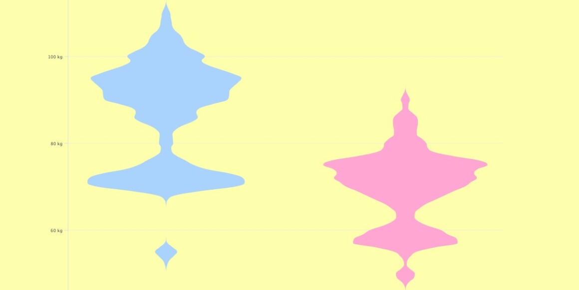
In a previous article, I covered how to create a violin plot using an areaSpline chart type. Well, there is more than one way to catch a rabbit, so in this article, I will show you how easy it is to create a violin plot with a streamGraph chart type with Highcharts.
Let’s see how these plots are created.
Like in the previous violin plot article, the data is fetched from the following GitHub link, then processed using the kernel density estimation (KDE) function. In the code, I just copy/paste the final result for both athletes (male and female) in the code.
Let male = [
    [47, 5.608535227799803e-11],
    [48, 1.372407067436998e-8],
    …
  ],
  female = [...
    [43, 1.7398814086959525e-10],
    [44, 4.2738095400258076e-8],
    …
  ];
Remark
The KDE function provides three values; the first one is the x-axis value, whereas the last two are the negative and positive density values. As the streamGraph chart uses only one y-Axis value, there is no need to keep both values, especially if you are dealing with a huge number of data as it might reduce the browser’s performance. In this case, I keep only positive values.
To use the streamGraph chart type in Highchart, you have to add the streamgraph.js module, then specify the type under chart:
 <script src="https://code.highcharts.com/modules/streamgraph.js"></script>
...
 chart: {
    type: "streamgraph",
    inverted: true
  },
...
To put the series side by side, I am using two y-axes (one axis of male and the other one for female):
yAxis: [
    {
      width: "45%",
      offset: 0,
      visible: false
    },
    {
      width: "45%",
      left: "55%",
      offset: 0,
      visible: false
    }
  ],
That’s it, it is that easy 🙂
Now, you know how to create a violin plot using a streamGraph type chart with Highcharts.
Feel free to share your experience with the violin plot in the comments section below.


Leave a Reply