
Kernel density estimation is a useful statistical method to estimate the overall shape of a random variable distribution. In other words, kernel density estimation, also known as KDE, helps us to “smooth” and explore data that doesn’t follow any typical probability density distribution, such as normal distribution, binomial distribution, etc.
In this tutorial, we will show you how to create an interactive kernel density estimation in Javascript and plot the result using the Highcharts library.
Let’s first explore the KDE plot; then we will dive into the code.
The demo below displays a Gaussian kernel density estimate of a random dataset:
This chart helps us to estimate the probability distribution of our random data set, and we can see that the data are concentrated mainly at the beginning and at the end of the chart.
Basically, for each data points in red, we plot a Gaussian kernel function in orange, then we sum all the kernel functions together to create the density estimate in blue (see demo):
By the way, there are many kernel function types such as Gaussian, Uniform, Epanechnikov, etc. The one we use is the Gaussian kernel, as it offers a smooth pattern.
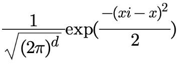
The mathematical representation of the Gaussian kernel is:
Now, you have an idea about how the kernel density estimation looks like, let’s take a look at the code behind it.
There are four main steps in the code:
- Create the Gaussian kernel function.
- Process the density estimate points.
- Process the kernel points.
- Plot the whole data points.
Gaussian kernel function
The following code represents the Gaussian kernel function:
function GaussKDE(xi, x) {
  return (1 / Math.sqrt(2 * Math.PI)) * Math.exp(Math.pow(xi - x, 2) / -2);
}
Where x represents the main data (observation), and xi represents the range to plot the kernels and the density estimate function. In our case, the xi range is from 88 to 107 to be sure to cover the range of the observation data that is from 93 to 102.
Density estimate points
The following loop creates the density estimate points using the GaussKDE() function and the range represented by the array xiData:
//Create the density estimate
for (i = 0; i < xiData.length; i++) {
  let temp = 0;
  kernel.push([]);
  kernel[i].push(new Array(dataSource.length));
  for (j = 0; j < dataSource.length; j++) {
    temp = temp + GaussKDE(xiData[i], dataSource[j]);
    kernel[i][j] = GaussKDE(xiData[i], dataSource[j]);
  }
  data.push([xiData[i], (1 / N) * temp]);
}
Kernels points
This step is required only if you would like to display the kernel points (orange charts); otherwise, you are already good with the density estimate step. Here is the code to process the data points for each kernel:
//Create the kernels
for (i = 0; i < dataSource.length; i++) {
  kernelChart.push([]);
  kernelChart[i].push(new Array(kernel.length));
  for (j = 0; j < kernel.length; j++) {
    kernelChart[i].push([xiData[j], (1 / N) * kernel[j][i]]);
  }
}
Basically, this loop is just about adding the range xiData to each kernel array that was already processed in the density estimate step.
Plot the points
Once all the data points are processed, it is time to use Highcharts to render the series. The density estimate and the kernels are spline chart types, whereas the observations are plotted as a scatter plot:
Highcharts.chart("container", {
  chart: {
    type: "spline",
    animation: true
  },
  title: {
    text: "Gaussian Kernel Density Estimation (KDE)"
  },
  yAxis: {
    title: { text: null }
  },
  tooltip: {
    valueDecimals: 3
  },
  plotOptions: {
    series: {
      marker: {
        enabled: false
      },
      dashStyle: "shortdot",
      color: "#ff8d1e",
      pointStart: xiData[0],
      animation: {
        duration: animationTime
      }
    }
  },
  series: [
    {
      type: "scatter",
      name: "Observation",
      marker: {
        enabled: true,
        radius: 5,
        fillColor: "#ff1e1f"
      },
      data: dataPoint,
      tooltip: {
        headerFormat: "{series.name}:",
        pointFormat: "<b>{point.x}</b>"
      },
      zIndex: 9
    },
    {
      name: "KDE",
      dashStyle: "solid",
      lineWidth: 2,
      color: "#1E90FF",
      data: data
    },
    {
      name: "k(" + dataSource[0] + ")",
      data: kernelChart[0]
    },...  ]
});
Now, you are ready to explore your own data using the power of the Kernel density estimation plot.
Feel free to share your comments or questions in the comment section below.


Leave a Reply