In this tutorial, we will learn how to calculate and plot a linear regression line, and use it to visualize a considerable number of points without cluttering a chart. We will also look at the limitations of the linear regression line.
Remark
The Highcharts Stock package has built-in support for advanced technical indicators including linear regressions and more. This blog article, however, focuses on how you can apply custom statistical analysis on the chart data, and render it using Highcharts.
I am using JavaScript Statistical Library (jStat) to do all the statistical heavy lifting, such as the calculation of the mean, the standard deviation, and the population correlation coefficient.
If you are not familiar with the linear regression here is a quick summary:
Linear regression is the most popular regression analysis technique. It helps us to make predictions and find a causal effect relation by exploring the relationship (correlation) between continuous dependent variables and continuous or discrete independent variables. For example, the demo below visualizes a relationship between the football athletes’ weight and the height of the 2012 Olympic event:
The regression line (the black line) represents the relationship (model) between the football athletes’ height and weight.
Technical note: Linear regression is represented by an equation Y= B*X + A. The B is the slope that is equal to r*(Sy/Sx) where r is the correlation coefficient, Sy is the standard deviation of y values and Sx is the standard deviation of x value. The equation of A (the intercept) is equal to the meanY-(B*meanX), where meanY and meanX are the means of the y values and x values, respectively.
And thanks to the jStat library, all I had to do is to make a few lines of code to calculate the main mathematical formula and use a simple line type to visualize the linear regression:
  function (data) {
    function regression(arrWeight, arrHeight) {
      let r, sy, sx, b, a, meanX, meanY;
      r = jStat.corrcoeff(arrHeight, arrWeight);
      sy = jStat.stdev(arrWeight);
      sx = jStat.stdev(arrHeight);
      meanY = jStat(arrWeight).mean();
      meanX = jStat(arrHeight).mean();
      b = r * (sy / sx);
      a = meanY - meanX * b;
      //Set up a line
      let y1, y2, x1, x2;
      x1 = jStat.min(arrHeight);
      x2 = jStat.max(arrHeight);
      y1 = a + b * x1;
      y2 = a + b * x2;
      return {
        line: [
          [x1, y1],
          [x2, y2]
        ],
        r
      };
    }
The mathematical equation of the line above is Y= -86.60 + 88.79*X. The correlation coefficients or r is 0.85, which means there is a strong positive relationship between the height and the weight. This coefficient also helps us to know how much the regression line estimates the actual values (measured values). In our case, with an r=0.85, that means our model is quite a nice representation of the measured values.
Now you have a good idea about what is a linear regression, and how to visualize it. Let’s see how we can use it as a smart way to visualize many data points and still have an easy-to-read chart.
Below is a chart with thousands of data points, representing the 2012 Olympic athletes’ height and weight for the top 10 most popular disciplines:
Even though I am using different colors, it is challenging to get insights from such a chart, as the data sets overlap each other. There are many ways to solve this issue, such as the small multiple technique that I talked about in detail in the previous article.
Another option that could solve a cluttered scatter chart is the clustered scattered plot. But with our case, there are so many series with data points, a clustered scatter plot doesn’t help that much (see demo below):
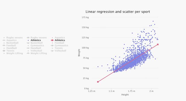
Another way to overcome this challenge is by using a mathematical representation or model for each discipline using linear regression, for instance (see chart below):
The chart looks much cleaner using line charts (mathematical model) instead of the scatter type charts. I kept the scatter chart option on the same chart for more exploration and comparison between the disciplines.
Another benefit of this solution is that The chart is now accessibility friendly, as it is easier to see the overall series’ patterns.
One major drawback of using linear regression is that it is a model, not the real representation. The model is just the best straight line that represents the measured values. Another drawback is that the linear regression is highly sensitive to outliers.
I hope this taught you something about how to best prepare your data through statistical analysis, and how to combine the results with the appropriate chart type to get the best results from your data.
Let me know in the comment section below if you have another favorite JavaScript statistical library, and feel free to share your experience with it.


Leave a Reply