
Linear regression is a simple, yet powerful mathematical tool for modeling and predicting data trends. In a nutshell, linear regressions let us predict the value of the dependent variable y using a value of the independent variable x. It is used in many fields, such as machine learning and finance, which we will use as examples here.
In this tutorial, we will explore the linear regression concept and show how you can easily plot a regression line using Highcharts.
Linear regression in machine learning
The main purpose of using linear regression in machine learning is to model and analyze a relationship between variables (independent variable x and dependent variable y). The model will help us to forecast and predict the value of the y using a known value of x. The mathematical model for a simple regression line is an equation Y= B*X + A. The B is the slope that is equal to r*(Sy/Sx) where r is the correlation coefficient, Sy is the standard deviation of y values and Sx is the standard deviation of x value. The equation of A (the intercept) is equal to the meanY-(B*meanX), where meanY and meanX are the means of the y values and x values, respectively.
The following demo displays the relationship between the height and weight of the 2012 Olympic rugby sevens athletes:
Remark
For more details on how to create such demos feel free to refer to Data science and Highcharts: linear regression.
Each blue dot represents the height and weight of an athlete, where the red line is the mathematical model of the relationship between the height and weight of all 2012 Olympic rugby sevens athletes.
Linear regression in finance
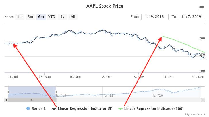
In finance, linear regression is used to predict/forecast the next price movement based on a previous price values period. (The trade name in finance is a “Linear Regression Indicator” and part of a family of statistical tools referred to as “Technical Indicators”). This indicator plots a series of points that are the end of a linear regression of the last N points. The end result will be a line, not necessarily linear, of all the calculated points (see demo below).
The chart above displays the AAPL stock price and two linear regression indicators over a period of 5 price points (black line) and 100 (green line) price points. By the way, a period refers to the number of values; for instance, a period of 5 in finance includes five price points/values.
We can easily notice that the accuracy of prediction is higher when the period is lower. So the line using a period of 5 is more accurate than the line with a period of 100. (However, “accurate” is dependent on your analysis goal. To better understand what different period regression lines may tell you, check out this article.)
As the points are processed based on the last period of values, the first point of the linear regression lines are plotted according to the length of the periods (see picture below):
Note, that when using Highcharts Stock, you don’t need to pre-process your raw data in order to draw a regression line. Just enable the Technical Indicator via the API, or manually via our Stock Tools GUI. (See all available Technical Indicators.)
As you may suspect, the use case for finance is slightly different than for machine learning. For machine learning, the task is to create a data-model and visualize the correlations. In finance, the Linear Regression Indicator is more of a forecasting tool, as predicting price changes is what it’s all about.
We hope that this article sheds some light upon the main differences in using the concept of linear regression in different contexts.


Leave a Reply