
Most dashboards are built one visualization at a time.
A chart shows sales by region. Another tracks monthly revenue. A KPI card summarizes quarterly performance, while a table lists the underlying transactions. Together they help tell the story, but technically they’re still independent components.
Filtering one chart doesn’t necessarily affect another. Comparing two customer segments often requires several manual steps. And AI assistants typically analyze one visualization at a time, with no awareness of the dashboard’s broader context.
Orbit Page Mode takes a different approach. It automatically discovers relationships between visualizations across the dashboard, enabling users to explore connected data, build the views they need, and share their work with colleagues, all from a single analytics workspace. Here’s how it works.
Orbit your page
Orbiting a page begins with a single method:
Highcharts.orbitPage();This adds a shared set of tools for filtering, comparing, sharing, managing layouts, and exploring the application as a whole.
Chart-level Orbit remains independently configurable. When enabled on individual Highcharts components, those visualizations receive their own Orbit toolbars, allowing users to move naturally between chart-specific analysis and page-wide exploration.
From dashboard to full analytics workspace
The foundation of Orbit Page Mode is its ability to understand how visualizations relate to one another.
Rather than requiring developers to wire charts together, Orbit does the job itself by analyzing the underlying datasets and identifying shared dimensions such as dates, regions, product names, customer IDs, or other common fields. Those relationships become the foundation for page-wide interactions.
If there are relationships you want Orbit to recognize that weren’t surfaced (or inferred relationships you’d rather not use), the Relationships panel lets you review, edit, disable, or create them manually.
Start exploring
Once Orbit understands how your data fits together, you can stop thinking about the individual parts of a dashboard and start exploring it as a whole via these page-level features:
Filter everything from one place
Orbit automatically generates page-wide filters based on detected relationships, allowing users to filter every connected visualization from one place instead of configuring filters individually for each chart.
Compare segments side by side
The Compare tool lets users place two segments side by side. Compare sales regions, customer groups, product lines, or time periods across the entire dashboard to understand what changed and why.
Surface what matters most
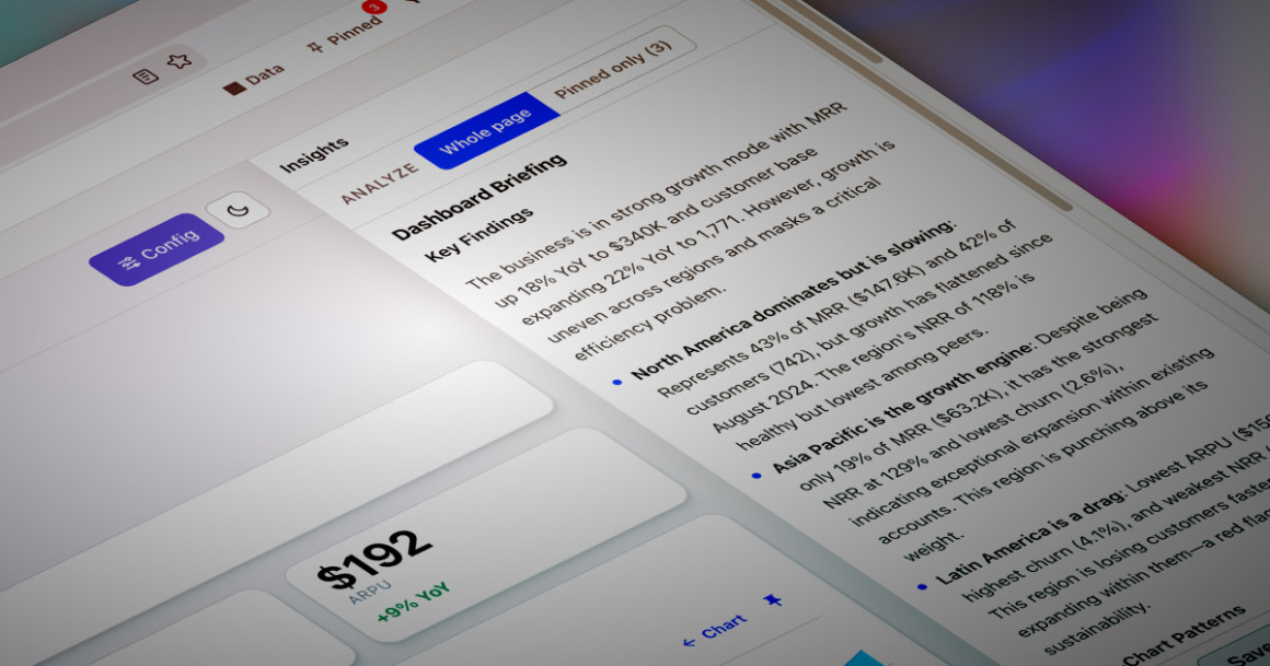
Sometimes users don’t know what question to ask first. The Highlights panel scans the connected dashboard and surfaces the observations most worth investigating, with direct links back to the relevant charts.
Access every dataset
Dashboards often contain dozens of charts, KPIs, and data grids, each with its own underlying dataset.
Orbit’s Data panel brings all of that information together in a single place, listing the datasets for every Highcharts chart and data grid on the page. Users can export and download CSV files directly from the panel.
Ask questions. Get context-rich answers.
Filters, comparisons, and highlights help users investigate data manually. Orbit’s AI tools provide another way to explore the same workspace: by asking questions, generating summaries, and incorporating business context that extends beyond the visualized data.
In our article Orbit’s heavy-duty analysis tools, we explored how you can enrich Orbit’s LLM context by referencing HTML elements and plain-text entries supplied through the orbit.llmContext configuration option. Orbit Page extends the same concept to the entire dashboard, but with a simpler workflow.
Using the Page Context panel, you can select the existing page elements you want the AI to understand: KPI cards, charts, tables or explanatory text already present on the page. Orbit then uses that shared context whenever it generates page-wide insights or answers questions through the AI Assistant.
The AI Assistant also understands context and scope. Users can chat about a single pinned visualization or the entire dashboard. That makes it equally useful for focused editing and broad analysis. A prompt like “Rename this chart to Monthly Revenue by Region” can target an individual visualization, while “Remove the legends from every chart” applies the change across the dashboard.
The same distinction applies to analytical questions, allowing users to investigate one visualization in detail or ask questions about the application as a whole or a group of pinned charts.
AI is also optional. Through the Orbit Admin panel, administrators can enable or disable AI features across their deployment. Organizations with security, compliance, or governance requirements can turn off generative AI while continuing to use Orbit’s interactive analytics and dashboard capabilities.
Share what you discover
Every investigation is different. Sometimes users want to focus on just two charts. Other times they want to temporarily reorganize the dashboard around a particular question.
Orbit’s Pinning feature allows users to create focused workspaces by collecting related charts and grids into new views. Those views can be rearranged, resized, and organized using built-in layout templates, so you can create dashboards tailored to a specific investigation, meeting, or presentation.
When an interesting pattern emerges, Orbit lets you share the investigation itself. Instead of sending screenshots or written instructions, users can generate a link that recreates the dashboard’s current state, including filters, comparisons, pinned views, layouts, and chart transformations, allowing colleagues to continue the analysis from exactly the same starting point.
Works with modern analytics applications
Applications that include visualizations from other charting libraries can still benefit from Orbit’s page-level capabilities, including relationship discovery, page-wide AI, shared filtering, highlights, and collaborative workspace features.
That flexibility makes Orbit a natural fit for organizations that already have existing dashboards and want to add page-wide analytics without rebuilding what they have.
Start orbiting your data
Whether you’re building customer-facing analytics, internal BI applications, operational dashboards, or executive reporting tools, Orbit Page Mode transforms collections of visualizations into connected analytics workspaces.
Orbit is currently available in beta. If you’d like to explore it with your own data, sign up for access and we’ll email you everything you need to start adding interactive analytics directly to your Highcharts charts.
If you’re not already using Highcharts, you can install via npm:
npm install highchartsOr head to highcharts.com/download for other installation options.






Leave a Reply