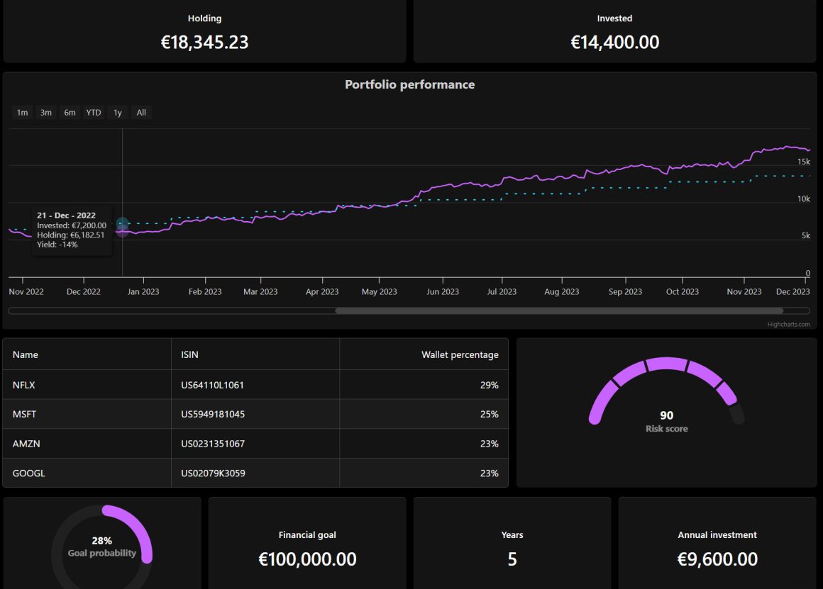
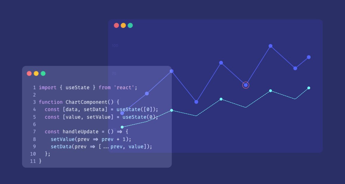
In Highcharts v7.2, we took the existing colorAxis out of maps and heatmaps and made it available for almost all series types. This means we can apply another data dimension to traditional charts like pie charts or column charts. A column chart with a color axis can now visualize three dimensions – the category, the Y value and a custom third value encoded by color. Other chart types that already visualize three dimensions, like bubble, variwide or variable pie, can now be extended to four data dimensions.
In addition to being available on almost all series types, a chart can now contain multiple color axis. This comes in handy if you want different color coding for your chart’s series, analogous to having multiple Y axes for series of different magnitude. The multiple color axes will appear in the legend.
The new implementation includes the following new API options:
- series.colorKey – Determines what data value should be used to calculate the point color if a color axis is used. See example.
- series.colorAxis – When using dual or multiple color axes, this setting defines which color axis the particular series is connected to. It can either be a number referring to the color axis index, or a string referring to its
id. - colorAxis.layout – While previously the color axis would render horizontally in a horizontal legend and vertically in a vertical legend, the layout can now be set independently. See example.
Information about feature updates from 7.1. can be found here, and the 7.0 release announcement can be found here.


Leave a Reply to Ben Cancel reply