
In the world of data visualization, the choice of chart type is critical to how effectively you convey information. While traditional charts like bar graphs, line charts, and pie charts are popular, there are situations where more specialized types are needed. One such chart is the polygon chart.
Polygon charts are particularly useful when comparing multiple variables across different categories. This blog post will guide you through the creation of a polygon chart using Highcharts, one of the most versatile and powerful charting libraries available.
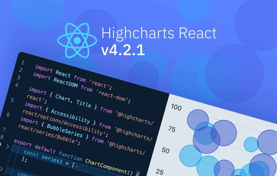
Whether you’re a developer working with JavaScript, .NET, React or other common frameworks, we’re confident you’ll find the inspiration you need.
Highcharts also integrates seamlessly with popular languages such as Python, R, PHP and Java, as well as mobile platforms like iOS and Android. Additional support for frameworks like Svelte, Angular, and Vue, makes it a versatile tool for various development environments.
To see more examples and get an even better understanding of the opportunities Highcharts offers, please head over to the demo section of our website or read up on the technical documentation on how to get started. Once you get the hang of it, the API reference will help you customize your charts in no time.
What is a polygon chart?
A polygon chart displays multivariate data in the form of a two-dimensional chart of three or more quantitative variables represented on axes starting from the same point. Each variable is represented by a point on the axes, and these points are connected to form a polygon, hence the name “polygon chart.” This type of chart is ideal for comparing the relative performance of different categories across various metrics.
For example, you might use a polygon chart to compare the features of several products. Each axis could represent a different feature, and the distance from the center would indicate how well each product performs in that area. The shape of the resulting polygon gives you an immediate visual indication of the strengths and weaknesses of each product.
When to use a polygon chart
Polygon charts are best suited for:
- Comparative analysis: They are ideal for comparing multiple entities across several variables.
- Multidimensional data: When you need to visualize data with more than two variables.
- Proportional comparison: Useful for showing how different categories measure up against each other on the same scale.
- Identifying patterns and outliers: The shape and symmetry of the polygons can quickly highlight patterns and anomalies.
However, they are less effective when dealing with large datasets or when the differences between categories are subtle, as the chart can become cluttered and difficult to read.
Creating a polygon chart with Highcharts
Let’s see how to recreate this polygon chart using Highcharts.
Step 1
Load the required files.
<script src="https://code.highcharts.com/highcharts.js"></script>
<script src="https://code.highcharts.com/highcharts-more.js"></script>
<script src="https://code.highcharts.com/modules/accessibility.js"></script>

<figure class="highcharts-figure">
    <div id="container"></div>
    <p class="highcharts-description">
        Chart showing use of the <code>polygon</code> series type to plot
        height and weight data using a set of coordinates.
    </p>
</figure>
Note that this example in addition to the base Highchart script also includes some additional scripts, namely the highcharts-more.js script, the Export modules (docs) and Accessibility module (docs).
The highcharts-more.js module is an extension for Highcharts that includes additional chart types and features not available in the standard Highcharts library. This module is essential when you need to create more specialized or advanced charts like the polygon chart.
Step 2
Create a container for your chart in HTML.
<figure class="highcharts-figure">
    <div id="container"></div>
    <p class="highcharts-description">
        Chart showing use of the <code>polygon</code> series type to plot
        height and weight data using a set of coordinates.
    </p>
</figure>
Step 3
Insert some CSS to control the container, style and elements of your chart.
.highcharts-figure {
    min-width: 360px;
    max-width: 800px;
    margin: 1em auto;
}
Step 4
Load and initialize the chart. Notice how there is a separate polygon series.
Highcharts.chart('container', {
    title: {
        text: 'Average height and weight for men by country',
        align: 'left'
    },
    subtitle: {
        text: 'Source: ' +
            '<a href="https://www.worlddata.info/average-bodyheight.php" ' +
            'target="_blank">WorldData</a>',
        align: 'left'
    },
    xAxis: {
        gridLineWidth: 1,
        title: {
            enabled: true,
            text: 'Height (cm)'
        },
        startOnTick: true,
        endOnTick: true
    },
    yAxis: {
        title: {
            text: 'Weight (kg)'
        }
    },
    legend: {
        layout: 'vertical',
        align: 'right',
        verticalAlign: 'middle'
    },
    series: [{
        name: 'Target',
        type: 'polygon',
        data: [
            [163, 42], [162, 46], [162, 55], [163, 64], [164, 70], [170, 90],
            [181, 100], [182, 90], [173, 52], [166, 45]
        ],
        color: Highcharts.color(
            Highcharts.getOptions()
                .colors[0]
        ).setOpacity(0.5).get(),
        enableMouseTracking: false,
        accessibility: {
            exposeAsGroupOnly: true,
            description: 'Target ranges in an upwards trending diagonal from ' +
                '161 to 182 on the x axis, and 42 to 100 on the y axis.'
        }
    }, {
        name: 'Observations',
        type: 'scatter',
        color: Highcharts.getOptions().colors[1],
        data: [
            { x: 184, y: 87.9, name: 'Netherlands' },
            { x: 183, y: 90.4, name: 'Montenegro' },
            // more data points...
            { x: 159, y: 53.9, name: 'Timor-Leste' }
        ]
    }],
    tooltip: {
        headerFormat: '<b>{point.key}</b><br>',
        pointFormat: '{point.x} cm, {point.y} kg'
    },
    responsive: {
        rules: [{
            condition: {
                maxWidth: 500
            },
            chartOptions: {
                legend: {
                    align: 'center',
                    layout: 'horizontal',
                    verticalAlign: 'bottom'
                }
            }
        }]
    }
});
Other common use cases for polygon charts
Survey data visualization
When dealing with survey data, polygon charts can be useful for visualizing responses across multiple questions or categories. Like the data in the chart example above that maps average height and weight for men by country. Another common use case would be customer satisfaction across various service aspects (e.g., speed, friendliness, accuracy).
Performance evaluation
Polygon charts are commonly used in performance evaluation to compare different entities (such as employees, products, or business units) across various performance metrics. For example, a company might use a polygon chart to compare the sales performance, customer satisfaction, and efficiency of different branches.
Product feature comparison
When comparing products, polygon charts are ideal for visualizing how different products perform across various features. For example, you could compare smartphones based on battery life, camera quality, screen resolution, and price.
Marketing analysis
In marketing, polygon charts can be used to compare the effectiveness of different campaigns across multiple channels. For example, a polygon chart could visualize how different marketing campaigns perform across social media, email marketing, and SEO.
Conclusion and additional resources
Polygon charts are a powerful tool for visualizing multivariate data and making complex comparisons between different entities. With Highcharts, creating and customizing polygon charts is straightforward and flexible, allowing you to tailor your visualizations to meet your specific needs. Whether you’re comparing products, evaluating performance, or analyzing survey data, polygon charts can provide clear insights that are easy to understand and interpret.
As with any chart type, it’s important to consider whether a polygon chart is the right tool for your data. When used appropriately, they can be incredibly effective, but when misused, they can become cluttered and confusing. Always keep your audience and the nature of your data in mind when choosing your visualization method.
Highcharts offers extensive documentation and support to help you get the most out of your polygon charts, so don’t hesitate to explore further and experiment with the many options available. For more examples and detailed documentation, be sure to explore the Highcharts demo section.
- Documentation – Getting started with Highcharts
- API reference – Polygon chart – series.polygon
- API reference – Polygon chart – plotOptions.polygon
- Demo/example section
- Highcharts® Core product page
Related posts
- Heat map examples using Highcharts
- Choropleth map examples using Highcharts
- Maps with latitude & longitude using Highcharts
- Visualizing geospatial data with Highcharts Maps
- Lightning map – create your own using Highcharts
- Dynamic charts in JavaScript with Highcharts


Leave a Reply