Climate change is a critical global issue, and understanding climate data is essential for informed decision-making. Visualizing climate data effectively can reveal patterns, trends, and anomalies that inform policy and raise public awareness. Highcharts is a powerful tool for creating interactive and responsive climate data visualizations, making complex datasets accessible and understandable.
By using charts, graphs, and maps, we can highlight trends in temperature changes, precipitation levels, greenhouse gas emissions, and more. These visual insights are crucial for identifying correlations, forecasting future scenarios, and making data-driven decisions to combat climate change.
In this post we’ll look at using Highcharts for climate data visualization, including a practical example using Highcharts® Dashboards.
Highcharts® Dashboards is a development library pre-loaded with time-saving features and options for customization that will save you hours of development time on your dashboard projects, whether you’re building a single custom dashboard or use it as a starting point for a more complete dashboards product.
To see more demos and get an even better understanding of the opportunities Highcharts® Dashboards offers, please head over to the dashboards in the demo section of our website, read up on the dashboards section of our technical documentation or visit the Highcharts® Dashboards product page.
Whether you’re a developer working with JavaScript, .NET, React or other common frameworks, we’re confident you’ll find the inspiration you need.
Highcharts also integrates seamlessly with popular languages such as Python, R, PHP and Java, as well as mobile platforms like iOS and Android. Additional support for frameworks like Svelte, Angular, and Vue, makes it a versatile tool for various development environments.
Key features for climate data with Highcharts® Dashboards
Interactive elements
Highcharts offers a range of interactive features such as drilldown, tooltips, zooming, and panning. These elements allow users to explore data in depth, providing detailed information on specific data points and enabling dynamic adjustments to views for a more comprehensive analysis.
Real-time data updates
Climate data often requires real-time monitoring. Highcharts supports real-time data updates, ensuring that visualizations reflect the latest information. This capability is particularly useful for tracking weather patterns, monitoring air quality, and observing changes in sea levels.
Scalability and performance
Handling large climate datasets efficiently is crucial. Highcharts is designed to render thousands or millions of data points without compromising performance. This scalability ensures smooth and responsive visualizations, even with extensive data.
Versatile chart types
Highcharts supports various chart types, including line charts, scatter plots, heat maps, and choropleth maps. This versatility allows users to choose the most appropriate visualization for their climate data, whether it involves tracking temperature trends, visualizing rainfall distribution, or mapping carbon emissions.
Practical example
Go to the demo page for “Climate data dashboard” to view its code or edit it on JSFiddle or Codepen.
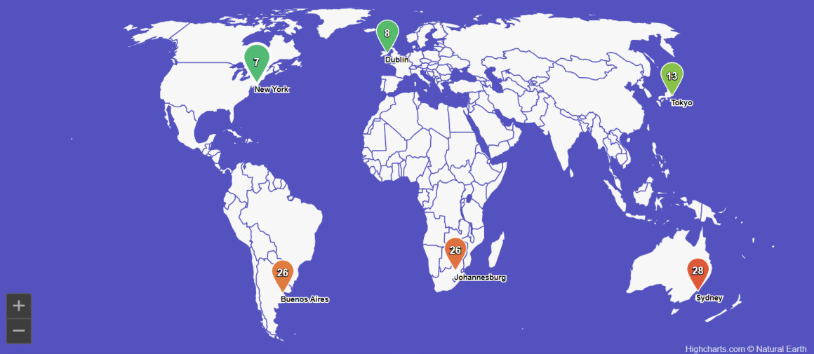
The Highcharts climate data dashboard is designed to visualize various climate-related metrics for global cities. The dashboard features multiple interactive components, including a world map with markers indicating different cities. Each marker provides quick access to detailed climate data for the selected location.
One key feature is the KPI gauges, which display essential climate metrics such as elevation and temperature. These gauges update in real-time, ensuring users have the latest data. The temperature gauge is adaptable, showing readings in both Celsius and Fahrenheit, catering to a global audience with varying preferences.
Another vital component of the dashboard is the selection grid. This grid allows users to choose specific data points and compare them across different cities. It includes metrics such as average temperature, maximum temperature, and days with rain. Users can filter the data based on specific criteria, making it easier to analyze trends and patterns.
The historical data trends section is particularly useful for tracking climate changes over time. It provides visual representations of temperature variations, precipitation patterns, and other critical climate data across different periods. This feature is essential for researchers and policymakers who need to monitor long-term climate trends.
Conclusion and additional resources
Highcharts is a versatile and powerful tool for visualizing climate data. Its interactive features, real-time data support, scalability, and variety of chart types make it ideal for transforming complex climate datasets into accessible and insightful visualizations. By leveraging Highcharts, scientists, policymakers, and the public can gain a deeper understanding of climate trends and make informed decisions to address climate change.
To explore the capabilities of Highcharts and start creating your climate data visualizations, visit the Highcharts demo section and the technical documentation.
- Documentation – Getting started with Highcharts
- Demo/example section
- Highcharts® Dashboards product page
- Highcharts® Dashboards technical documentation
Related posts
- Big data visualization using Highcharts
- Visualizing geospatial data with Highcharts Maps
- Heat map examples using Highcharts
- Choropleth map examples using Highcharts
- Maps with latitude & longitude using Highcharts
- Data charting with Highcharts


Leave a Reply