A bar graph, also known as a bar chart, is among the most popular charts to visualize data.
The simplicity of a bar chart shape makes it easy to create, understand, and gain insights.
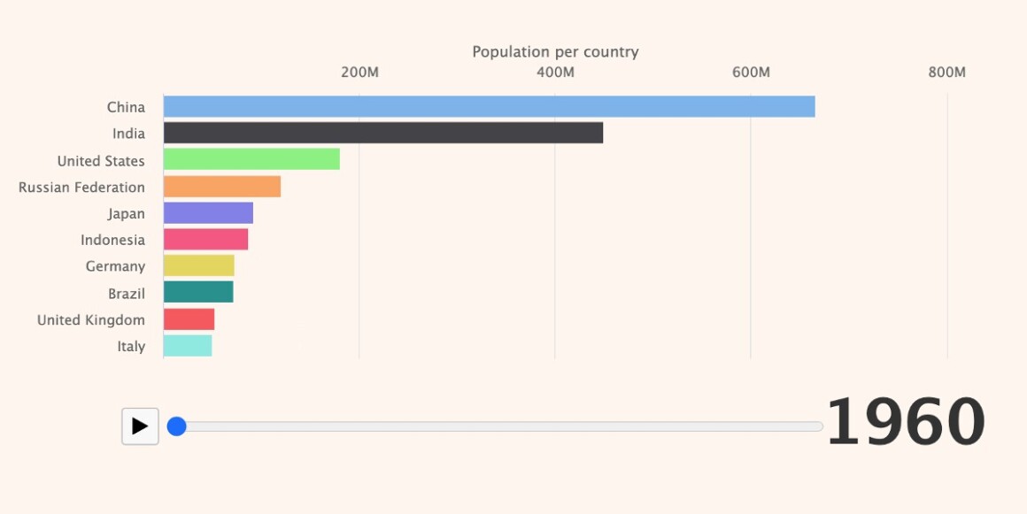
Here is a popular bar chart demo type known as the bar chart race:
Remark
Read more about how to create a bar chart race with Highcharts.
In many cases, a bar graph is mainly used with categorical data.
Remark
By the way, data is labeled categorical if its values describe a quality, grade, level, or any other characteristics, such as happy/neutral/sad, low/high, dark/light. Categorical data can be Nominal or Ordinal. Nominal data such as Male/Female, countries’ names, colors, etc. Ordinal data such as different levels (low, medium, and high), times of the day (morning, afternoon, evening), educational stages (preschool, elementary, high school, college, and graduate school), etc.
But do you know when to use a bar graph with categorical data?
A bar chart is an excellent choice to display the comparison, composition, and distribution of categorical data.
Bar chart to compare categorical data
The demo below compares the top 10 EU countries in organic farming area by 2018:
The data is categorical (nominal) as it represents countries’ names. A column chart could also be used to compare categorical data; however, one of the advantages of a bar chart is that it fits very well with small screens such as smartphones or tablets.
Bar chart to display the composition with categorical data
Another way to use a bar chart with categorical data is to show composition. The demo below visualizes the composition of honey using a stacked bar chart:
Here again, the data used is nominal data since there is no order within the data set used.
Bar chart to display the distribution with categorical data
Bar charts can also be used to visualize the distribution of categorical data. The demo below displays the distribution of the Danish population in 2019.
The data used in this demo is ordinal, as there is a concept of order among the data from the first category 0-14, all the way up to the 85+ category.
Bar chart and accessibility
Thanks to the shape of the bars, it is easy to adapt any bar chart to suit the impaired vision community. The charts above can be created using pattern fill or monochrome:
Now, you know when and how to use bar charts to visualize comparison, composition, and distribution of categorical data.
Feel free to share your comments and questions about how you use bar charts.


Leave a Reply to Ben Cancel reply