Share this

Animated Charts

Mustapha Mekhatria Avatar

by

1 minutes read

Line chart visualizes the Arctic Sea Ice extent from 1980 to 202

 
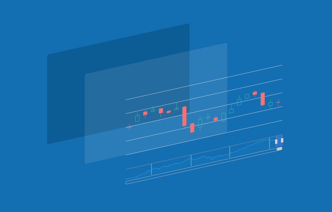
Animated charts offer effective means to attract attention to specific aspects of the data. As an alternative to overwhelming the audience with abundant data, animations enable the audience to gain a deeper insight into the data at a moderate speed.

Check our more Highcharts demos.

Stay in touch

No spam, just good stuff

We're on discord. Join us for challenges, fun and whatever else we can think of
XSo MeXSo Me Dark
Linkedin So MeLinkedin So Me Dark
Facebook So MeFacebook So Me Dark
Github So MeGithub So Me Dark
Youtube So MeYoutube So Me Dark
Instagram So MeInstagram So Me Dark
Stackoverflow So MeStackoverflow So Me Dark
Discord So MeDiscord So Me Dark

Comments

Leave a Reply

Your email address will not be published. Required fields are marked *

This site uses Akismet to reduce spam. Learn how your comment data is processed.