The Covid-19 pandemic has put what seems to be an unprecedented focus on data reporting and forecasting into the public domain. Done right, data visualization can enhance, and in some cases, give data the necessary impact to drive behavioral change. I particularly like this visual simulation from WSJ, which does a good job of helping people understand why social distancing was chosen as a strategy.
Fortunately, a plethora of data has been made available publicly. We took a look at some of the data that were made available in this github repository, to see if we could bring these data to life, both as a technical demonstration as well as a public service.
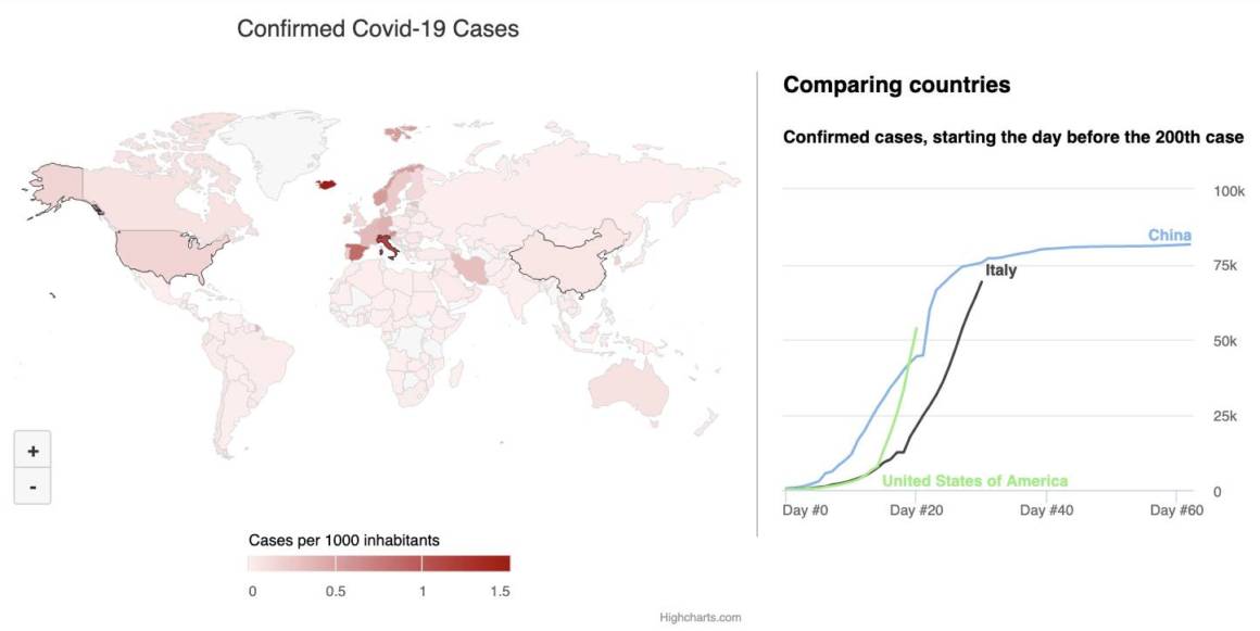
Public service announcement
We’ll start with the public service portion by showing a small dashboard with two charts, one showing a world map of reported Covid-19 cases per capita, complemented with a line chart that shows the growth in cases by country. By clicking on a country on the map, the corresponding line chart is updated. By shift-clicking on multiple countries (or touching one by one on touch devices), you will be able to compare the growth rate between countries. Since every growth curve starts the day before case number 200 was registered, we can compare the relative growth independent of each country’s size, and independent of when the epidemic started in each country.
As you can see, the map has an interactive legend at the bottom that tracks the color intensity on the map. Note that this map displays reported cases, relative to the population in the country. It is probably not a reflection of the actual cases,as each country’s testing and reporting efficiency may be the determining factor. For example, Iceland is testing every citizen, thus has many reported cases. (However, hypothesizing on causality is probably best left to medical professionals, which we are not!).
Nonetheless, it will be interesting to see over time, how closely the line chart of actual cases will track the simulated trajectories in the aforementioned WSJ story.
View the dashboard in full screen.
Technical information
For those who are interested in how these charts were implemented, here is a brief explanation of how this visualization was created, and how you may create something like this of your own.
The data foundation of this dashboard is from three different sources – the Covid-19 time series repo, the Highmaps Map Collection, and a data file of all the World’s countries’ population. These data sets are combined programmatically. In some cases we needed to adjust the naming of countries, as the for example “United States of America” in one data set translates to “US” in another. The Covid-19 time series consists of a day-by-day value array for each country, so for the map, we took the latest value and divided it by the population, to get the rate.
So upon clicking or touching a country in the map, we simply slice the data array on the day before 200 cases were registered, then add it to the line chart. On desktops shift-clicking is a convenient way to select multiple countries. On touch devices we needed to create a different UX, so we allow users to select/unselect each country independently, then add a button to clear the selection.


Leave a Reply