
Stazy offers a portfolio management tool that helps users to collect and aggregate information and dependencies across all structures – top-down and bottom-up. The tool creates dashboards to provide at a glance a global visibility, improve decision making, save time and resources, etc.
We pay particular importance to offering the right dashboards to our users. That requirement doesn’t come without challenges that we have to overcome constantly. The main challenge is to provide a data visualization library that is highly interactive, stylish, and very responsive that suits all our users’ needs; and, at the same time, easy to learn, simple to configure, and with good technical support to our internal development team. After careful selection, we realized that the Highcharts data visualization library checks all the requirements. We managed to make our users pleased with our portfolio management tool and our tech team happy with the Highcharts data visualization library.
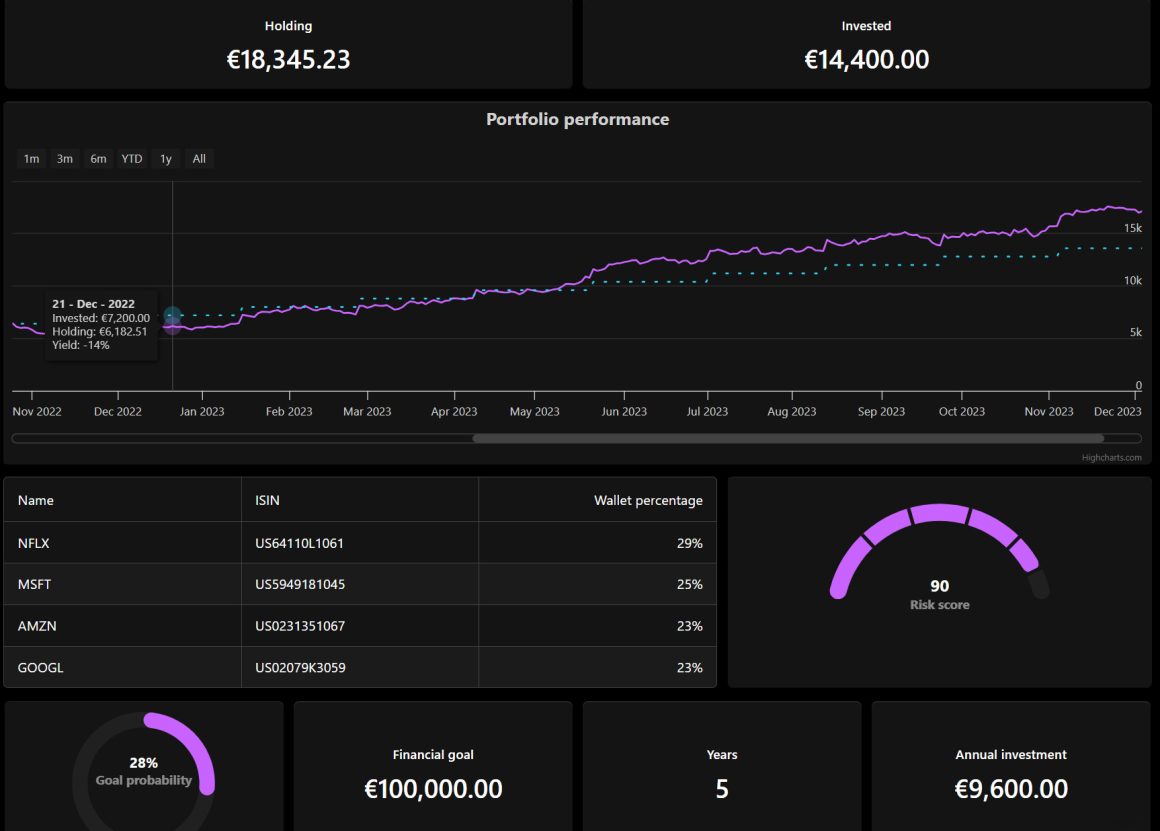
Here is an example of one of our dashboards:

From a technical point of view, the Highcharts library is part of the frontend built with ReactJS.
Let’s take a closer look to see how easy it is to create a visualization using the toot and Highcharts library:
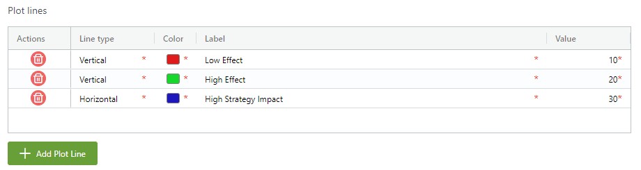
The following example displays a bubble chart with plot lines. The X-axis represents the amount of total effect, and the Y-axis represents Strategy Alignment Index.
The Plot Lines tip you where the projects with high Strategy Impact, Low or High Effect are. In addition, the bubbles are colored according to the Project’s Main Strategy, and the total Budget measures their size.
Set up a bubble chart in Stazy
Now, let’s see how to configure such a chart in four simple steps:
1. Create a new chart and fill in the general information such as name, description, and permissions sets:

2. Choose the type of chart you want to create:

3. The most important part of the configuration consists of data fields or tables. To create a bubble chart, you need to define X/ Y/ and Z axis (size of a bubble) and set up a couple of other settings:

4. Click the Save button and check the result, or you can also add some plot lines to the chart:
That is it; you have a ready-to-use powerful, and effective dashboard.
We are happy to satisfy our customers and our internal tech team by offering an intelligent solution with a suitable data visualization library.


Leave a Reply