
We’re excited to introduce Highcharts Orbit, a new feature that turns any Highcharts chart into a full analytics workspace.
Most charting tools are built to display data. Orbit helps you understand it with a suite of analysis tools for forecasting, anomaly detection, and reporting. And although we didn’t build Orbit as an AI product, AI features for generating insights, shareable summaries, and data visualization suggestions are part of the toolkit. We realize not every team wants to or can use AI due to security and environment constraints, so these features are 100% configurable and easy to disable entirely.
Read on to find out what Orbit does and how to get started.
From data viz to a data analysis platform
Once Orbit is added to any Highcharts setup, a toolbar appears above the chart, giving you access to a suite of analysis and reporting tools organized into four menus.
The View menu offers different ways of looking at your chart:
- Chart displays the chart by itself, full focus.
- Data Grid displays your data as an interactive table powered by Highcharts Grid.
- Present builds a slide deck from your chart with KPIs, key takeaways, anomaly flags, and correlations included.
- Alt. Visualization uses AI to suggest alternative chart types suited to your data, with a brief note on how each would reframe what the data emphasizes.
- Full Screen lets you explore without distractions
The AI gives you tools for investigating and describing your data:
- Insights reads your data and returns both a summary and a set of directions worth exploring.
- Narrator produces copy-paste-ready summaries in various tones, from crisp executive briefs to casual Slack-ready recaps.
- AI Assistant lets you chat with your chart. Ask questions about your data or modify the chart directly via prompts.
Note that AI features can be enabled or disabled independently.
The Analyze menu gets into the numbers:
- Summary Stats displays key statistics per series such as min, max, mean, median, standard deviation, and trend direction.
- Correlations calculates the Pearson coefficient between every pair of series, displayed as labeled bars with plain-language strength ratings.
- Anomaly Detection flags statistical outliers with highlighted points on the chart.
- Forecast projects trends forward using linear regression and moving averages, extending the chart timeline with confidence bands and per-series fit scores.
- Indicators enables you to add technical indicators from Highcharts Stock such as SMA, EMA, Bollinger Bands, RSI, MACD, and more.
The Transform menu is for when you want to look at your data differently:
- Filter & Focus lets you toggle series visibility and axes ranges to isolate the data matters.
- Derived Series lets you perform various operations on your data and add the results to your chart as new series.
Most tools run entirely client-side in the browser, so your data never leaves your environment. The optional AI-powered features (Insights, Narrator, AI Assistant, Alt. Visualization) send your chart configuration and data to our backend for processing, and can be enabled or disabled independently.
Try it and tell us what you think
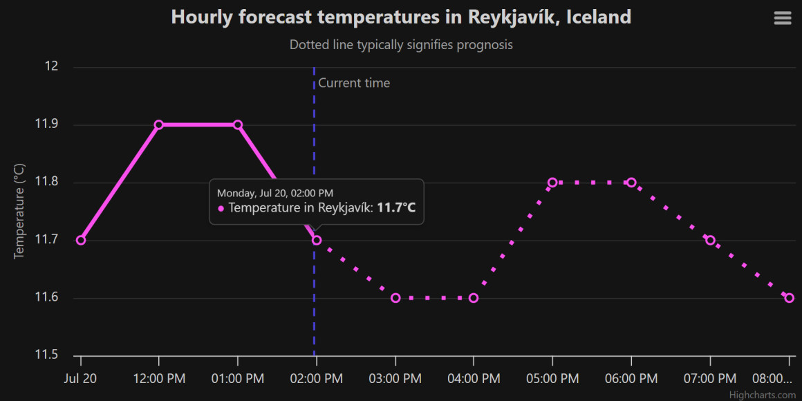
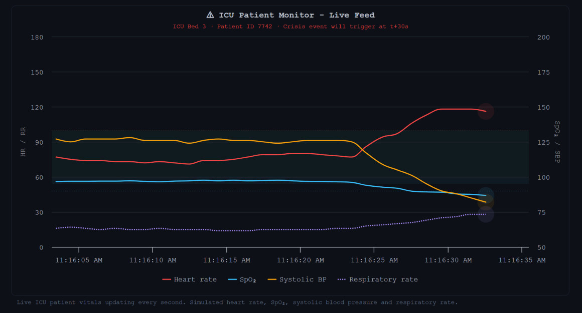
Orbit is currently in preview. Give it a try below. All the tools are active, so you can get a real sense of Orbit’s capabilities.
If you want to try it with your own data, fill in the form below to get access to the code. Orbit works with any Highcharts chart, so if you’re new to Highcharts, you can download it here for evaluation purposes.
And once you’ve tried it, let us know what you think. Your feedback at this stage can shape what Orbit becomes.


Leave a Reply