
Predictive analytics forecasts future trends, but raw predictions lack impact. Visualization transforms forecasts into clear insights that stakeholders understand instantly. Highcharts excels at displaying predictions, confidence intervals, and historical context simultaneously.
With Highcharts for React, developers get first-class charting with hooks, TypeScript support, and optimized rendering out of the box. Highcharts also integrates with Angular, Vue, and Svelte, as well as server-side languages like Python, R, PHP, and Java, and mobile platforms including iOS and Android.
To explore Highcharts further, visit the interactive demo gallery to see real-world examples, or consult the comprehensive documentation. You can also review the full API reference or learn more about Highcharts products and features.
Why forecast visualization matters
Predictions lose credibility without clear visualization. Decision-makers need historical accuracy, confidence bounds, and projected values visible simultaneously. Visual distinction between past and future prevents misinterpretation. Confidence intervals explicitly communicate uncertainty. Poor visualizations hide critical patterns; effective ones accelerate comprehension.
Essential forecast chart elements
- Historical data: Establishes context and baseline for predictions.
- Forecast line: Predicted values extending beyond current data, often with dashed or dotted styling.
- Confidence intervals: Shaded bands showing uncertainty range, typically 90% or 95%.
- Temporal markers: Vertical lines or color shifts clearly separating history from prediction.
- Tooltips: Detailed hover information showing exact values and confidence ranges.
Confidence intervals and uncertainty
Point estimates alone mislead stakeholders. A sales forecast of 10,000 units appears certain, but actual sales might range 8,500 to 11,500 units at 95% confidence. Wider intervals indicate greater uncertainty. Short-term forecasts have narrow intervals; long-term ones widen as uncertainty compounds. Display this expanding uncertainty visually through progressively wider bands, helping viewers assess forecast reliability intuitively.
Trend analysis and seasonality
Time-series data exhibits patterns: uptrends, downtrends, and seasonal cycles all influence predictions. Overlay actual versus predicted data to compare accuracy. Use color gradients or zones to highlight different phases. Seasonal components should be visible without overwhelming the chart.
Seasonal decomposition separates trend, seasonal, and residual components. Multi-axis charts showing these separately clarify patterns. Forecasting algorithms produce point estimates; visualizing them alongside confidence intervals shows model reliability.
Distinguishing historical from predicted data
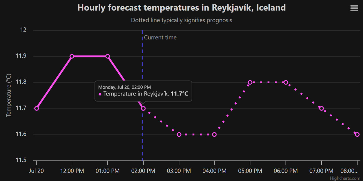
Visual clarity separates fact from projection. Solid lines represent history; dashed or dotted lines show forecasts. Color changes at the transition reinforce the boundary. Opacity shifts, gradient fills, and vertical marker lines all work effectively. Explicit labels (“actual” vs “forecast”) and subtitles clarify interpretation for all viewers.
Interactive example
The following demonstrates forecast visualization with real weather data:
Note that these examples in addition to the base Highcharts script also includes some additional scripts, namely the Export modules (docs) and Accessibility module (docs).
Implementation steps
1. Load the required files and create a container to hold the chart
<script src="https://code.highcharts.com/highcharts.js"></script>
<script src="https://code.highcharts.com/modules/exporting.js"></script>
<script src="https://code.highcharts.com/modules/accessibility.js"></script>

<div id="container"></div>Load core Highcharts and essential modules. The container div holds your rendered chart.
2. Add CSS to control the dimensions of the container
.highcharts-figure {
    min-width: 360px;
    max-width: 800px;
    margin: 1em auto;
}Style ensures responsive behavior. Set minimum width for mobile usability and maximum for desktop readability. Centered margins improve layout.
3. Implement the JavaScript
(async () => {
    const json = await fetch(
        'https://api.met.no/weatherapi/locationforecast/2.0/compact?lat=64.128288&lon=-21.827774'
    ).then(response => response.json()),
    data = json.properties.timeseries.slice(0, 10).map(el =>
        [
            new Date(el.time).getTime(),
            el.data.instant.details.air_temperature
        ]),
    todayDate = new Date(),
    today = todayDate.getTime() - todayDate.getTimezoneOffset() * 60 * 1000;

    Highcharts.chart('container', {
        title: {
            text: 'Hourly forecast temperatures in Reykjavík, Iceland'
        },
        subtitle: {
            text: 'Dotted line typically signifies prognosis'
        },
        xAxis: {
            type: 'datetime',
            plotLines: [{
                color: '#4840d6',
                width: 2,
                value: today,
                zIndex: 2,
                dashStyle: 'Dash',
                label: {
                    text: 'Current time',
                    rotation: 0,
                    y: 20,
                    style: {
                        color: '#333333'
                    }
                }
            }]
        },
        yAxis: {
            title: {
                text: 'Temperature (°C)'
            }
        },
        legend: {
            enabled: false
        },
        tooltip: {
            valueSuffix: '°C'
        },
        series: [{
            name: 'Temperature in Reykjavík',
            data: data,
            zoneAxis: 'x',
            lineWidth: 4,
            marker: {
                lineWidth: 2,
                lineColor: '#4840d6',
                fillColor: '#fff'
            },
            color: {
                linearGradient: { x1: 0, x2: 0, y1: 0, y2: 1 },
                stops: [
                    [0, '#fa4fed'],
                    [1, '#5897ff']
                ]
            },
            zones: [{
                value: today
            }, {
                dashStyle: 'Dot'
            }]
        }]
    });
})();This implementation fetches real weather data and renders it with Highcharts. Zones switch line style at the current time, creating visual separation between historical and forecast data.
Advanced techniques
Confidence intervals visualize as area ranges using areaspline range series type. Multiple series at different confidence levels (68%, 95%, 99%) with varying opacity show uncertainty intuitively. Color gradients or stacked areas represent components. Threshold lines highlight critical values. Real-time updates use addPoint or setData for efficient rendering without full redraws. WebSocket connections push fresh predictions continuously.
Best practices
- Label clearly: Distinguish actual from forecast through text, style, and color.
- Show uncertainty: Always display confidence intervals or bounds. Point estimates alone hide critical information.
- Provide context: Include sufficient historical data to establish patterns and build credibility.
- Optimize readability: Avoid clutter. Remove non-essential elements. Support responsive design.
- Support interaction: Tooltips, zoom, and pan enable exploration. Export options facilitate sharing.
- Document methodology: Explain forecasting methods in subtitles or captions to build trust.
Real-world applications
Financial institutions forecast market trends and communicate risks. Hospitals visualize patient admission volumes for staffing planning. Energy companies predict electricity demand. Retailers forecast product demand for inventory management. Transportation firms project delivery volumes and maintenance needs. Each domain benefits from clear visual separation of historical patterns and future projections.
Conclusion
Predictive analytics visualization combines statistical precision with intuitive design. Highcharts transforms forecasts, confidence intervals, and trends into interactive dashboards. For complete forecast dashboard solutions, Highcharts Dashboards lets you combine forecast charts with KPI indicators and synchronized data grids in a single, responsive layout. Clear visual distinction between historical and predicted data prevents misinterpretation. Interactive features enhance exploration. By following best practices and leveraging Highcharts capabilities, you create dashboards that turn predictions into actionable intelligence and confidence.
Resources
- Documentation – Getting started with Highcharts
- Demo/example section
- Highcharts API reference
- Highcharts Core product page






Leave a Reply