Sometimes when charts have a high density of data points such as line charts with multiple series, the visualization may end up being cluttered and may obscure.
With some careful planning, data-density issues can be avoided using a multitude of approaches. One approach, which I will discuss here, is the small multiple or the grid chart. This solution separates data series into individual charts are arranged in a grid, with identical, axes and chart type.
The small multiple can be very useful and easy to set up. Nevertheless, this method is not a very popular approach, probably because developers and designers may believe it is difficult to set up, or they are just not aware of this powerful method.
In this tutorial, I will show you how to set up a small multiple, as well as discuss the advantages and disadvantages of this data visualization method.
First, let’s examine a chart symptomatic of this problem. The demo below displays the Euro foreign exchange reference rates of 10 different currencies from January 2009 to July 2018 on the same chart.
Even though I have added the zooming capability, and a shared tooltip to display the data in a single view, it is a challenge to process the chart’s information. By representing all the data sets on one chart, many issues emerge such as:
- The main chart’s message is entirely hijacked by the disproportional values of one or multiple charts, in this case, the Indonesian rupiah, as its values are way more significant than the rest of the data series; making it difficult to compare the different line charts.
- The readers have to zoom in/out and deselect some data series to be able to check the rest of the data. (Click on the Indonesian rupiah to deselect the series, and you’ll see how this may work, yet not the ideal way to interact with a chart)
As you can see, displaying multiple data series, or series, on one chart could end up confusing the readers, especially if either some values are very close across series, or is considerably different from each other.
The small multiple solves the issues I mentioned above by isolating and displaying each series from the data set on one chart. Readers may this way get to look at the “shape” of each series’ trend and therefore get a better idea of the dynamics of each series. Readers may also find it easier to compare series in a grid-shape. Once the first chart is understood, the readers will not have to spend any effort to decipher the other charts’ legends and axes, but rather keep their attention to process the data to either make a decision or to find patterns.
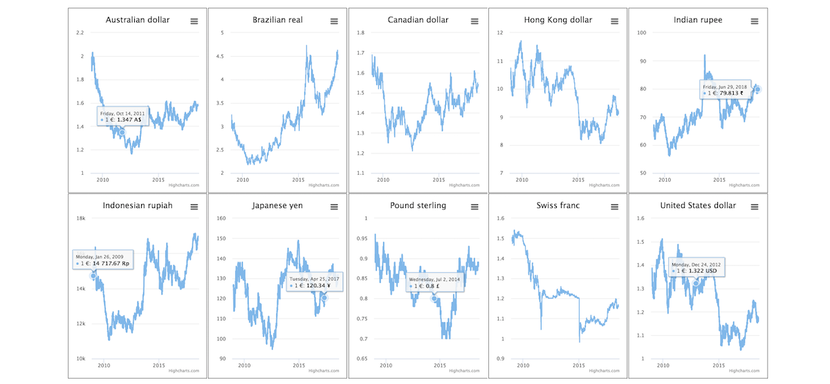
In the demo below, I visualize the same data of the Euro foreign exchange reference rates using the small multiple method.
From the charts above, I can easily see that the Swiss Franc gets stronger than the Euro over the past years; one Euro was worth 1.5 Swiss Franc in 2009 and in July 2018 it is only worth 1.2 Swiss Franc. Whereas, the Pound Sterling is almost worth the same value in 2009 and 2018, with a significant plunge at the beginning of 2015.
Remark
The small multiple, in general, has the same scale for all the data series, but in this case, for clarity purposes, I used different scales on the y-axis due to the significant differences in the data values. In such instances, it is strongly recommended to make it clear to the readers that the scales are different, in order to avoid making the wrong conclusions when comparing series.
To create this small multiple, I had to isolate each data series on one chart using Highcharts cloud, then gather their iframe in one div, that is it, easy right 🙂 :
  <div class="reduce">
    <ul>
      <li>
        <div class="gridMap" id="highcharts-gT_Eme5tu">
          <script src="https://cloud.highcharts.com/inject/gT_Eme5tu/" defer="defer"></script>
        </div>
      </li>
      <li>
        <div class="gridMap" id="highcharts-PganD5_th">
          <script src="https://cloud.highcharts.com/inject/PganD5_th/" defer="defer"></script>
        </div>
      </li>
      <li>
        <div class="gridMap" id="highcharts-QzQT1743W">
          <script src="https://cloud.highcharts.com/inject/QzQT1743W/" defer="defer"></script>
        </div>
      </li>
      <li>
        <div class="gridMap" id="highcharts-RbERuxfAt">
          <script src="https://cloud.highcharts.com/inject/RbERuxfAt/" defer="defer"></script>
        </div>
      </li>
      <li>
        <div class="gridMap" id="highcharts-DS8I5A42B">
          <script src="https://cloud.highcharts.com/inject/DS8I5A42B/" defer="defer"></script>
        </div>
      </li>
      <li>
        <div class="gridMap" id="highcharts-zNOknhPhQ">
          <script src="https://cloud.highcharts.com/inject/zNOknhPhQ/" defer="defer"></script>
        </div>
      </li>
      <li>
        <div class="gridMap" id="highcharts-9F2XWYAqK">
          <script src="https://cloud.highcharts.com/inject/9F2XWYAqK/" defer="defer"></script>
        </div>
      </li>
      <li>
        <div class="gridMap" id="highcharts-fiBWvn6jC">
          <script src="https://cloud.highcharts.com/inject/fiBWvn6jC/" defer="defer"></script>
        </div>
      </li>
      <li>
        <div class="gridMap" id="highcharts-CMpwG933f">
          <script src="https://cloud.highcharts.com/inject/CMpwG933f/" defer="defer"></script>
        </div>
      </li>
    </ul>
  </div>
To map or not to map
Another practical use of the small multiple method is with maps. The irregularity of the maps’ shapes and sizes could mislead the readers to make the wrong assumptions. Often bigger areas can overshadow smaller ones. For instance, the Canadian province of the Prince Edward Island is 300 times smaller than the Nunavut territory, so any standard Canadian map representation will completely hide the small province at the expense of the largest one. In this case, the small multiple can easily solve the issue without tempering with the shape of the maps like the tilemap chart.
The demo below visualizes the Canadian provinces and territories with their exact shape and almost the same sizes. It shows the winning political party during the 2015 federal election for each province or territory. This demo helps to focus on one point only: Which is the winning party.
You can easily see that the Liberal party won in all provinces and territories except in Saskatchewan and Alberta where the conservative party has the majority of seats.
Again, this demo is also easy to set up. I create each province and territory on a separate chart; then I gather them using the unordered list tag <ul>.
 <ul>
    <li><span class="gridMap" id="yt"> </span></li>
    <li><span class="gridMap" id="nt"> </span> </li>
    <li><span class="gridMap" id="nu"> </span> </li>
    <li><span class="gridMap" id="ns"> </span></li>
    <li><span class="gridMap" id="nl"> </span></li>
    <li><span class="gridMap" id="nb"> </span></li>
    <li><span class="gridMap" id="qc"> </span></li>
    <li><span class="gridMap" id="pe"> </span></li>
    <li><span class="gridMap" id="on"> </span></li>
    <li><span class="gridMap" id="mb"> </span></li>
    <li><span class="gridMap" id="sk"> </span></li>
    <li><span class="gridMap" id="ab"> </span></li>
    <li><span class="gridMap" id="bc"> </span></li>
  </ul>
To be able separate the province or the territory from the main Canadian map, I set up the option allAreas to false in each chart under the series feature:
  series: [{
    data: [
      ['ca-nb', 10],
    ],
    name: null,
    color: liberal,
    allAreas: false,
    dataLabels: {
      enabled: false
    }
  }]
Now, the map, in this case, is deliberately sparse with data. However, I can use other chart types with this dataset to tell a different version of the same story. In the demo below I am using pie charts to allow readers to see the vote distribution within each province and territory at first glance. Depending on your data visualization goal, this may what you actually intended to highlight.
Disadvantages with grid charts
So far, I shared only the advantages of the small multiple (grid chart), but like any other method, there are disadvantages too.
One of the main drawbacks is that visualizing many small charts on a big screen is fine. However, on smartphones and some tablets, it is not practical at all, as the reader has to scroll back and forward to check/compare each chart. Another disadvantage is the number of the small charts, the bigger the number is the more time the readers need to process the charts, readers often ended up by using their memory to remember charts than actually processing the charts’ information.
Another problem is that when the data series contain values that are very far apart, you have to choose between having a fixed y-axis scale (which may render some series like a flat line like in our initial exchange rate chart) or you have to adjust the y-axis scale to maximize the vertical real-estate, which means that you might be misrepresenting the magnitude of each series (at the expense of comparing the “shape” of the trend appropriately) as exemplified in our small multiple currency chart.
In the case of maps, the small multiple may be advantageous in some cases, but it removes geographical context like size, placement, borders, etc. For readers not familiar with the country or the regions, this may be confusing.
So there you go; Another data visualization tool for your toolbox. Bear in mind to use common sense when it comes to data visualization. Don’t avoid a little extra work if it helps your reader, and also, don’t create crazy small multiple visualizations just because you can!
I am pretty sure that they are many other cases where small multiple can be very useful, feel free to share your experience and tips about it in the comment section below.


Leave a Reply to Jamie Briggs Cancel reply