Have you ever found yourself in life, business or academia, explaining relationships, or correlations between data? Chances are, you resorted to a visual aid, such as a chart, made on your computer, or drawn on the back of a napkin, when trying to get others to grasp what you are trying to convey quickly.
When doing so, it is important to understand that a chart is always subjective. When you try to visualize data, you are, sometimes unconsciously, deciding what information to highlight and obscure, as various chart types “forces” the data into specific data-stories. The charts you use may also exclude certain audiences if they require specialized knowledge (e.g., some charts used in science or finance).
So picking the right chart is actually important if you want to communicate clearly. Once you become aware of your charting options, the appropriate choices often become apparent. Here is a quick guide to help you pick the right chart, when your goal is to illustrate relationships between data.
The article is divided into three main sections according to the different types of data sets to visualize:
- Categorical data sets.
- Continuous data sets.
- Mixed data sets (categorical and continuous).
Feel free to read about data types if you are not familiar with the subject.
1. Categorical Datasets
Bar and column chart
Bar, stacked bar, column, and stacked column charts are commonly used to visualize relationships between categorical data sets.
The following stacked bar chart shows the top-10 female-dominated professions in Sweden in 2017.
The chart shows the relationship between two categorical data: the data on the x-axis represents the professions, and the data on the y-axis represents the percentage of women vs. men in each profession.
The stacked bar chart can be easily adapted to suit the color-blind community (see below), by using a monochrome chart:
Another way to visualize the data sets above is by using a bar chart, where we use the number of men vs. women employed in each profession instead of their ratio (percentage).
Take a look at these two charts. The underlying data are the same, but the story they tell (the data they make easy to compare) is different. Among other things, the Stacked Bar chart doesn’t tell us about the size of the universe, i.e., the number of people in each profession. It could lead us to believe that all of these professions are well-staffed. The Bar Chart makes it clear that there are more “Home care nurses” than “Accountants” in the job market, and that there are also more male Home Care Nurses than there male Accountants in the job market.
The question to ask when choosing your chart is: What point are you trying to make?
Network chart
The network chart is popular for visualizing complex relationships and connections that involve categorical data.
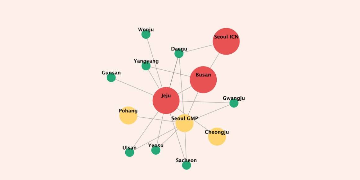
The chart below shows relationships (domestic connections) between different airports in South Korea. The links connect the airports, and the bubbles with colors refer to the number of destinations (domestic and international), ranked by size into three groups.
- Red bubble: airports with more than 50 direct destinations.
- Yellow bubble: airports with more than 10 and less than 50 direct destinations.
- Green bubble: airports with less than 10 direct destinations.
Maps
Geographical maps are used to display categorical as well as continuous data. The chart below shows the same previous network chart (categorical data) on a map:
Maps offer the possibility to view the connections on a real geographic area, where the users can compare actual distances between each point. Nevertheless, from an accessibility perspective, it is not an optimal visualization since the colors that distinguish the number of international connections for each city could be a big challenge for the colorblind community.
One way to solve the issue is by combining the network chart and the map chart to produce a sort of hybrid chart (see chart below)
None colorblind and colorblind alike can read the map thanks to the following features:
- Big size red circles: for airports with more than 50 direct destinations.
- Medium size yellow circles: for airports with more than 10, but less than 50 direct destinations.
- Small size green circles: for airports with less than 10 direct destinations.
- Solid lines: for Jeju flight routes.
- Dot lines: for Busan flight routes.
- Dash lines: for Seoul flight routes.
Now you might ask: Which map to choose? Well, it depends on your audience, and the details/information you would like highlight. The first map is simple and easy to read since the focus is mainly on the domestic connections between the different Korean airports; this map is not convenient for the colorblind community. The second map is more complex and detail oriented. Every element on the map is highlighted, such as the airport’s size by destination using different colors/size, and the domestic flight for the main airport using different dash styles; this map suits a broad audience (colorblind and none colorblind).
2. Both data sets are continuous
Scatter chart
A scatter chart is commonly used to display correlations between data.
This example illustrates the relationship between the height and weight of athletes competing in the 2012 Summer Olympics.
Height and weight displayed respectively along the x-axis and y-axis, are continuous data. The red dot represents the average height and weight of all athletes. When the height increases, the weight increases as well; the pattern looks pretty consistent with some outliers (it can be fun to hypothesize about what sports the outliers compete in!) In statistics, this is called a positive correlation, and it is easily determined with a quick glance at this chart. However, note that in some cases identifying outliers may be the purpose of the analysis. This chart type also allows you to identify data that doesn’t “fit” easily.
A scatter chart comes with some disadvantages, such as a novice could have some issues to get insight from a scatter chart, as it is rarely found outside of scientific materials. Also, keep in mind that an overplotted scatter chart could make patterns and relationships hard to detect, so be sure to not overplot the chart to the point where the insights get lost.
In this case, like all others, make sure your charts are aligned with your audience’s level of proficiency.
3. Data sets are a mix (categorical and continuous)
Box plot
The Box plot offers a practical way to visualize complex datasets in a compact form. It is also colorblind-friendly, as it is monochrome by default. While it allows for easy identification of outliers, like the Scatter Plot, the Box plot does a better job dealing with categorical data.
A Box Plot visualizes useful statistical information such as the maximum/minimum values, the 1st, and the 3rd quartile, and the median (see demo below)
The Box Plot demo below shows the EU road accident fatalities by category in 2017. Whereas a bar chart may have shown only the average across the EU countries, with a box plot, we can see that there is great variation between countries. (In case you are curious, the country with the most passenger car fatalities, is Croatia, with 45 fatalities per million, and the county with the least, is Switzerland with 9.5 fatalities per million 🙂 )
The box plot above visualizes the data without indicating including extreme values/outliers. (In case you are curious: The “Min” and “Max” value in the box plot is actually a calculated value, not the absolute highest or lowest value. In statistics, outliers are data points that are above Q3 + 1.5.IQR, or lower than Q1 – 1.5.IQR; where IQR is the interquartile range or Q3-Q1.)
Outliers could be a good way to detect errors either during the data editing or during the data collecting process; outliers could also point out patterns.
Below is a boxplot with the same EU road accident data, but with outliers explicitly highlighted. The upper outliers (above the max limits) are mainly recorded in eastern European countries, Iceland, and Portugal. To check if it is a pattern or just a coincidence, we had to go back to the data and do further analyses. It turns out that the countries that appear as upper outliers in one category also have the highest fatalities recorded in other categories as well. By displaying outliers, we found a pattern that helps us to get a better insight into the data.
It is easy to see that Busses and Coaches are relatively safe, compared to Passenger cars, where we find the highest number of fatalities.
Now, you have a good idea to visualize data relationships depending on the nature of the data.
I hope you enjoyed this article as much as I did.
Feel free to share your favorite charts to display data relationships in the comment section.


Leave a Reply