“The only new thing in the world is the history you don’t know.” Harry S.Truman.
Treemaps are widely used nowadays, mainly to display hierarchical data. Hierarchical data represent data that are related to each other in successive ranks or orders.
The following diagram is a good example of treemaps:
The shape of Treemaps – as we know it today, differs from its early design. Throughout history, treemaps have taken different forms and shapes; let’s dive into history to check the initial design of treemap.
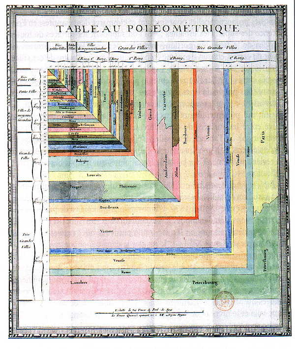
During the eighteen century, the growing urban population in Europe started to attract the attention of local authorities. Decisions on the extension of existing cities or to build new cities became critical to make. Improved methods to assess the situation were highly appreciated. In 1782, a French mathematician known as Charles Louis de Fourscore published work using a revolutionary visual diagram to classify towns by their surface area. The diagram is entitled Tableau Poléometrique, see picture below:

Tableau Poléometrique 1782
Tableau Poléometrique evolved throughout history, and many believe that treemap is a result of that evolution. The diagram below allows us to see a treemap diagram with the same data used by Charles Louis de Fourcroy hundreds of years ago:
The presentation of the data above is slightly different from Charles Louis Fourcroy’s work. Instead of visualizing data as a whole, this new treemap approach gathers data within blocks to better understand the pattern. Decision-makers could then process collected data much easier.
Nevertheless, Charles Louis de Fourcroy succeeded in revolutionizing the way to visualize data, using patterns, colors, and shapes. Basically, Charles Louis de Fourcroy created a diagram in the brain’s language.


Leave a Reply