
We’ve just released Highcharts v12.4, and it packs a few upgrades that make charts easier to configure, exports more visually consistent and boosted series more colorful.
Here’s what’s new:
Histograms and bell curves now easier to use
Prior to Highcharts 12.4, the histogram and bellcurve series types depended on accompanying series for their data. With our latest release, you can now pass an array of numbers directly to these series types, making configuration easier. View full demo.
Take your web fonts with you
If you’ve ever exported an image of a chart that uses web fonts and thought, “Why does this look weird?”, this update is for you. With Highcharts 12.4, web fonts are now inlined when exporting charts to images. That means your exported visuals maintain your web font choices.
More Visual Continuity for Polar Bars and Radial Gauge Segments
If you’ve worked with polar bar charts or radial gauge segments, you might have noticed that the ends of adjacent bars didn’t quite match up. Instead of forming a continuous ring, they looked more like a row of jellybeans.
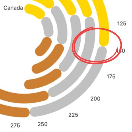
With Highcharts 12.4, we’ve introduced more granular control over border radii in polar charts and radial gauges, so adjacent segments now align cleanly by default. View full demo.
Boost Module Fixes and Features
With Highcharts 12.4, we’ve made it possible to use colorByPoint with a boosted series and fixed the boosted point halo.
Conclusion
For additional bug fixes, take a look at the changelog and be sure to check out our updated demos on our demo pages.
As always, if you hit a snag or have ideas for new features, let us know.


Leave a Reply