
This is a guest blog post by Brent Dykes, author of Effective Data Storytelling and a leading expert in data visualization and communication. Brent shares practical strategies to turn your data into visuals that drive insight and action. He works with leading organizations around the world to build stronger data cultures and is a sought-after speaker at company and industry conferences. Learn more at analyticshero.com. Jump directly to part 2 of this series here or part 3 here.
As data continues to play a greater role in our lives—both professionally and personally—we often need to visualize the numbers to really understand what they’re saying. However, with so many data visualization options to pick from, it can be overwhelming to know which one is best suited to each scenario. Without guidance, it can be just as easy to obscure potential insights as it is to find them with the wrong chart.
Until Dr. Andrew Abela introduced the first chart chooser tool in 2006, many people were unsure how to best visualize certain data sets. Today, anyone can lean on a variety of online chart selection tools to pinpoint the right chart, including Highcharts’ own chart chooser. For people who are new to data visualization, these tools can help narrow down which chart fits their specific use case. For more experienced data practitioners, they can provide invaluable inspiration when you run into less familiar use cases or need a fresh visualization approach.
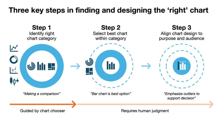
While using a chart chooser can certainly improve the chances of selecting the right chart, it’s not always as straightforward as it seems. You might land on a chart that technically fits your data but still fails to communicate your message clearly. Even after using a chart chooser to identify the right chart category (Step 1), you must still navigate through two additional steps: Step 2, selecting the best-fit chart within that category; and Step 3, aligning the chart design to your purpose and audience.
In this three-part series, I’m going to explore the entire process of choosing an appropriate chart and examine how each step impacts the success or failure of your final chart choice. Upon closer investigation, you will discover finding the right chart is often more challenging than it first appears.
To explore how someone identifies the right chart using a chart chooser, I’ll examine how the Highcharts version guides people through this process. This particular tool is integrated with Highcharts’ extensive visualization library, and you have the option to draw charts from its different libraries (Highcharts, Highcharts Stock, or Highcharts Maps).
Step 1: Identify the right chart category
Rather than jumping straight to a specific chart type, chart choosers primarily focus on matching your use case to the right chart category. Once you’ve identified the chart category that best aligns with your data type and objective, you must determine which option suits your needs and audience. The Highcharts Chart Chooser uses a two-step process to help identify the right chart category.
Clarify the data type
Before you begin visualizing your data, it can be helpful to identify what type of data you’re working with. While some chart choosers don’t ask about the data type, the Highcharts tool uses this information to filter out chart types that aren’t a good fit. While this is a useful approach, you must be able to recognize the two primary types of data: categorical and continuous.
Categorical data provides values for a set of groups or categories, and it can be either nominal or ordinal. As you can see in the following examples of nominal data, there’s no inherent order to the values:
- Eye color: Blue, brown, green, hazel, green, gray
- Country: Canada, Norway, Japan, New Zealand
- Pet types: Dog, cat, bird, fish, reptile
On the other hand, ordinal data has an inherent order to the values. As you’ll see the following examples, they must be ordered in a specific manner to make the most sense:
- Satisfaction ratings: Poor, fair, good, excellent
- Spice level: Mild, medium, hot, extra hot
- Age groups: Child, adolescent, adult, senior
Continuous data consists of values that are measured rather than counted and can take on any value within a range, including fractions and decimals. It has two subtypes: ratio and interval.
Ratio data has equal intervals and a true, meaningful zero, allowing for valid comparisons of magnitude (e.g., “twice as much” or “half as much”). In the following ratio data examples, you’ll also notice they don’t support negative values:
- Weight: 100 kg is twice as heavy as 50 kg (0 kg = no weight)
- Time: 10 minutes is half as long as 20 minutes (0 minutes = no time)
- Distance: 3 km is three times as far as 1 km (0 km = no distance)
Interval data also has equal intervals between values, but its zero point is arbitrary—so comparing values using ratios (like “twice as much”) is not meaningful. Here are some interval data examples:
- Temperature (Celsius or Fahrenheit): 0°C doesn’t mean “no temperature”
- IQ Scores: An IQ of 0 doesn’t mean “no intelligence”
- Time of Day: 00:00 (midnight) doesn’t mean “no time has passed”
By distinguishing between these two data types, a chart chooser tool can immediately eliminate incompatible charts. For example, if you wanted to display the daily temperatures for the past week (continuous data), the chart chooser would recommend you use a line chart instead of a pie chart that is better suited to categorical data.
Define your primary objective
The next step is focused on clarifying your intent. To select the right chart category, the chart chooser must understand the objective or purpose behind your chart. In simple terms, it’s about understanding what you’d like to show or display in your chart. On a deeper level, it’s about what type of questions you’re trying to help the audience answer or what kinds of insights you want to surface for your audience.
Chart choosers typically organize data visualizations into categories like the following:
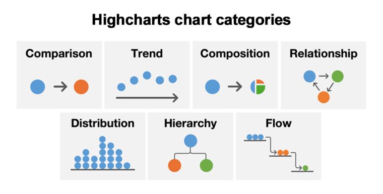
- Comparison shows the similarities or differences between categories or groups. For example, a bar chart could be used to compare how many units were sold across products.
- Composition displays how parts make up a whole. For instance, a pie chart could show what percentage of total revenue came from various regions.
- Trend shows how data changes over time. For example, a line chart could display how website visits fluctuate daily over an entire month.
- Relationship represents how two or more variables are connected or influence each other. For example, a scatterplot could show how years of experience and salary correspond to each other.
- Distribution depicts how values are spread across a range. For instance, a histogram could reveal the frequency of order values across all customer orders.
- Hierarchy shows levels of organization or ranking within a structure. For example, an organization chart could display how teams map to different functional departments.
- Flow reveals how movement occurs between nodes, stages, or locations. For instance, a Sankey diagram could show how loan applications pass through different approval stages.
Once you’ve narrowed down the right category, you’ll often have several charts to choose from within that category. While a chart chooser rules out poor fits, it’s still up to you to determine which one works best for your specific needs. You don’t want to settle on the first option that appears to work with your data when another one could be far superior to it. The goal isn’t just to select a visualization but to find one that communicates your information in the clearest way possible.
In practice, you may find your visualization needs to serve more than one purpose. In some scenarios, you may find you have more than one objective which can complicate the process. You’ll need to identify all the relevant objectives and then rank them by importance to your message and audience. This ranking becomes crucial as you move through the remaining steps. In Step 2, you’ll factor secondary objectives into your chart selection criteria, and in Step 3, you’ll use design elements such as color, emphasis, and annotations to address secondary objectives. This layered approach ensures your visualization serves multiple purposes without compromising clarity or confusing your audience. To see how this works in practice, let’s follow a marketing professional through this process.
Use case: Identifying the right chart category
To illustrate how each of these steps plays out in a real-world scenario, let’s follow Susan, a marketing manager navigating the challenge of selecting the right chart for a leadership presentation. She wants to visualize how many leads were generated last quarter and how they were distributed across key customer segments: small business, mid-market, and enterprise.
When she turns to the Highcharts Chart Chooser, she first identifies her data type. She determines it’s categorical because each lead is assigned to one of the three discrete segments. Susan also realizes she needs to serve multiple purposes with this single visualization, so she outlines all her objectives:
- Show the total volume of leads (composition)
- Display the proportion that came from each segment (composition)
- Highlight which segment contributed the most leads (comparison)
Following the framework for multiple objectives, Susan ranks them by importance to her message and audience. Her primary objective is composition because she wants to help leadership understand how all three segments contribute to the total lead pool. Her secondary objective is comparison by highlighting that small business leads dominated the other segments. With composition as her primary objective, the Highcharts Chart Chooser recommends options like a pie chart, donut chart, stacked column chart, and treemap, which are suited to part-to-whole relationships.
If she had stuck with the comparison as her primary objective, she would have chart options like a bar chart, radial chart, column chart, and others, which can highlight differences in values between categories. However, with composition being her primary objective, the chart chooser recommends a different set of options. If she hadn’t specified the data type as categorical, she would have had a map, scatterplot, and line chart as options even though they are better suited to continuous data. To Susan, the pie chart feels like a strong contender for her composition objective, but Susan will evaluate all options against both her primary and secondary goals in Part 2.
In the next article of this three-part series, we’ll explore the crucial considerations that ensure you select a chart that will convey your message clearly or helps your audience understand and interpret the numbers correctly. As a preview, the kind of metric you’re visualizing—whether it’s a total, rate, percent change, or cumulative value—can also influence which chart is most effective.
Stay tuned for the next article to see what happens in Susan’s quest to design the right chart!


Leave a Reply