
Making charts talk
Here is something you may not think about often: As the web grows more visual, it becomes more inaccessible to the visually impaired.
This is of particularly of concern in the area of journalism, where universal access is both a financial and moral imperative.
The media industry has, since Gutenberg, been both a technological trailblazer as well a Luddite with regards to distributing content in a channel and format aligned with consumer expectations. This is especially true with respect to the visually impaired.
There are naturally limits to what one can do in terms of accessibility of image and video content. However, as data journalism is becoming increasingly more prevalent and important, many media companies turn to inaccessible formats for communicating data, were accessible options are often easier to implement.
In what follows, I will attempt to share our perspective on accessibility challenges and solutions from the vantage point of a company that wants to make itself part of the solution.
“Make charts great again!”
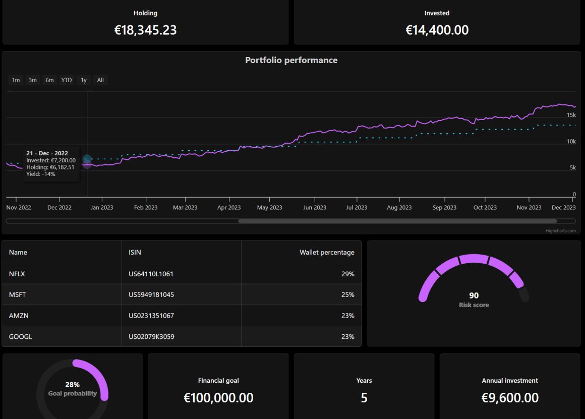
At Highsoft, as a leading developer of charting tools for the web, nothing bugs us more than when sites publish charts as images. There is little reason for a screen reader to simply utter “chart.jpg” when a key statistic is being presented.
Screen readers, the technology that synthesizes digital text into spoken words, is a key interface to the web for the visually impaired. Therefore, any information that screen readers can’t process, is basically invisible to those who depend on these tools.
Industry standards
As software developers we are constrained by the limitations of current web browsers, screen readers, and the industry standards to which they adhere. Standards evolve slowly, which may be frustrating, but also ensures that our solutions have a long shelf-life and will work on new versions of browsers.
Highsoft is not the first company to attempt making charts accessible within these constraints, but we honestly think we have had the greatest success.
The key to our success was our partnership with our client, Elsevier, an academic and scientific publisher. They were immensely helpful in setting up interviews with domain experts on web accessibility, who were visually impaired themselves. This upfront qualitative research taught us to leave our assumptions behind when it came to proposing solutions. (It turned out visually impaired people knew better than us, sighted developers, on what they needed. Go figure.)
Our solution
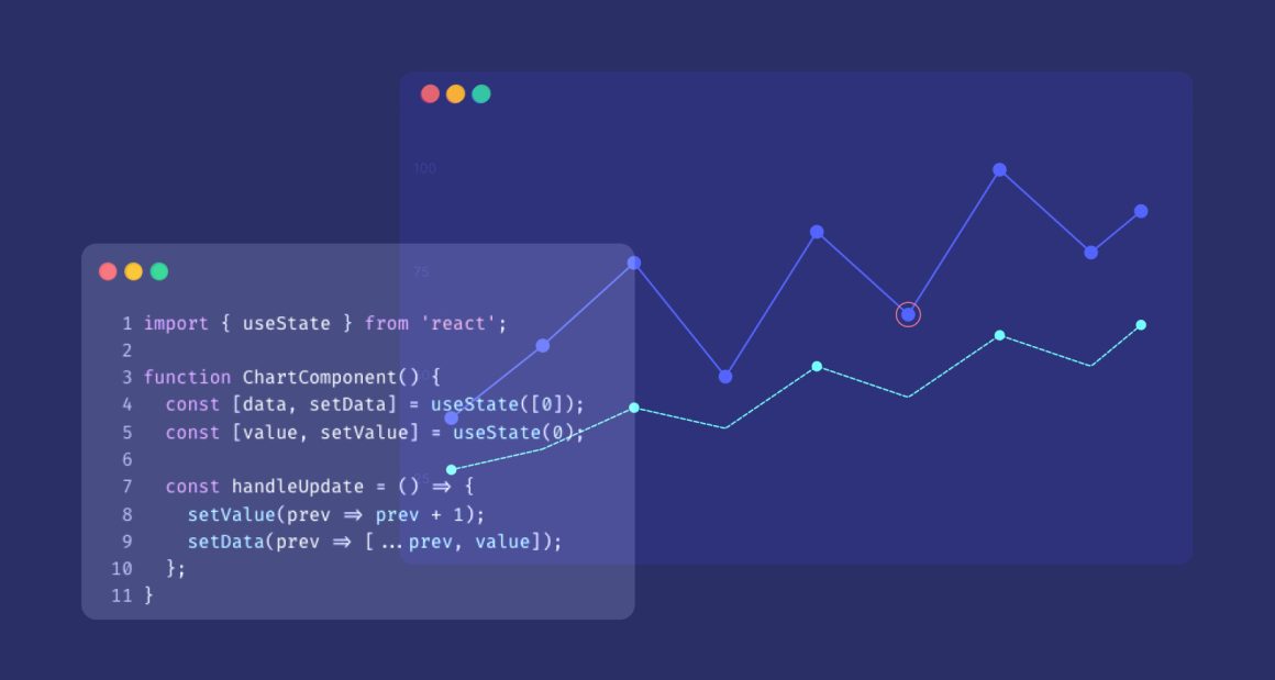
Our solution, in a nutshell, is one whereby web charts are annotated with information that screen readers can parse (thus read out loud), and where people can navigate through (and hear) different different data points using a computer keyboard.
As we presented our work to our research subjects, the feedback was overwhelmingly positive. Still, we realized that with all the possible types of charts one could make, there may never be a perfect solution. A key challenge is dealing with the data itself in a contextually relevant way: For example, imagine listening to a screen reader verbalizing a line-chart with monthly average temperatures. Listening to 12 data-points per year is tolerable, but what if there were 365 data-points?
Our work has just begun
What we are exploring next is how to think more broadly about what “accessible” charts really mean. For sighted users, charts allow you to quickly compare and contrast different data points and trends. A verbal data-dump doesn’t quite have the same effect. We are looking at other ways to bring data to life, from auto-calculating and summarizing trends to allowing more detailed editorial annotations to guide the user. Even sonification (using sound effects, such as timbre, volume, speed) to express trends in the dataset is being investigated.
It is a priority for us to make charts as accessible as technology allows, but more than anything else, it is a privilege and an honor to have the opportunity to be part of the solution that for making data more accessible for visually impaired readers everywhere. (And frankly, why should the visually impaired be spared from political polls).


Leave a Reply