
As a long time user of data visualization tools for scientific purposes, I thought I would share my perspectives on why modern web charting libraries may be the ideal choice for scientific charting.
As those who operate in the areas of scientific data analysis knows, the underlying data-sets of many visualizations projects are often complex and large. Rendering such data in a web browser may seem like pushing the limits of what web browsers were designed for. Therefore students and researchers unfamiliar with web technologies, often look to more specialized and complicated programs for generating charts.
However, the question is: Can web technologies be a substitute for dedicated data analytics and visualizations applications? As you’ll see below, the answer is “yes!”
But first, let’s look at why use web technologies when existing desktop-tools are mature and plentiful.
THE DIFFERENCES BETWEEN SCIENTIFIC AND “STANDARD” CHARTS
To answer these question, let’s start from the beginning: What are the main differences between scientific and “standard” charts? Fundamentally nothing: Both aim to visualize data in a way that helps the reader grasp the nature of (potentially) large datasets while helping to highlight the most important conclusions.
In a scientific chart, the data is often the result of the experiment itself. Experiments often carry some margin of error, or uncertainty, as one is rarely able obtain perfect results. The margin of error will vary depending on your precision. (I.e. When measuring distance, what is the smallest scale on the measuring tape? Was your hand stable? How precise was your starting point?) Imagine there are multiple measurements of a specific value; you need to compare all of them to get the right result. But if you have different results from many measurements, which ones are correct? And what mistake is ‘calculated’ into the result? If your result data changes, does it change in a specific pattern? Maybe it is normal for a certain measurement to change during the course of study.
Statistical mathematics gives us the chance to address these questions with not-so complicated equations. (Unfortunately, this is beyond the scope of this article.)
The real question is: are you living in a paper-world or a web world? Chances are that your work is published and discussed via a web page. Static screen-grabs of your charts is a really bad use of web technology, and not a great way to dynamically allow the reader to explore the depth of the data, including the margin of error itself.
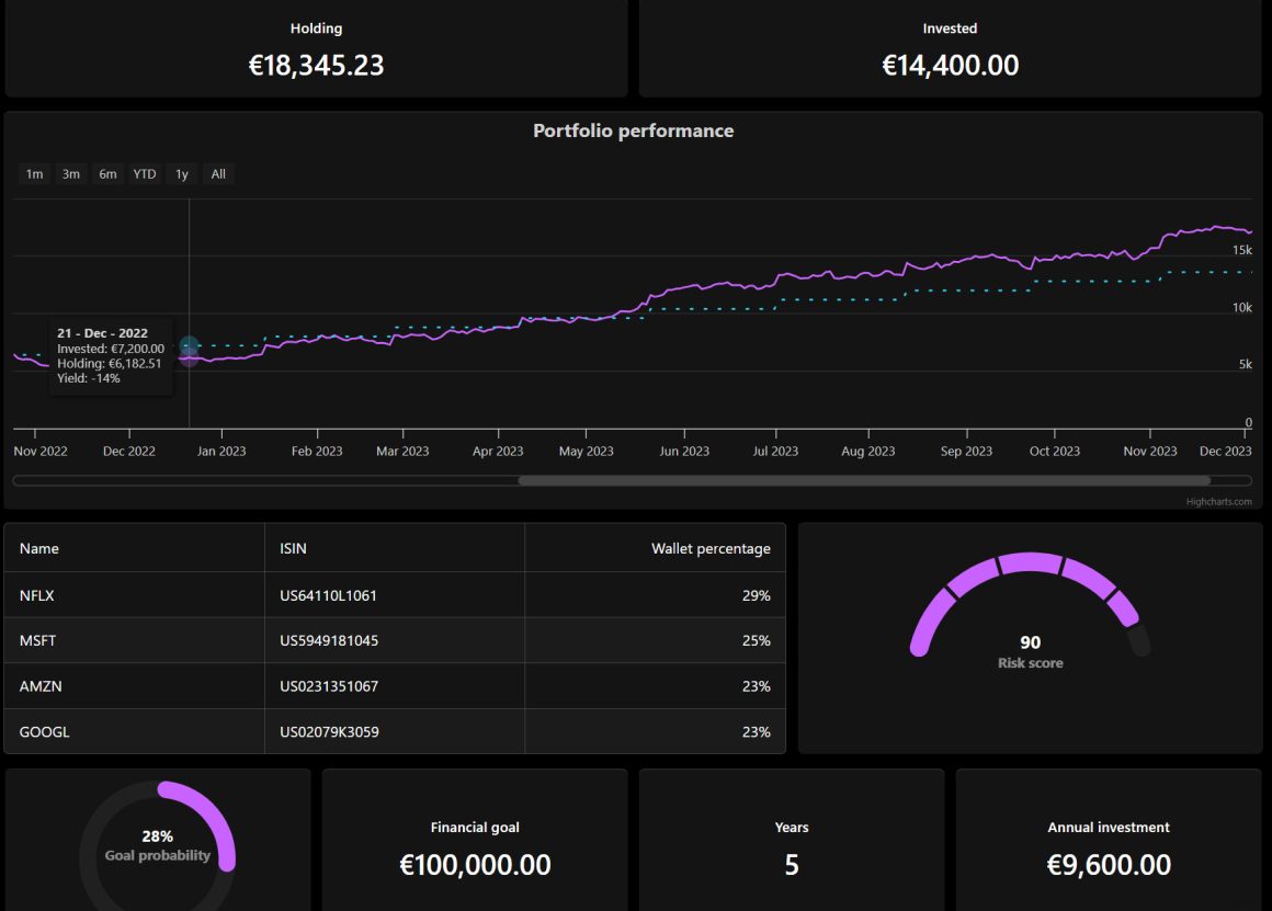
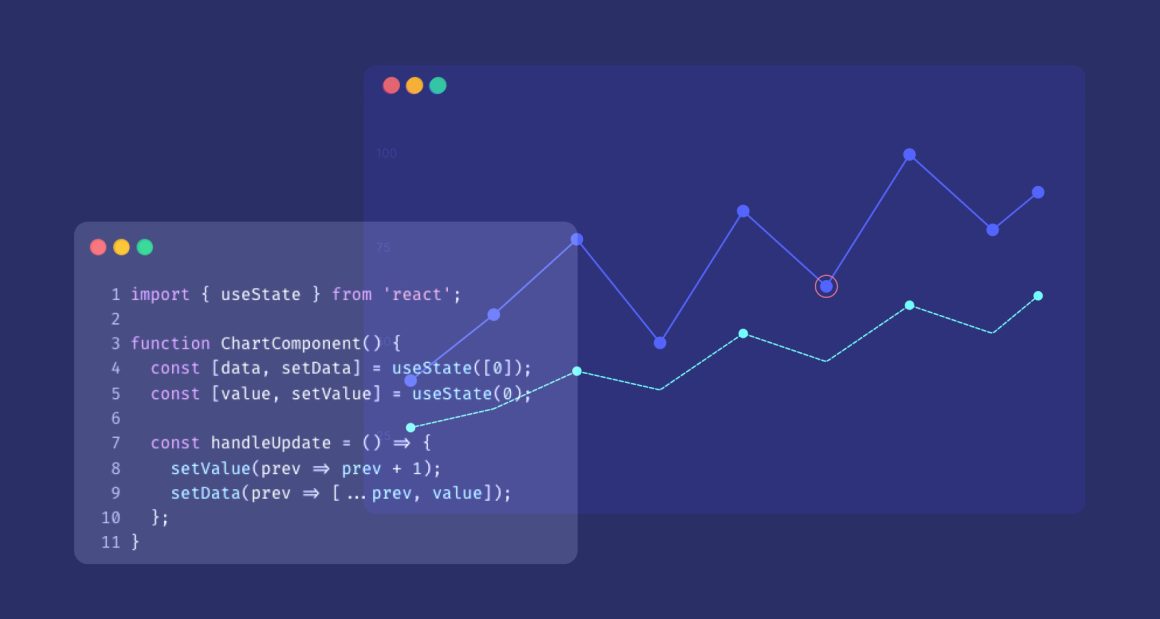
As a scientist, your job is rarely to just collect and analyse data, but also to effectively communicate your findings to your audience. Nothing can help you display your data with the flexibility, responsiveness, interaction, and universal access, like web technology. Web technology allows you to dynamically zoom-in, zoom-out to better see your data, select specific points to get more information about measurement, hide and show specific series for improving readability, dynamically change type of your chart to show another point of view of your data, compare your data with theoretical measurements, remove points from your charts, add annotations and many others. Such functionality is so simple to implement, that intermediate users can add them to their charts in several minutes. If you have any doubts, look into the following examples using the Highcharts JavaScript library.
SOME CHART EXAMPLES
Let’s imagine set of data with points with their margins or error. You may use errorbar types of series instead of normal series – this will give you a chance to express the data from basic experiments alongside their errors.
Of course, most scientific data charts use regressions. Often we would like to check the trend in the measurements. I.e. When you apply force to a spring, how will its length change with increasing force? What will happen when you remove the force from the spring? Sometimes we know (or we think that we know) the physical equation of the study, and we just want to fix the parameters so it will match to data.
There is a plugin for Highcharts which gives the possibility to make a regression for special data points on a chart. It is called Highcharts Regression (BTW. Highcharts’ vibrant community of developers are building new plugins, wappers and extensions all the time, another benefit of open, standards-based technologies).
Here is an example of measuring sound pressure level (SPL) in Highcharts using this plugin. The sound source is one meter away. Move away from the source and measure the SPL every meter. Compile the data and check if the theoretical shape is correct in this case. The SPL should decrease logarithmically as the distance from the sound source increases.
Here you can find the table with the measurements:
| Distance [m] | 1 | 2 | 3 | 4 | 5 | 6 | 7 | 8 | 9 |
| SPL [dB] | 100 | 70 | 55 | 45 | 38 | 33 | 30 | 26 | 23 |
Here is the visualization of the measurements in Highcharts using a logarithmic regression:
Regression line is visible on the chart. The equation for this regression is visible in the legend. It looks like the data is decreasing in logarithmic order. It complies with a theoretical shape of SPL. You may add errorbar type of series into the chart to check, if the data is correct:
As you can see, with this plugin, simple measurements are really simple and straightforward to visualize. But what with more advanced charts, containing multiple series and regressions?
Here is an example of measuring sound pressure level (SPL) from two sound sources. The idea is the same like in previous measurements. After collecting all of the data the measurement will be repeated with both sound sources turned on. This time the chart will have more points and will be less readable.
If you want to make your chart more readable, you can hide your series by clicking on its legend item. This will give you a chance to show only these series that are important in the moment, for example if you want to compare two series with each other.
If you think that your chart has wrong series types, you can add 6 lines of code, that will give you a chance to change this type just like you would like to:
Or maybe you would like to better see a trend between specific distances from your sound sources? To achieve that you can use zoomType parameter and select the area you want to zoom-in.
Let’s now add some annotations to your chart. You can use annotations plugin available inside Highcharts plugins repository:
With this plugin you are able to add different type of comments to your chart and share this comments with other people.What about more complicated measurements? Are you able to fix Gaussian to your data? Look for an answer to these questions in future articles!


Leave a Reply