
This is a guest blog post by Brent Dykes, author of Effective Data Storytelling and a leading expert in data visualization and communication. Brent shares practical strategies to turn your data into visuals that drive insight and action. He works with leading organizations around the world to build stronger data cultures and is a sought-after speaker at company and industry conferences. Learn more at analyticshero.com. Jump directly to part 1 of this series here or part 3 here.
In the previous article, we examined how a chart chooser will help you identify the right chart category (comparison, trend, composition, etc.) for your data visualization. Once you’ve narrowed down the right category, you’re then tasked with selecting the ‘right’ chart from the category options. To use an analogy, it’s like heading into a large supermarket to find an ingredient for a dish you’re preparing. The chart chooser acts like a helpful grocer who points you to the right aisle. But once you’re in the right aisle, you face another challenge: picking the right item off the shelf.
And just like in a grocery store, this step is rarely straightforward. You’re suddenly faced with a row of similar-looking items. Do you pick a can of chopped tomatoes, crushed tomatoes, or tomato purée? Likewise, a bar chart, stacked bar chart, grouped bar chart, and bullet chart may appear similar at first glance but serve different purposes depending on the nuance of your data and intended focus.
Your decision can be further complicated by a variety of brands to choose from—each with its own strengths and weaknesses. If you default to a more familiar chart like a basic bar chart, you might overlook another chart that would better support your specific use case. Finding the right aisle is a great start, but it doesn’t mean you’ve picked the best item. A chart chooser narrows the field, but the final decision still requires human judgment.
Step 2: Select the best chart within the category
After you’ve used a chart chooser to identify the right category, you must then determine which of the options best addresses your use case. While the chart chooser ensures you’re selecting from viable visualization options, it’s not going to offer any more guidance beyond that. In this article, I will share a framework that assists with further narrowing down your options so you can pinpoint the right chart. The best chart choice depends on four key factors—each with a guiding question to help you choose wisely.
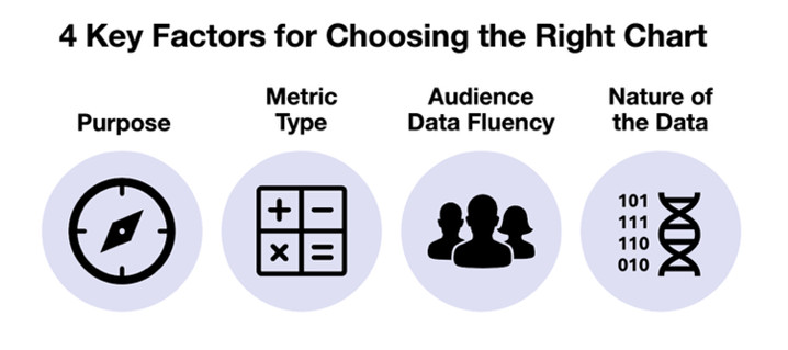
1. Purpose
Question: What do you want your audience to notice or take away from this chart?
In the previous step, your objective or intent helped determine the appropriate chart category. Now, that purpose becomes more focused at this stage. Instead of thinking broadly—like “I’m showing a comparison”—you need to clarify exactly what you want the chart to reveal. In exploratory cases, you might only have a general sense of what you’re looking for. But in explanatory contexts, you’re often guiding the audience toward a specific takeaway, which may include both primary and secondary objectives. For example, you may want to show composition while also emphasizing a comparison, or reveal trends while highlighting outliers. Even having a rough idea of what you’d like to reveal can meaningly steer your chart choice within the category.
2. Metric Type
Question: What form of data best supports your intended purpose or message?
Before choosing the chart, consider whether you’re using the best version of your metric. Different metric types can shift the most effective chart type. Too often, people fixate on finding the right chart without first considering what form of metric will most effectively communicate their message. Not every scenario gives you multiple metric options, but when it does, it’s worth exploring different possibilities. Below are five common forms of metrics, each with unique implications for your chart selection and design:
- Totals or counts: Raw numbers that represent “how many” or “how much.”
Examples: number of leads, total sales. - Calculated metrics (Rates or ratios): Derived from two or more values to reveal proportions or relationships.
Examples: Conversion rate, cost per unit. - Difference or variance: The absolute difference between two values.
Examples: actual vs. target, this year vs. last year. - Percent change: The relative increase or decrease between two values, expressed as a percentage.
Examples: Month-over-month % change in sales, % change in sales since January. - Cumulative effect: Running totals that accumulate over time or across categories.
Examples: Year-to-date revenue, cumulative leads.
When multiple options are available, experiment with how each one pairs with different chart types. You may find one combination illuminates the data or clarifies your message more effectively than the others.
3. Audience Data Fluency
Question: How comfortable is your audience with interpreting data visuals and how quickly do they need to grasp the information?
Another crucial factor that influences your chart choice is the data fluency of your audience. Choosing a chart that’s either unfamiliar or overly complex for your intended audience can undermine your communication goals—no matter how accurate or elegant your visualization is.
For busy executives, simplicity and clarity often matter more than depth. If they can’t process the chart quickly, it may be overlooked or ignored. Most executives appreciate visuals that are fast to interpret, often favoring bar or column charts over more abstract ones like scatterplots.
For analytical audiences, the opposite may be true. They may expect and appreciate more nuanced or technically detailed visuals that reveal deeper insights. Technical audiences may find scatterplots more informative and engaging than simpler alternatives. Ultimately, you must meet your audience where they are, not expect them to meet you where you are.
4. Nature of the data
Question: What characteristics of your data could affect how it’s visualized?
Depending on the unique features of your dataset, you may find one chart type communicates more effectively than another—even within the same category. Key characteristics of your data such as the volume of data values, distribution shape, data granularity, or secondary dimension can impact clarity, readability, and interpretability.
- Volume of data values: A bar chart may work well for a small number of categories, but as the volume increase, it can become cluttered or hard to read. For larger datasets, charts like heatmaps or scatterplots can reveal patterns within dense datasets.
- Distribution shape: Skewed or unevenly distributed data can be misleading in some chart types but enlightening in others. For example, a histogram helps show the overall shape of a distribution, while a box plot can highlight outliers and quartiles that might otherwise be obscured.
- Data granularity: Highly granular data—like hourly data or individual transactions—can lead to noisy visualizations that hide trends rather than reveal them. Applying aggregation or smoothing techniques can help surface the broader patterns your audience needs to see.
- Secondary dimension: Some datasets contain an additional layer beyond your primary focus. Even if your chart highlights a single category, the presence of a strong secondary dimension—such as region, time period, or subgroup—can influence which chart types are most effective.
The structure and behaviors of your data provide important clues for chart selection. By evaluating these characteristics upfront, you can choose a visualization that will be compatible with your dataset. While these data characteristics can guide you toward an optimal chart, real-world constraints like available tools, technical skills, time limitations, and organizational preferences may require you to balance the ideal choice with what’s practically achievable. When making these trade-offs, your chart’s purpose and your audience’s data fluency often carry the most weight when narrowing down the best option.
Use case: Selecting the best chart type
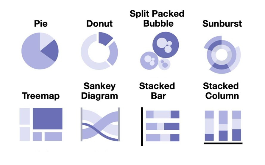
In the previous article, Susan, a marketing manager, worked through the process of identifying her chart category. After recognizing she had multiple objectives, she ranked composition as her primary goal with comparison as a secondary objective for her upcoming presentation. She wants to clearly show how last quarter’s leads broke down across three customer segments: small business, mid-market, and enterprise. The Highcharts Chart Chooser presents her with a variety of visual options:
While it’s encouraging to have different choices, Susan knows that not all of them will suit her message, audience, or data. To determine the best fit, she evaluates each option using the four key factors:
- Purpose: Susan’s primary goal is to show the complete lead breakdown (composition), but she also wants to highlight which segment performed best (comparison). The donut chart serves her primary purpose thorugh its part-to-whole structure while allowing her to use emphasis techniques to address her secondary comparison objective.
- Metric type: Susan’s dataset includes total lead counts by customer segment, which works well with any part-to-whole chart. She briefly considers whether she should convert those values into percentages but realizes it doesn’t affect the chart type—just the labeling.
- Audience data fluency: This chart will be used for a group of sales and marketing leaders who will value clarity and speed. The pie, donut, and stacked column charts will be familiar and easy to interpret for her executive audience. With just three categories, the treemap offers little visual advantage and doesn’t easily support her secondary comparison goal through emphasis techniques. While effective for larger datasets or nested groups, it doesn’t add value for her dual-purpose needs.
- Nature of the data: Because her dataset is straightforward with no secondary dimension, Susan rules out the sunburst chart, split-packed bubbles, and Sankey diagram that are better suited to nested- and flow-based scenarios.
After narrowing down the options, she decides on using a donut chart. It strikes the right balance for her multiple objectives. The part-to-whole structure clearly serves her primary composition goal, and it also allows for strategic emphasis (color, labels) to highlight her secondary comparison objective about small business dominance. Although the stacked column/bar chart was considered, it’s better suited to comparing segment breakdowns across multiple time periods or groups. Since Susan is presenting a single snapshot, the donut chart offers a cleaner, more focused view.
At the end of this chart selection process, you may still choose the chart you prefer, but with the help of these four factors, you can do so with greater confidence and intention.
Still, the work isn’t over once a chart is selected.
In the final part of this series, we’ll explore how thoughtful design choices – like labeling, emphasis, color, and layout – can elevate a chart from good to great. Even the right chart can fall flat without smart design. The article will also identify common pitfalls that can derail the chart selection process and discuss how to avoid them. The series concludes with a look at the refinements Susan makes to ensure her donut chart delivers maximum clarity and impact for her audience.


Leave a Reply