This is a guest post by Rebeca Pop, founder of Vizlogue, a Data Visualization and Storytelling Lab. Rebeca has nearly 10 years of experience creating data visualizations, has worked as a digital analytics leader for top media and analytics companies, and teaches Data Visualization and Storytelling at the University of Chicago and Northwestern University. Find her on YouTube. Highcharts is not affiliated with any of the authors or publishers mentioned in this post.
About a decade ago (hard to believe so much time has passed!), I was working as an analyst and creating reports and presentations on a daily basis. After a few years in the industry, I had a moment that changed everything. I was building charts for a big presentation, and I remember staring at my screen thinking: Am I doing this right? The truth was, I was making choices about colors, chart types, and storytelling based mostly on intuition and on what I had learned from my peers. Sometimes it worked, but often times I felt like I was guessing.
That realization was uncomfortable. I didn’t want to be the person who “just had a feeling” or “just had an intuition” about how to visualize and present data. I wanted to know the why behind every decision. That’s what pushed me to dive into data visualization and data storytelling much more seriously. I started by simply going online and researching what book I should start with to educate myself. I knew I wanted practical tips that would be widely applicable to different industries, as I was covering industries that didn’t seem to have much in common (such as pharma and automotive).
And so, I landed on my first data visualization and data storytelling book (Storytelling with Data by Cole Nussbaumer Knaflic) and my journey into this field truly began. A journey that has since taken me through dozens of books and countless projects. A journey that has ultimately given me a deeper understanding of how data, when visualized with care and intention, can transform not just presentations, but entire decisions.
In this blog post, I’ll share my top 5 favorite data visualization and data storytelling books of all time, including the very first one that set me on this path. These books have had a tremendous influence on guiding my growth in data visualization and storytelling. My hope is that by sharing them, you’ll find inspiration and practical tools to guide your own path.
Book #1: Storytelling with Data by Cole Nussbaumer Knaflic
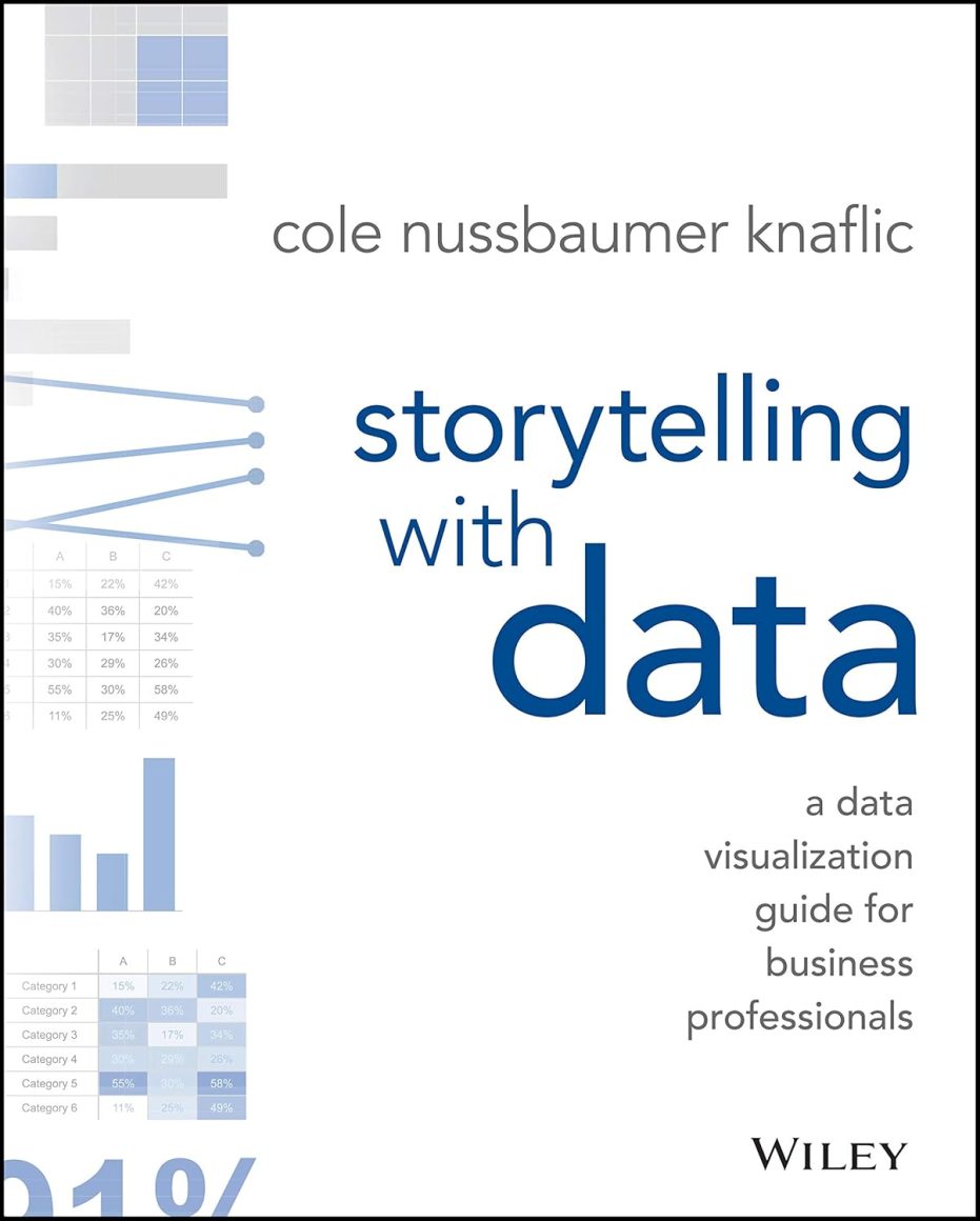 As I said, this was the first book that really opened my eyes. Cole’s approach is practical and clear: understand your audience, choose the right chart, eliminate clutter, and guide attention. I remember redesigning one of my own charts (a donut chart!) after reading it. I stripped away the noise, highlighted the key trend, and suddenly the story clicked not just with me, but with my audience as well. It wasn’t just prettier, but also much more persuasive.
That was the moment I realized design isn’t about decoration, but about communication. What I love most about this book is how approachable it is. Cole doesn’t overwhelm you with jargon or theory. Instead, she gives you tools you can apply immediately. I’ve recommended this book countless times, and it’s always the one that sparks those “aha” moments, especially for those who are at the beginning of their data visualization and data storytelling.
Book #2: Avoiding Data Pitfalls by Ben Jones
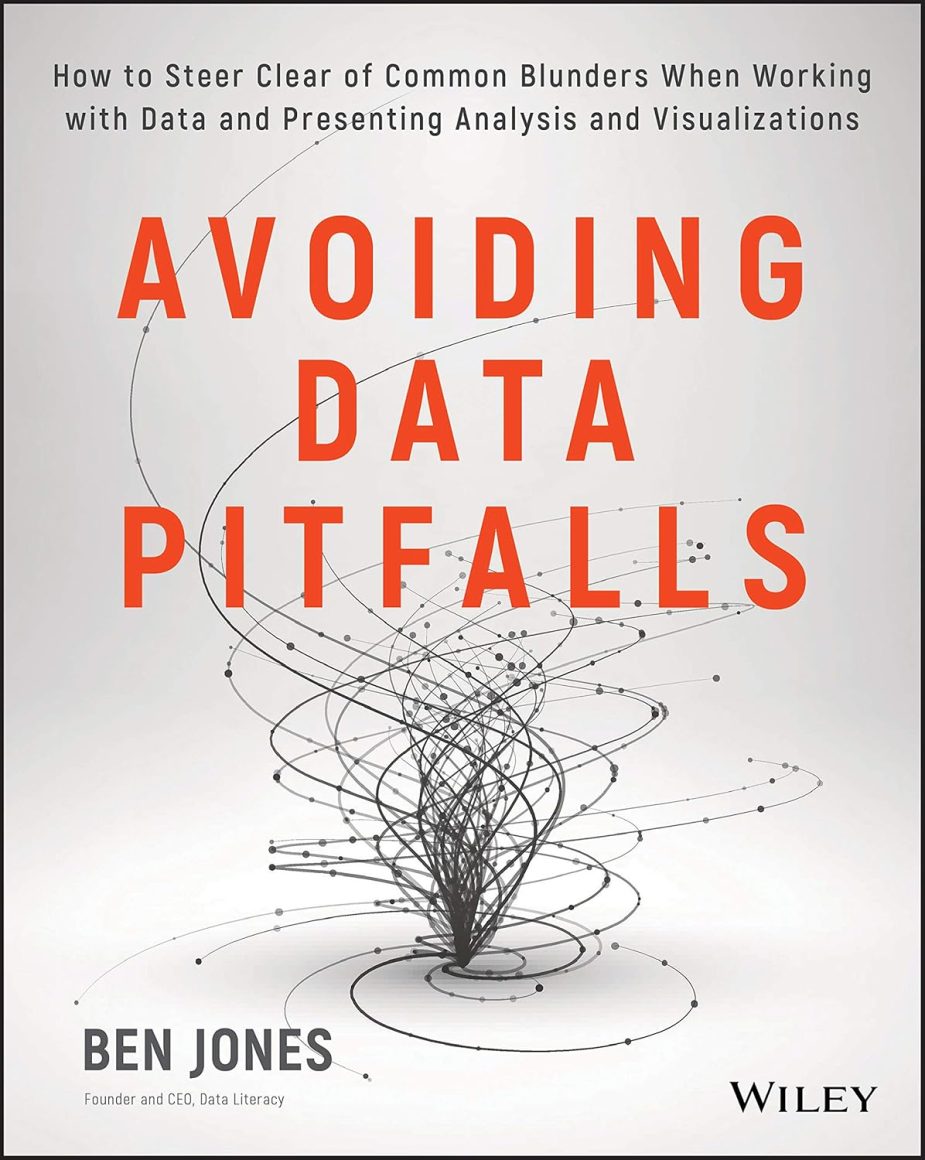 A few years later, I hit another wall. I could design clean, engaging charts, but I kept running into issues with the data itself. Ben Jones’ book was released at just the right time and was a wake-up call. He walks readers through the common mistakes we all make (from statistical fallacies to design dangers) and shows, very practically, how to avoid them.
Reading it made me slow down and ask better questions: Is this data reliable? Am I interpreting it correctly? That shift made me not just a better designer, but a more responsible communicator. One example: I once worked on a survey analysis where the headline number looked impressive: 80% satisfaction. But when I dug deeper, I realized only a handful of people had responded. Without context, that chart would have been misleading. Ben’s book helped me catch those pitfalls before they reached an audience.
Jones’ book might not be directly about data visualization, but data understanding and accuracy is the foundation for solid data visualization.
Book #3: Info We Trust by RJ Andrews
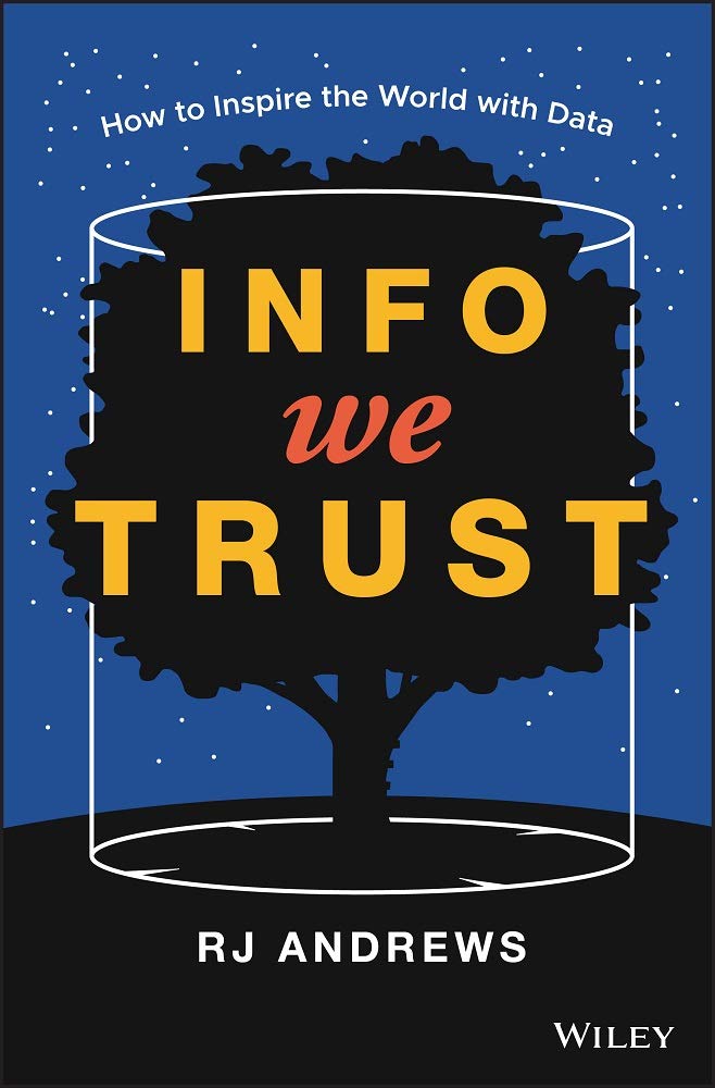 I read RJ Andrews’ book about 4 years ago. It was such a refreshing take on data storytelling, as it goes way beyond technique and into philosophy. His book is about meaning, about why we visualize data in the first place. It made me see charts as cultural artifacts, shaped by human psychology and storytelling traditions.
Reading it felt like stepping into a new dimension. It reminded me that empathy and imagination are as important as accuracy.
Visualization isn’t just about numbers; it’s about weaving narratives that inspire action. What stayed with me most was Andrews’ point that charts aren’t just technical outputs, they’re part of how people make sense of the world. That shifted my own approach: I now ask less Does this look polished? and more Will this resonate with the person reading it? The book also includes beautiful illustrations that make reading it even more engaging. It’s a book that truly deserves a place on your coffee table, not just your desk.
Book #4: Good Charts by Scott Berinato
 Scott Berinato’s Good Charts is especially practical for professionals who need to communicate with executives or clients (like I was and still am!). He emphasizes that anyone can learn to design effective charts. It’s not about artistic talent, but about thinking visually.
His focus on moving from “bad charts” to “good charts” resonated tremendously with me. I’ve used his lessons countless times when coaching teams or presenting to leadership. It’s a book that bridges theory with the everyday reality of business communication. For example, I remember preparing a quarterly report where my stacked bar chart looked impressive but was hard to read. After applying Berinato’s advice, I simplified it into a clean line chart with a few key annotations. The insight landed immediately, and the conversation shifted to decisions rather than deciphering the chart.
Book #5: Data Sketches by Nadieh Bremer and Shirley Wu
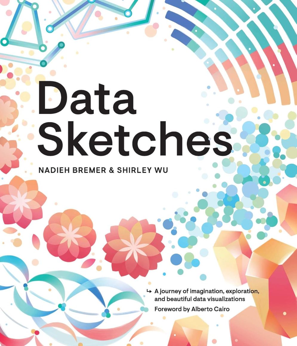 Data Sketches is another book that is pure inspiration. Nadieh Bremer and Shirley Wu pull back the curtain on their creative process, showing not just the polished visuals but also the messy drafts and experiments along the way. What I loved most was their honesty about trial and error. It reminded me that visualization isn’t supposed to be perfect on the first try. Rather, it’s about exploring, tweaking, and sometimes failing and starting over. After all, we learn from our failures and, by persevering, we do better the next time around. One of Shirley’s projects on movie data really stuck with me. She turned something familiar into a playful, artistic piece that still told a clear story. After reading it, I started encouraging myself to sketch ideas before jumping into tools. It made the process feel lighter, more creative, and, in a way, less intimidating.
How These Books Work Together
Taken together, these five books feel like a toolkit I’ve carried with me over the years.Knaflic teaches clarity and design. Jones grounds you in data literacy. Andrews expands your philosophy and imagination. Berinato equips you for practical, persuasive communication. Bremer & Wu remind you to embrace creativity and experimentation.They don’t just teach you how to make charts, but actually shape how you think, how you lead, and how you connect with others.
Closing Thoughts
Looking back, I’m grateful for that moment years ago when I realized intuition wasn’t enough. It pushed me to seek knowledge, and books became my mentors in a way. To date, every data visualization and storytelling book I’ve read has sharpened my skills and given me new tools I use every day.
If you’re starting your own path, don’t just read these books for theory. Use them to pick up practical tips you can apply right away. Whether that’s choosing the right chart for your data, avoiding common mistakes, or making your visuals clear and persuasive. And, as Bremer and Wu remind us in Data Sketches, don’t be afraid to experiment and play with ideas along the way. In the end, good data visualization and strong data storytelling aren’t about fancy graphics. They’re about helping people understand and be influenced by the story your data is telling.


Leave a Reply