
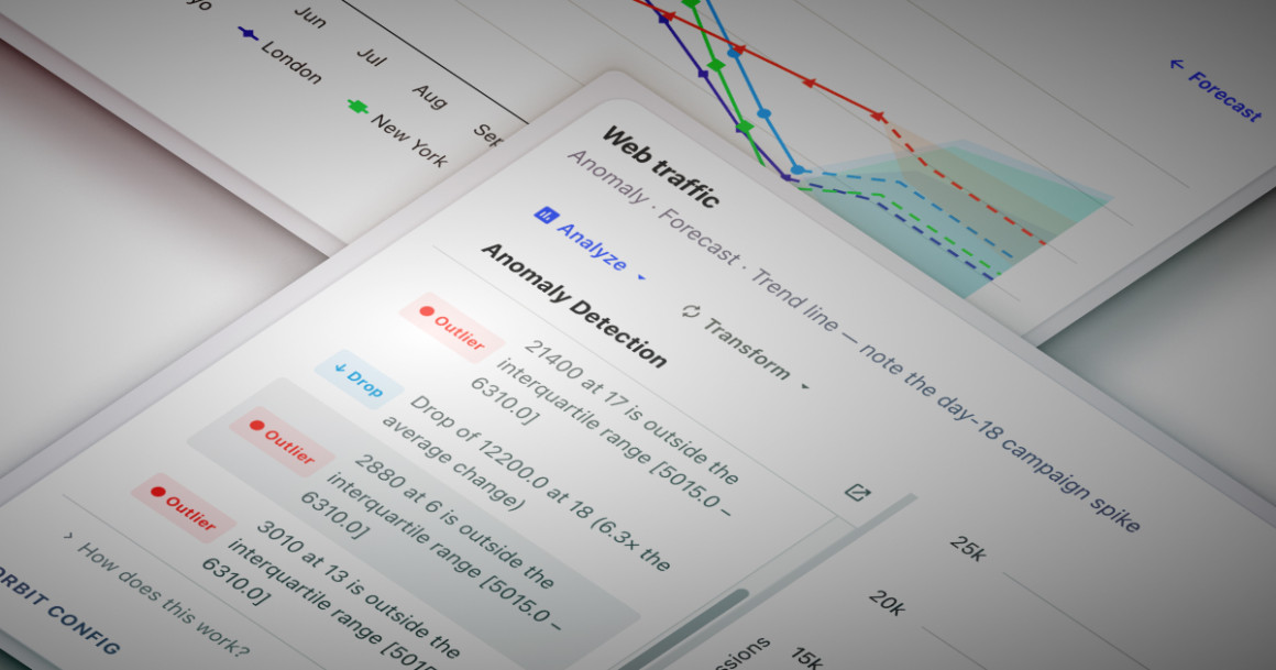
Interactive charts help people see data. But answering questions about that data often requires much more than visualization.
Sure, there’s a spike, but why did it happen? Why is this outlier point unusual? What trend should I expect next month?
For many organizations, answering those questions means exporting data into another analytics platform, building custom logic, or relying on analysts to manually interpret charts.
Highcharts Orbit changes that. Instead of treating charts as the end of the analytics workflow, Orbit adds analytical capabilities directly to every Highcharts chart so users can stay inside the application while Orbit does the analysis.
Here’s a tour of Orbit’s most powerful tools.
See the whole picture, not just the chart
Most AI chart assistants can only describe the data that’s visible within the chart itself. Orbit goes further. Its AI-powered Insights feature generates summaries grounded not only in the chart data, but also in any additional business context you choose to provide.
Using the orbit.llmContext configuration option, developers can expand the information available to Orbit’s AI tools beyond the visualized data.
In the example below, the chart is flanked by a set of KPI cards above and a regional revenue table below. Neither has Orbit enabled, and neither is part of the chart itself.
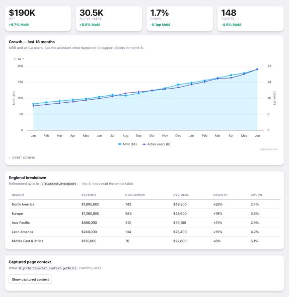
But by listing those elements in the htmlNodes array, we can include them in the AI’s context by referencing their element IDs. If additional context isn’t represented by an HTML element, you can supply it directly through the text array in the configuration.
orbit: {
  enabled: true,
  tools: ['insights', 'narrate', 'ai'],
  llmContext: {
    htmlNodes: ['kpi-mrr', 'kpi-users', 'kpi-churn', 'kpi-tickets', 'ai-region-table'],
    text: ['Fiscal-year target: $2.5M ARR by Q4']
  }
}Rather than treating each chart as an isolated visualization, Orbit lets developers connect it to the surrounding application. KPIs, tables, business notes, targets, and other contextual information become part of the conversation, so AI responses reflect the broader business picture instead of just the plotted series.
And since the AI understands that broader picture, its analysis goes beyond a one-line note that revenue is increasing. It can also explain what’s driving the trend relative to targets, KPIs, or notes you’ve already surfaced elsewhere on the page.
Orbit also includes two additional AI-powered tools:
- AI Assistant lets users ask their own questions in natural language, exploring the data conversationally instead of relying on predefined reports.
- Narrator turns analysis into written summaries you can copy into reports, presentations, or emails.
Because AI capabilities are configured independently, you can enable only the features you need, or disable AI tools entirely for deployments where generative AI isn’t permitted.
Catch anomalies, no hunting required
When you’re monitoring operational metrics, web traffic, sensor readings, or financial data, unusual values are often the first indication that something deserves attention. But manually scanning charts for spikes and dips isn’t practical, especially across large dashboards.
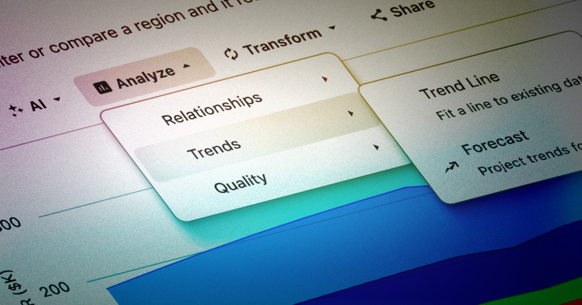
Orbit’s Anomaly Detection, available under the Analyze > Quality, scans every visible series for statistically unusual data points and highlights them directly on the chart.
Orbit evaluates the data using three complementary methods:
- Z-score, which identifies values that are unusually far from the series mean.
- Interquartile Range (IQR), which detects values outside the expected range while remaining robust to skewed distributions.
- Rate of Change, which flags sudden spikes or drops between consecutive observations.
When you run the tool, Orbit lists each finding alongside the chart, explains why it was flagged, and categorizes the result as an outlier or a sudden drop, for example. Orbit highlights the corresponding data points directly on the visualization, so you can move from a statistical alert to the underlying data without leaving the chart.
While Anomaly Detection is designed for discovering unexpected events in any time series, Control Limits is particularly useful for manufacturing, quality assurance, and other process-monitoring applications where consistency matters as much as change.
Answer “what’s next” in the same chart
Historical data tells you what happened. Forecasting helps answer the question of what’s likely to happen next.
Orbit’s Forecast tool extends each visible series into the future using statistical forecasting methods. Depending on the characteristics of the data, Orbit selects an appropriate approach: linear regression when a clear trend exists, or a moving average when the series is relatively flat or noisy.
Orbit accompanies the forecast with a confidence interval that widens farther into the future, showing that predictions become less certain over time.
The analysis panel explains which forecasting method was selected and summarizes the projected values for every series, so users understand not only the prediction itself, but how it was produced.
The Analyze > Trends menu also includes Trend Line, which fits a regression line to existing data to reveal long-term directional movement without projecting future values.
For financial charts, Orbit provides a collection of technical indicators from Highcharts Stock, including moving averages, Bollinger Bands, and pivot points. Apply them directly to the chart without building custom analysis tools into your application.
See what Orbit can do with your data
The examples in this article highlight three of Orbit’s core analytical capabilities: AI-powered insights, statistical quality analysis, and predictive forecasting. Together, they illustrate a larger idea: analysis doesn’t have to happen in a separate BI platform.
Instead of exporting data, building custom analytical interfaces, or relying on external reporting tools, developers can embed sophisticated analysis directly into the applications their users already work in.
Orbit is currently available in beta. If you’d like to explore it with your own data, sign up for access and we’ll email you everything you need to start adding interactive analytics directly to your Highcharts charts.
If you’re not already using Highcharts, you can get started via npm:
npm install highchartsOr head to highcharts.com/download for other installation options.






Leave a Reply