
Please note: Highcharts v13 is now out of beta. Check out the final release announcment for details.
Highcharts v13 is now available as a public beta.
This major release is about making charts easier to configure, easier to brand, and harder to make look accidental, and we’d love for you to try it before the final version lands in early June.
Changes include a new palette option, DataTable-based chart data, experimental autoloading for modules, as well as numerous design and UX refinements that make everyday charts feel more polished.
Read on for more details.
Centralized color management with palette
Highcharts v13 introduces a new palette option that enables you to define a central color system for your entire chart or collection of charts, making branding easier, dark mode cleaner, and the maintenance of large chart libraries less repetitive.
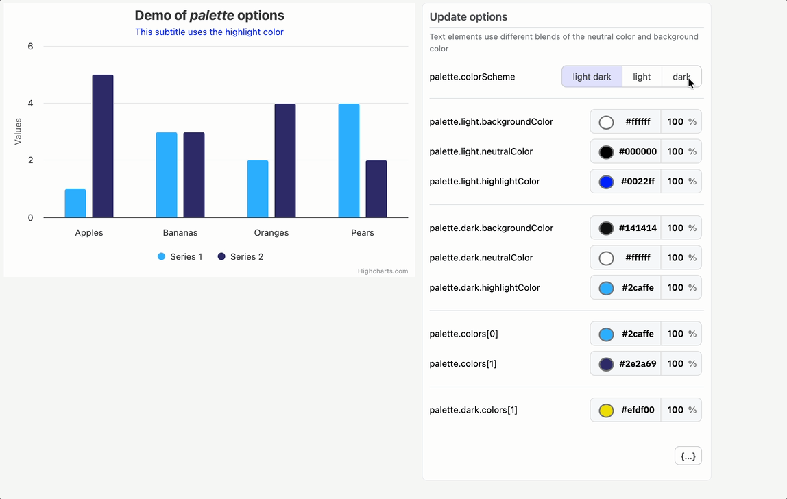
Use palette to define your series colors and light and dark mode values for backgrounds, chart elements (axes, titles, labels, etc.) and highlight colors for UI states and more.
Highcharts.setOptions({
    palette: {
        colors: ['#e32412', '#fadb8b', '#2364b9', '#059649'],
        light: {
            backgroundColor: '#f6f5f4',
            highlightColor: '#e32412'
        },
        dark: {
            backgroundColor: '#1b1918',
            highlightColor: '#fadb8b'
        }
    }
});
As you can see from the code sample above, the colors array for your series and point colors is now an option under palette. You can define one shared set and then override individual colors for light or dark mode with palette.light.colors and palette.dark.colors.
There’s also a colorScheme option that accepts ‘light’, ‘dark’, ‘light dark’, or ‘inherit’ so charts can follow a user’s system preference, inherit from the page, or be pinned to a specific mode.
At runtime, Highcharts exposes palette colors values as CSS variables and applies them to your chart. A nice side effect is that chart-specific styling can now reference CSS vars instead of duplicating hard-coded strings:
title: {
    style: {
        color: 'var(--highcharts-neutral-color-60)'
    }
}This kind of change seems modest when dealing with a single chart, but for teams managing dashboards, you’ll be glad it exists by the time you get to chart number 200.
The best part: designers get a single place to define color, developers get fewer one-off overrides, and users get charts that adapt more naturally to light and dark environments.
The new palette layer replaces the former Adaptive theme.
Additional resources:
Bring your own data table
Highcharts v13 makes it easy to use tabular data as a data source.
Until now, most charts were configured with series.data, a convenient method for small examples, but awkward when your actual source is a database table, CSV, API response, or shared dashboard dataset.

Instead of restructuring your source data to fit the series format, the new dataTable, series.dataTable, and series.dataMapping options let map your existing columns directly to chart points.
const dataTable = new Highcharts.DataTable({
    columns: {
        Year: [2020, 2021, 2022, 2023],
        Cost: [11, 13, 12, 14],
        Revenue: [12, 15, 14, 18]
    }
});
Highcharts.chart('container', {
    dataTable,
    plotOptions: {
        series: {
            dataMapping: { x: 'Year' }
        }
    },
    series: [
        { dataMapping: { y: 'Cost' } },
        { dataMapping: { y: 'Revenue' } }
    ]
});
One table, multiple series, no repeated arrays.
Mappings shared across series, like the x column, live in plotOptions.series, leaving each series to only declare what makes it unique.
If your columns are already named ‘x,’ ‘y,’ ‘name,’ etc., Highcharts will map them automatically. If not, just use the dataMapping option to assign them explicitly.
You can also attach a table directly to a series with series.dataTable, pass either a Highcharts.DataTable instance or a configuration object, and use typed arrays for heavier datasets.
 series: [{
        name: 'Options + array',
        dataTable: {
            columns: {
                x: [2026, 2027, 2028, 2029],
                y: [4, 2, 5, 1],
                z: [2, 1, 4, 2]
            }
        }
    }, {
        name: 'Instance + array',
        dataTable: new DataTable({
            columns: {
                x: [2026, 2027, 2028, 2029],
                y: [3, 6, 5, 7]
            }
        })
    }, {
        name: 'Options + typed array',
        dataTable: {
            columns: {
                x: new Uint16Array([2026, 2027, 2028, 2029]),
                y: new Uint8Array([6, 4, 7, 3])
            }
        }
    }, {
        name: 'Instance + typed array',
        dataTable: new DataTable({
            columns: {
                x: new Uint16Array([2026, 2027, 2028, 2029]),
                y: new Uint8Array([9, 5, 9, 4])
            }
        })
}]There’s a performance angle too. When used with the Boost module, configuring data through a DataTable with TypedArray columns is about 20% faster than series.data in a 500k-point chart. That’s a big payoff for a tiny syntax change, especially when data-heavy dashboards are involved.
Additional resources:
- Using DataTables with Series
- Chart-level dataTable
- Series-level dataTable
- series.dataMapping
- Single chart-level DataTable demo
- Series-level DataTable demo
Experimental Autoload: a patient friend who finds the missing pieces
Ever create a bubble chart with no bubbles because you forgot to include highcharts-more.js?
Our new experimental highcharts-autoload.js bundle solves this problem by inspecting your chart options and loading the required modules before your chart renders.
This is especially useful when chart options are assembled dynamically: from a CMS, a chart editor, a saved dashboard configuration, or a friendly LLM that enthusiastically suggests a more exotic chart type but spaces out on the required modules.
For example, in the ESM build setup below, the configuration includes features that normally require additional modules (bubble series, exporting and accessibility.) Autoload resolves those dependencies asynchronously, then creates the chart.
const { default: Highcharts } = await import(
    'https://code.highcharts.com/esm/highcharts-autoload.js'
);
await Highcharts.chart('container', {
    chart: { type: 'bubble' },
    exporting: { enabled: true },
    accessibility: { enabled: true },
    series: [{
        data: [[1, 2, 10], [2, 3, 15], [3, 1, 8]]
    }]
});And Autoload does more than fetch required modules. If your configuration uses styledMode or includes Stock Tools, Autoload will pull in all the necessary CSS and UI dependencies too.
Of course, Autoload isn’t meant to replace deliberate bundling. If you know exactly which modules your product uses, a regular build still gives you full control.
Additional resources:
- Highcharts Loader API
- Installation docs: Autoload modules
- ESM installation docs: Autoload
- UMD autoload demo
- ESM autoload demo
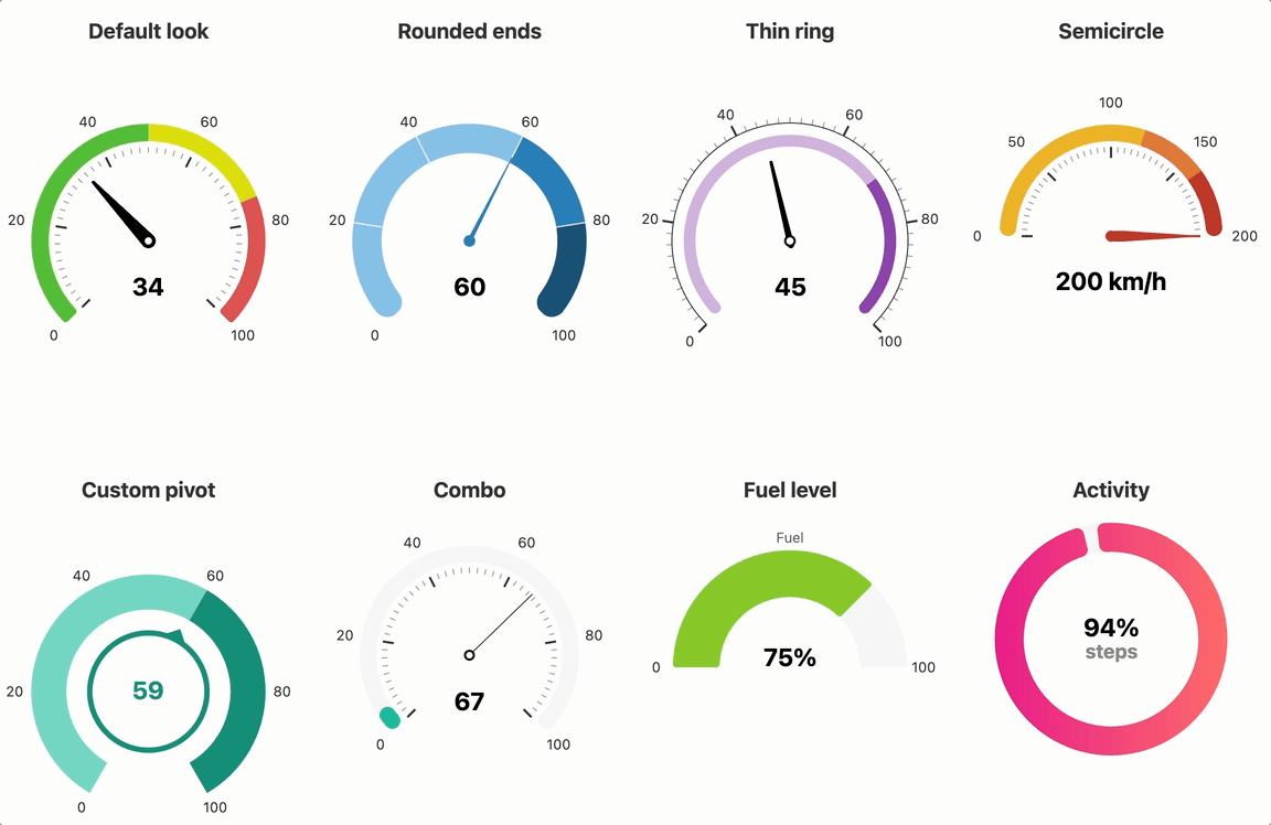
A proper glow-up for gauges
If you’ve ever created a modern-looking gauge with Highcharts, you’ve probably accumulated a small bag of tricks: where to place the pane, how wide the arc should be, and how to shape the dial.
In Highcharts v13, the defaults handle more of that work with one goal in mind: to make gauges look good before you touch a single option.
Panes fit the plot area more intelligently, gauge labels are positioned in accordance with the circular layout, and the default dial looks much closer to something you’d actually ship.
With these smart defaults, out-of-the-box gauge configurations are now very small:
Highcharts.chart('container', {
    chart: { type: 'gauge' },
    yAxis: {
        min: 0,
        max: 100,
        plotBands: [
            {
                from: 0,
                to: 70,
                color: '#d2b4de',
            },
            {
                from: 70,
                to: 100,
                color: '#8e44ad',
            }
        ]
    },
    series: [{ name: 'Score', data: [68] }]
});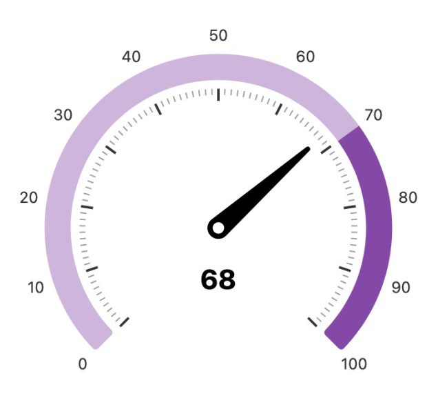
From here, you can layer on the parts that carry business meaning: plot bands for ranges, pane.innerSize for a ring layout, pane.borderRadius for rounded arc ends, or a solidgauge series for KPI and progress-style displays.
Our gauge inspiration demo (essentially a gauge mood board) shows an array of possibilities, from default gauges to concentric KPI rings to custom dial paths.
Additional resources:
Datetime axes that know where you are in time
For a while, Highcharts has used an internal “higher ranks” logic for labels, where years rank higher than months, months higher than days, etc. For example, when a Highcharts Stock chart crosses into a new year, month-based labels may switch over to years since the higher-ranked unit takes precedence.
In Highcharts v13, new boundary formatting makes this switchover fully configurable and extended across all time units.
Highcharts.stockChart('container', {
    xAxis: {
        dateTimeLabelFormats: {
            month: { main: '%b' },
            year: { boundary: '<b>%Y</b>' }
        }
    },
    series: [{ data }]
});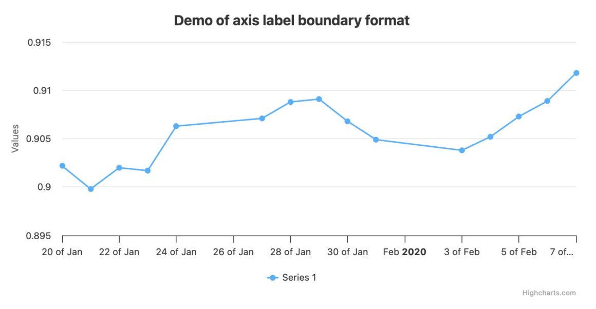
In the example above, monthly ticks (“Jan,” “Feb,” “Mar”) appear in normal-weight font, while the year uses a bolded label.
This works at every resolution: minute ticks can highlight hour boundaries, hourly ticks can highlight days, and so on up the chain. There is also a templating route where axis labels have a “boundary” value in their formatting context, so you can branch directly in labels.format:
xAxis: {
    labels: {
        format: `{#if (eq boundary "month")}
            {value:%b <b>%Y</b>}
        {else}
            {value:%e %b}
        {/if}`
    }
}It’s the same helpful “new section starts here” behavior, now explicitly defined in the chart configuration rather than a hidden heuristic.
Additional resources:
- Highcharts boundary labels demo
- Boundary labels with labels.format
- Highcharts Stock boundary labels demo
Modern, readable data labels
Highcharts has always helped data label readability by defaulting to contrasting text color and applying text outlines where appropriate.
But in Highcharts v13, we’ve come up with a calmer option: dataLabels.backgroundColor that can now be set to “contrast.”
plotOptions: {
    column: {
        stacking: 'normal',
        dataLabels: {
            enabled: true,
            inside: true,
            backgroundColor: 'contrast',
            style: { textOutline: 'none' }
        }
    }
}Set it to ‘contrast’ to add a plain, semi-transparent background behind each label, giving the text a stable reading surface regardless of what’s underneath. This is especially useful for stacked columns, pies and maps where labels appear over a wide variety of colors.
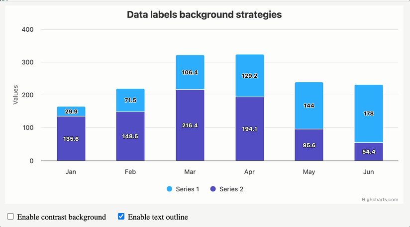
The related dataLabels.distance option has also been generalized to apply across more series types, making it easier to nudge labels without series-specific workarounds.
Additional resources:
- Contrast background in stacked columns
- Contrast background in pie
- Data label background strategies demo
Other Design and UX Improvements
Highcharts v13 also includes a handful of smaller “hey, that’s cool” changes, the kind users may not name, but will definitely feel:
Smoother point animations. Points now fade in and out from the correct position in the coordinate system when added, removed, or updated, resulting in a noticeable cleaner impression in dynamic charts.
Better legend symbols. Symbols now more accurately reflect the actual styling of their series, making legends more useful as visual keys rather than decorative labels.
Rounded plot area corners. Setting chart.plotBorderRadius gives cartesian charts and maps a softer frame, with axes, plot bands, and grid lines clipped to match.
Gantt treegrid facelift. Updated default colors and a tighter fit with the rest of the grid-axis styling.
Try It
This beta phase is the perfect time to test Highcharts v13 with your existing charts and let us know where the edges still feel sharp.
Install via npm:
npm install highcharts@betaOr get the code via jsDelivr:
https://cdn.jsdelivr.net/npm/highcharts@beta/highcharts.jsThe final release is targeted for early June. If something looks off, let us know.


Leave a Reply