
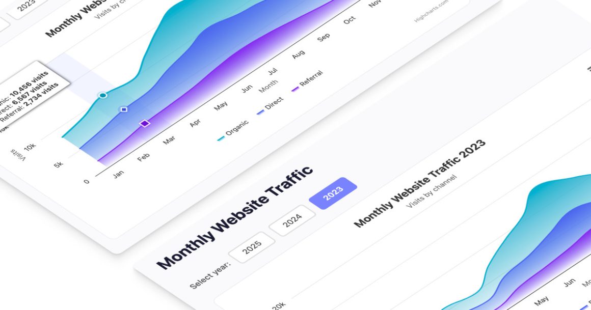
Weather data visualization is increasingly important in our connected world. From monitoring climate patterns to planning daily activities, accessing real-time weather information has become essential for both individuals and businesses. In this post, we’ll explore how to create an interactive weather dashboard using Highcharts and its powerful Dashboards components.
Modern IoT weather stations collect vast amounts of data including temperature, wind speed, precipitation, and more. Without effective visualization tools, this data remains difficult to interpret and use. That’s where Highcharts comes in, offering a robust solution for transforming raw weather data into interactive, user-friendly visualizations that make meteorological information accessible to everyone.
To see more examples and get an even better understanding of the opportunities Highcharts offers, please head over to the demo section of our website or read up on the technical documentation on how to get started. Once you get the hang of it, the API reference will help you customize your charts in no time.
Whether you’re a developer working with JavaScript, .NET, React or other common frameworks, we’re confident you’ll find the inspiration you need.
Highcharts also integrates seamlessly with popular languages such as Python, R, PHP and Java, as well as mobile platforms like iOS and Android. Additional support for frameworks like Svelte, Angular, and Vue, makes it a versatile tool for various development environments.
Why visualize weather data?
Weather data visualization serves multiple purposes across different sectors. For meteorologists and researchers, visualizations help identify patterns and anomalies in climate data. For agriculture, they assist in making critical decisions about planting, irrigation, and harvesting. For everyday users, weather visualizations provide easy-to-understand forecasts that help plan daily activities.
The benefits of interactive weather visualizations include:
- Improved decision-making: Visualizations make it easier to understand complex data, leading to better-informed decisions.
- Pattern recognition: Visual representations help identify trends and patterns that might not be apparent in raw data.
- Accessibility: Well-designed visualizations make weather information accessible to users of all technical backgrounds.
- Engagement: Interactive elements encourage users to explore data, leading to deeper understanding and insights.
Introducing our weather visualization demo

Our demo showcases a comprehensive weather dashboard built with Highcharts Dashboards components. It provides real-time weather forecasts from the Norwegian Meteorological Institute for various weather stations across North America. The dashboard displays current observations and forecasts for the next 24 hours, allowing users to monitor weather conditions with ease and precision.
The demo features multiple interactive components, each serving a specific purpose in the visualization:
- Interactive map: Displays weather stations with color-coded markers based on the selected parameter (temperature, wind, or precipitation).
- KPI gauges: Show current temperature, wind speed, and expected precipitation in an easy-to-read format.
- Geographic information: Provides location details for the selected weather station.
- Forecast grid: Displays a detailed table with hourly forecasts for all weather parameters.
- Forecast chart: Shows a visual representation of the selected parameter over the next 24 hours.
Key features of the dashboard
The weather dashboard offers several powerful features that enhance the user experience and make weather data more accessible:
Interactive station selection
Users can select different weather stations by clicking on markers on the map. Each marker is color-coded to represent the current value of the selected weather parameter (temperature, wind speed, or precipitation) at that location. When a station is selected, all dashboard components update to display data specific to that location.
This interactivity allows users to quickly compare weather conditions across different geographic areas and focus on locations of interest. The map also includes zoom and pan functionality, making it easy to navigate between different regions.
Parameter selection via KPI gauges
The KPI (Key Performance Indicator) gauges serve dual purposes: they display current weather values and act as selectors for the parameter to be visualized across the dashboard. Users can click on the temperature, wind, or precipitation gauge to update the entire dashboard to focus on that parameter.
The gauges use a semicircular design with color-coded indicators that make it easy to interpret values at a glance. Each gauge shows the current value for its respective parameter, providing an immediate overview of current conditions.
Detailed forecast grid
The forecast grid presents a comprehensive table view of all weather parameters for the selected station. It displays hourly forecasts for temperature, wind speed, wind direction, and precipitation over the next 24 hours. This tabular format allows users to see exact values for specific times, which is particularly useful for detailed planning.
The grid includes synchronized highlighting with the forecast chart, so selecting a row in the grid highlights the corresponding point on the chart and vice versa. This synchronization helps users correlate data across different visualization types.
Dynamic forecast charts
The forecast chart visualizes the selected weather parameter over the next 24 hours. The chart type automatically adapts based on the parameter being displayed:
- Temperature: Displayed as a spline chart with a color gradient from blue (cold) to red (hot).
- Wind speed: Shown as an area chart with wind barbs indicating direction.
- Precipitation: Presented as a column chart with intensity indicated by color.
This dynamic approach ensures that each parameter is visualized using the most appropriate chart type, making the data easier to interpret. The charts include interactive tooltips that display detailed information when hovering over data points.
Creating the weather dashboard
Now, let’s look at how to create this interactive weather dashboard using Highcharts. We’ll break down the implementation into manageable steps, focusing on the key components and their configurations.
Setting up the basic structure
First, we need to include the necessary Highcharts libraries and create a container for our dashboard. Here’s the basic setup:
<script src="https://code.highcharts.com/dashboards/datagrid.js"></script>
<script src="https://code.highcharts.com/highcharts.js"></script>
<script src="https://code.highcharts.com/highcharts-more.js"></script>
<script src="https://code.highcharts.com/modules/datagrouping.js"></script>
<script src="https://code.highcharts.com/modules/windbarb.js"></script>
<script src="https://code.highcharts.com/maps/modules/map.js"></script>
<script src="https://code.highcharts.com/modules/solid-gauge.js"></script>
<script src="https://code.highcharts.com/modules/accessibility.js"></script>
<script src="https://code.highcharts.com/dashboards/dashboards.js"></script>
<script src="https://code.highcharts.com/dashboards/modules/layout.js"></script>

<div id="container">Loading...</div>
This code includes all the necessary Highcharts modules for creating the dashboard, including support for maps, gauges, and data grids. The container div will hold our entire dashboard.
Configuring weather parameters
Next, we need to define the configuration for our weather parameters. This includes the name, description, unit, minimum and maximum values, and color stops for each parameter:
const paramConfig = {
    temperature: {
        name: 'temperature',
        descr: 'Temperature',
        unit: '˚C',
        min: -20,
        max: 40,
        floatRes: 1,
        chartType: 'spline',
        colorStops: [
            [0.0, '#4CAFFE'],
            [0.3, '#53BB6C'],
            [0.5, '#DDCE16'],
            [0.6, '#DF7642'],
            [0.7, '#DD2323']
        ]
    },
    wind: {
        name: 'wind',
        descr: 'Wind speed',
        unit: 'm/s',
        min: 0,
        max: 30, // Hurricane > 32.7
        floatRes: 1,
        chartType: 'area',
        colorStops: [
            [0.0, '#C0CCC0'],
            [0.25, '#CCCC99'],
            [0.50, '#99CC66'],
            [0.75, '#336633']
        ]
    },
    precipitation: {
        name: 'precipitation',
        descr: 'Precipitation',
        unit: 'mm',
        min: 0,
        max: 10, // per hour
        floatRes: 1,
        chartType: 'column',
        colorStops: [
            [0.0, '#CCCCCC'],
            [0.1, '#CCCCAA'],
            [0.2, '#9999AA'],
            [0.8, '#0000CC']
        ]
    }
}
This configuration defines how each parameter will be displayed on the dashboard. The chartType property specifies which type of chart will be used for each parameter, while colorStops defines the color gradient for visualizing intensity.
Defining weather stations
For our demo, we need to define the locations of our weather stations. This includes their names, coordinates, elevations, and time differences:
const locations = {
    mapUrl: 'https://code.highcharts.com/mapdata/custom/north-america-no-central.topo.json',
    default: 'New York',
    points: [
        ['station', 'lat', 'lon', 'elevation', 'timeDifference'],
        ['New York', 40.71, -74.01, 10, 5],
        ['San Diego', 32.71, -117.16, 36, 8],
        ['Anchorage', 61.22, -149.89, 0, 9],
        ['Winnipeg', 49.90, -97.14, 236, 6],
        ['Monterrey', 25.68, -99.13, 540, 6],
        ['Baracoa', 20.35, -74.50, 15, 5]
    ]
}
This configuration specifies the URL for the map data, the default station to display when the dashboard loads, and an array of station information. Each station includes its name, latitude, longitude, elevation, and the time difference (in hours) from UTC.
Creating the dashboard layout
The dashboard layout defines how the components are arranged on the screen. Here’s a simplified version of the layout configuration:
gui: {
    layouts: [{
        rows: [{
            cells: [{
                // Top left
                id: 'station-map'
            }, {
                // Top right
                id: 'kpi-layout',
                layout: {
                    rows: [{
                        cells: [{
                            id: 'html-geo-info'
                        }]
                    }, {
                        cells: [{
                            id: 'kpi-temperature'
                        }, {
                            id: 'kpi-wind'
                        }, {
                            id: 'kpi-precipitation'
                        }]
                    }]
                }
            }]
        }, {
            cells: [{
                // Bottom left
                id: 'forecast-grid'
            }, {
                // Bottom right
                id: 'forecast-chart'
            }]
        }]
    }]
}
This layout organizes the dashboard into two rows. The top row contains the map on the left and the KPI gauges on the right, with the geographic information above the gauges. The bottom row displays the forecast grid on the left and the forecast chart on the right.
Implementing the interactive map
The interactive map is one of the core components of our dashboard. It displays the weather stations and allows users to select a station to view its data. Here’s how we configure the map component:
{
    cell: 'station-map',
    type: 'Highcharts',
    chartConstructor: 'mapChart',
    chartOptions: {
        chart: {
            map: await fetch(weatherStationConfig.location.mapUrl)
                .then(response => response.json())
        },
        title: {
            text: paramConfig.getColumnHeader('temperature')
        },
        colorAxis: {
            startOnTick: false,
            endOnTick: false,
            max: activeParam.max,
            min: activeParam.min,
            stops: activeParam.colorStops
        },
        legend: {
            enabled: false
        },
        mapNavigation: {
            buttonOptions: {
                verticalAlign: 'bottom'
            },
            enabled: true,
            enableMouseWheelZoom: true
        },
        mapView: {
            maxZoom: 4
        },
        series: [{
            type: 'map',
            name: 'Weather Station Map'
        }, {
            type: 'mappoint',
            name: 'Stations',
            data: [],
            allowPointSelect: true,
            // Configuration for data labels, events, marker, tooltip...
        }]
    }
}
This configuration creates a map chart with two series: one for the base map and another for the weather station markers. The mapNavigation property enables zoom and pan functionality, while the colorAxis defines how colors are applied to markers based on their values.
Creating the KPI gauges
The KPI gauges display current weather values and allow users to select which parameter to display across the dashboard. Here’s the configuration for the temperature gauge:
{
    cell: 'kpi-temperature',
    type: 'KPI',
    columnName: 'temperature',
    chartOptions: {
        chart: kpiGaugeOptions.chart,
        pane: kpiGaugeOptions.pane,
        title: {
            text: paramConfig.getColumnHeader(
                'temperature', false
            ) + ' (latest)',
            verticalAlign: 'bottom'
        },
        yAxis: {
            ...kpiGaugeOptions.yAxis,
            min: paramConfig.temperature.min,
            max: paramConfig.temperature.max,
            accessibility: {
                description: paramConfig.getColumnHeader(
                    'temperature'
                )
            }
        },
        series: [{
            ...kpiGaugeOptions.series[0],
            dataLabels: {
                format: '{y:.1f} ' + paramConfig.temperature.unit,
                y: kpiGaugeOptions.series[0].dataLabels.y
            }
        }]
    },
    events: {
        click: function () {
            // Update dashboard to show temperature data
            activeParam = paramConfig.temperature;
            updateBoard(
                board, activeStation,
                'temperature', true, false
            );
        }
    },
    states: {
        active: {
            enabled: true,
            isActive: true
        },
        hover: {
            enabled: true
        }
    }
}
This configuration creates a gauge chart for temperature, with an event handler for clicking on the gauge. When clicked, it updates the dashboard to display temperature data. Similar configurations are created for wind speed and precipitation gauges.
Implementing the forecast grid
The forecast grid displays detailed hourly forecasts in a tabular format. Here’s how we configure it:
{
    cell: 'forecast-grid',
    type: 'DataGrid',
    title: {
        enabled: true,
        text: 'Forecast for ' + currentDay
    },
    sync: {
        highlight: true
    },
    dataGridOptions: {
        credits: {
            enabled: false
        },
        columns: [{
            id: 'time',
            header: {
                format: 'Local Time'
            },
            cells: {
                formatter: function () {
                    return Highcharts.dateFormat(
                        '%I:%M %p', this.value
                    );
                }
            }
        },
        // Additional columns for temperature, wind, windDir, precipitation
        ]
    }
}
This configuration creates a data grid with columns for time, temperature, wind speed, wind direction, and precipitation. The sync property enables synchronization with the forecast chart, so selecting a row in the grid highlights the corresponding point on the chart.
Creating the forecast chart
The forecast chart visualizes the selected weather parameter over time. Here’s the configuration:
{
    cell: 'forecast-chart',
    type: 'Highcharts',
    sync: {
        highlight: true
    },
    chartOptions: {
        chart: {
            spacing: [40, 40, 40, 10],
            styledMode: true,
            type: activeParam.chartType
        },
        credits: {
            enabled: true,
            href: 'https://api.met.no/weatherapi/locationforecast/2.0/documentation',
            text: 'MET Norway'
        },
        legend: {
            enabled: false
        },
        colorAxis: {
            startOnTick: false,
            endOnTick: false,
            max: activeParam.max,
            min: activeParam.min,
            stops: activeParam.colorStops
        },
        // Additional configuration for plotOptions, title, xAxis, yAxis, accessibility
    }
}
This configuration creates a chart that adapts its type based on the active parameter. The sync property enables synchronization with the forecast grid. The chart includes interactive tooltips and is styled according to the active parameter’s configuration.
Connecting to real-time data sources
Our weather dashboard connects to the Norwegian Meteorological Institute’s API to fetch real-time weather data. The data is refreshed whenever a new station is selected or a different weather parameter is chosen. Here’s how we handle the data connection:
dataPool.setConnectorOptions({
    id: station,
    type: 'JSON',
    options: {
        firstRowAsNames: false,
        dataUrl: url,
        // Pre-parsing for filtering incoming data
        beforeParse: function (data) {
            const retData = [];
            const forecastData = data.properties.timeseries;

            // Get the time difference for the current station
            const timeDifference = getTimeDifference(station);

            for (let i = 0; i < rangeConfig.hours; i++) {
                const item = forecastData[i];

                // Instant data
                const instantData = item.data.instant.details;

                // Data for the next hour
                const hourSpan = item.data.next_1_hours.details;

                // Convert UTC time to local time
                const localTime = new Date(item.time).getTime() -
                    timeDifference * 3600000;

                // Picks the parameters this application uses
                retData.push({
                    time: localTime,
                    temperature: instantData.air_temperature,
                    precipitation: hourSpan.precipitation_amount,
                    wind: instantData.wind_speed,
                    windDir: instantData.wind_from_direction
                });
            }
            return retData;
        }
    }
});
This code configures a data connector for each weather station. The beforeParse function processes the raw data from the API, extracting the relevant weather parameters and converting the time to the local time zone of the station. The resulting data is then used to update the dashboard components.
Implementing dark mode support
Our weather dashboard includes support for dark mode, which can be triggered manually or based on the user’s system preferences. We implement this using CSS custom properties (variables) that define different color schemes for light and dark modes.
Here’s a simplified example of how we define the color variables for the forecast chart:
#forecast-chart {
    --color-axis: #333;
    --color-axis-labels: #333;
    --color-background: #fff;
    --color-title: #2f2b38;
    --color-text: #2f2b38;
    --color-tooltip-background: #5352be;
    --color-tooltip-text: #d9d8e8;
}

@media (prefers-color-scheme: dark) {
    /* dark mode */
    #forecast-chart {
        --color-axis: #ccc;
        --color-axis-labels: #ccc;
        --color-background: #20202c;
        --color-title: #dadae2;
        --color-text: #dadae2;
    }
}
This approach allows the dashboard to automatically adapt to the user’s preferred color scheme. The prefers-color-scheme media query detects if the user has dark mode enabled in their system preferences and applies the appropriate colors.
Making the dashboard responsive
To ensure our weather dashboard works well on devices of all sizes, we implement responsive design using CSS media queries. Here’s how we adjust the layout for different screen sizes:
#station-map,
#kpi-layout,
#forecast-grid,
#forecast-chart {
    flex: 1 1 50%;
}

#kpi-temperature,
#kpi-wind,
#kpi-precipitation {
    height: 204px;
    flex: 1 1 33.333%;
}

#html-geo-info {
    height: 204px;
    flex: 1 1 100%;
}

/* MEDIUM */
@media (max-width: 992px) {
    #station-map,
    #kpi-layout,
    #forecast-grid,
    #forecast-chart {
        flex: 1 1 100%;
    }
}

/* SMALL */
@media (max-width: 576px) {
    #kpi-temperature,
    #kpi-wind,
    #kpi-precipitation,
    #station-map,
    #kpi-layout,
    #forecast-grid,
    #forecast-chart {
        flex: 1 1 100%;
    }
}
On large screens, the dashboard is arranged in a two-column layout with multiple components side by side. On medium screens (less than 992px wide), the major components stack vertically while keeping the KPI gauges side by side. On small screens (less than 576px wide), all components stack vertically for optimal viewing on mobile devices.
Customizing the weather dashboard
One of the strengths of our weather dashboard is its flexibility and customizability. Here are some ways you can customize the dashboard to suit your specific needs.
Adding new weather stations
You can easily add new weather stations to the dashboard by updating the locations configuration. Simply add a new entry to the points array with the station name, coordinates, elevation, and time difference:
points: [
    ['station', 'lat', 'lon', 'elevation', 'timeDifference'],
    ['New York', 40.71, -74.01, 10, 5],
    ['San Diego', 32.71, -117.16, 36, 8],
    // Add your new station here
    ['Chicago', 41.88, -87.63, 182, 6]
]
Once added, the new station will automatically appear on the map and be available for selection.
Changing the forecast range
By default, our dashboard shows forecasts for the next 24 hours. You can adjust this range by modifying the rangeConfig object:
const rangeConfig = {
    first: 0, // 0: current observation
    hours: 48 // Increase to show more hours (max: 19 days)
};
This example increases the forecast range to 48 hours, showing two days of forecast data instead of one.
Using alternative data sources
While our demo uses data from the Norwegian Meteorological Institute, you can adapt the dashboard to use data from other weather services or even your own IoT weather stations. You’ll need to update the beforeParse function to handle the different data format:
beforeParse: function (data) {
    // Custom logic to parse data from your API
    const retData = [];
    // Transform the data into the required format
    return retData;
}
This allows you to integrate data from various sources while maintaining the same interactive visualization interface.
Real-world applications
Our weather dashboard has numerous real-world applications across various industries:
Agriculture
Farmers can use the dashboard to monitor weather conditions that affect crop growth and planning. Temperature, precipitation, and wind data help inform decisions about planting, irrigation, and harvesting. By selecting different weather stations, farmers can compare conditions across various fields or regions.
Transportation
Transportation companies can use the dashboard to track weather conditions along shipping routes or at destinations. This information helps in planning routes, scheduling deliveries, and preparing for adverse weather conditions that might affect operations. The ability to view forecasts for multiple locations on a single dashboard streamlines decision-making.
Energy management
Energy companies can use the dashboard to anticipate demand based on weather forecasts. Temperature trends directly impact heating and cooling needs, while wind forecasts are crucial for wind energy production. The interactive nature of the dashboard allows energy managers to explore different scenarios and plan accordingly.
Emergency management
Emergency response teams can use the dashboard to monitor weather conditions that might lead to disasters like floods, wildfires, or severe storms. The ability to track multiple parameters simultaneously helps in identifying potential risks and allocating resources proactively. The dashboard’s responsive design ensures it remains accessible on mobile devices during field operations.
Conclusion and additional resources
Creating an interactive weather dashboard with Highcharts provides a powerful way to visualize real-time meteorological data. By combining interactive maps, KPI gauges, data grids, and dynamic charts, we’ve built a comprehensive tool that makes weather information accessible and meaningful.
The dashboard we’ve explored offers several key advantages:
- Interactivity: Users can select different stations and parameters to explore the data that matters most to them.
- Comprehensiveness: The dashboard presents multiple types of weather data in a single interface, providing a complete picture of conditions.
- Responsiveness: The layout adapts to different screen sizes, ensuring usability across devices.
- Customizability: The dashboard can be tailored to include different stations, parameters, and data sources based on specific needs.
Whether you’re a meteorologist, a farmer, or simply someone interested in weather patterns, this dashboard provides a valuable tool for understanding and utilizing weather data. By leveraging the power of Highcharts, we’ve transformed complex meteorological information into an intuitive, engaging visualization that helps users make informed decisions based on current and forecasted weather conditions.
The integration of IoT weather stations with interactive visualization tools represents the future of meteorological data presentation. As more weather stations come online and data becomes increasingly available, tools like our dashboard will play a crucial role in making this information accessible and actionable for users across all sectors.
- Documentation – Getting started with Highcharts®
- Documentation – Getting started with Highcharts Dashboards
- Documentation – Live data
- Demo/example section
Related posts
- Data visualization framework by Highcharts
- Data visualization library by Highcharts
- Data charting with Highcharts
- Stock charting with Highcharts
- Financial charts with Highcharts
- Dynamic charts in JavaScript with Highcharts


Leave a Reply