
It has never been easier to get access to, and process public (and private) data using APIs. However, data is rarely neatly packaged for your exact analysis requirements or data visualization needs. But don’t let that stop you in your tracks!
Here is a two-part series on how to request data from a popular Open Data source and generate custom visualization.
All you need is a well-formulated API request, some minimal JavaScript coding and your favorite charting library.
API AS A DATA-SOURCE
The Open data movement has transformed the way people access information from the public sector. The World Bank was among the pioneering institutions to open up their data and (thus) became the champion of international statistics, providing an impressive amount of indicators on economic and social development. The Internet opened up for data dissemination with ease and at scale. Not long ago datasets had to be delivered on floppy disks via snail mail, practically outdated by the time you could hear your disk drive buzz… I’ll admit I’m too young to have experienced econometrics from the floppy disk, but I do remember ordering and paying for CD-ROMs of data from OECD. The Internet “revolution” brought about online sharing of data via spreadsheets, which could be updated and re-shared a lot faster than one could with physical media. With modern APIs, we are now able to get “programmatic” access to data, giving our applications real-time access to the most current data.
In this article, I will show how to leverage the World Bank API with Highcharts. There are other charting libraries you could use, however, I think Highcharts offers the best way to get started (and get going) for both the novice and experienced web developer.
EXAMPLE: HOW TO ACCESS THE WORLD BANK API
Click here to see an example of request that you can send to the API.
Let’s look at it. The URL requests data for Afghanistan (AFG), its GDP growth (NY.GDP.MKTP.KD.ZG) and retrieves the 20 last results (MRV=20), displayed on a single page (per_page=20), formatted as a jsonP, with ‘?’ as a prefix.
- For more information about the query structure see World Bank data page.
Resulting data (jsonP) from this request:
?([{
"page": 1,
"pages": 1,
"per_page": "20",
"total": 13
}, [{
"indicator": {
"id": "NY.GDP.MKTP.KD.ZG",
"value": "GDP growth (annual %)"
},
"country": {
"id": "AF",
"value": "Afghanistan"
},
"value": "1.51991126448578",
"decimal": "1",
"date": "2015"
},
// .....
{
"indicator": {
"id": "NY.GDP.MKTP.KD.ZG",
"value": "GDP growth (annual %)"
},
"country": {
"id": "AF",
"value": "Afghanistan"
},
"value": "8.44416322679218",
"decimal": "1",
"date": "2003"
}]])
- Note that the last value available is for the year 2003, and not for the year 1996 which actually corresponds to 20 data points requested. The reason is that no other data is available for this country. Replacing AFG by ISL in the request will indeed show 20 years of GDP growth for Iceland.
FROM API TO INSIGHTS USING HIGHCHARTS
Getting access to an ocean of data is interesting, but not everyone finds JSON attractive, no matter your choice of font… Highcharts is my go-to library to display data and reveal insights from it. It is also friendly to web developers with a ‘designer’ orientation who prefer CSS styling over tweaking JavaScript parameters.
In honor of Highcharts’ Viking heritage, let’s dive in by creating a timeline displaying the evolution of the Norwegian GDP over the last 30 years.
1ST EXAMPLE:
In order to display this linechart, a bit of work is necessary to retrieve and parse the data. This first example shows how to request a time serie for one indicator and one country. Here is how we request the GDP growth (NY.GDP.MKTP.KD.ZG) for Norway, for the last 30 data points available (click here).
getJSON() method allows to access the requested result above, the next step is to parse the data using each method:
each(json[1], function(i, data) {Note that the iteration starts with json[1]; json[0] contains only the metadata that describes the request (page:1, pages:1, per_page: 30, total: 30)
Data structure:
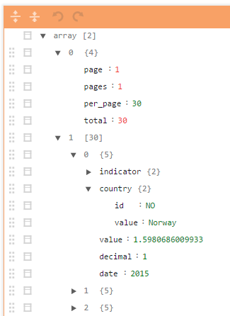
FYI: You may visualise the data structure of json files in your favorite code editor or with online tools such as: jsoneditoronline.org
X and Y axis need data to draw the chart. To do so, data.value (GDP growth values) and the data.date (the corresponding years) are called using .push() method.
In case of a missing Data point, the result could include strings instead of number (use typeof to check). To avoid any issues with the null notation, I use a two-steps procedure to create the final data values vector NB. Room for improvement in this piece of code, contributions welcome…
1st step:
$.getJSON(url, function(json) {
$.each(json[1], function(i, data) {
//Store indicator name
country_name = data.country.value;

// Store indicator label
indicatorName = data.indicator.value;

// fill the date array
year_list.push(data.date);

// fill the string data array
arrayString.push(data.value);
});
Note that we are here affecting the same country and indicator names to the same variables several times. (Efficient, but not very elegant…)
After this two-step procedure, I ended up with a vector year_list containing years value, in this case an array from 2015 to 1986 ([2015, 2014,…., 1986]) and a vector containing the GDP growth values, stored as a string.
The following lines transform each value of the GDP growth vector into a float – or a null if data is missing – and store them into array_final.
2nd step:
for (var i = 0; i < arrayString.length; i++) {
if (arrayString[i] != null) {
array_final.push(parseFloat(arrayString[i]))
} else {
array_final.push(null)
};
}
The data is then ready for drawing using Highcharts.
var chart = new Highcharts.Chart({
chart: {
type: 'spline',
renderTo: 'container'
},
title: {
text: indicatorName
},
tooltip: {
valueDecimals: 2
},
subtitle: {
text: 'Source: World Bank Data'
},
xAxis: {
categories: year_list.reverse() //.reverse() to have the min year on the left
},
series: [{
name: country_name,
data: array_final.reverse() //
}]
});- Note that I applied the .reverse() method to the vectors, in order to display the data in the chronological order from 1986 until 2015. As the API provides time descending array from 2015 down to 1986. It also sorts countries alphabetically, which I will address in the next example.
2ND EXAMPLE, MORE COUNTRIES, MORE FUN…
So far, what we have done is not too complex as we’ve only dealt with one indicator and one country. However, some context to other would make it a more insightful presentation.
In Part 2 of this post you will learn how to combine multiple datasets into your analysis with ease, and bring your data to life with the Highcharts charting library. Stay tuned!
Comments
Jan Bruusgaard | 7 years ago
Statistics Norway has got a few small examples using their API and the format JSON-Stat together with Highcharts.
JSON-Stat is used as output format by all the Nordic statistical institutes, Eurostat and others. See:
http://www.ssb.no/en/omssb/tjenester-og-verktoy/api/px-api/code-examples
a n onymous | 6 years ago
Please fix the fiddle. Content is not rendering in chrome because of Mixed Content/HTTPS warning.
Want to leave a comment?
Comments are moderated. They will publish only if they add to the discussion in a constructive way. Please be polite.