Maintaining brand consistency across devices
Brand identity relies on visual consistency. A logo, color palette, and typography must feel identical on all surfaces. Highcharts achieves this through a single configuration object that renders identically across web, mobile, and print mediums. Define your brand colors, fonts, and spacing once, and Highcharts applies them everywhere. This unified approach drastically reduces the maintenance overhead typically associated with managing visual assets across multiple platforms, and it prevents the subtle drift that occurs when teams maintain parallel stylesheets for different environments.
The key is leveraging the Highcharts theme system. Create a custom theme that encodes your brand guidelines into configuration objects. This theme acts as a single source of truth, eliminating the need to manage separate styles for different platforms. Mobile users see the same color scheme as desktop users. When printed, the charts maintain your brand identity without requiring manual adjustments. The theme system also allows you to define variants for light and dark modes, which automatically switch based on user preferences without any additional code changes.
Beyond colors, consistency extends to interactive elements. Tooltips, legends, and labels follow the same design language everywhere. On mobile, tap interactions replace hover states automatically. On print, these interactive elements adapt gracefully to static output. The user experience remains coherent despite these mechanical differences, and end users develop muscle memory that transfers seamlessly from one device to another.
Typography deserves special attention in cross-platform work. Web fonts render differently across operating systems, and print output may default to entirely different font families if the original isn’t embedded properly. Highcharts lets you specify font stacks with sensible fallbacks, ensuring that even when the primary brand font isn’t available, the chart maintains a close visual match. Combined with consistent sizing ratios, this keeps your charts recognizable regardless of the rendering environment.
Platform-specific optimizations
Consistency and optimization aren’t contradictory. While the underlying data and configuration remain the same, Highcharts adapts presentation to suit each platform’s strengths and limitations. The trick is thinking of platform adaptation as a progressive enhancement layer on top of a solid, consistent foundation rather than as separate builds for each target.
Web optimization
Desktop browsers support high fidelity rendering, extensive interactivity, and real-time updates. Highcharts leverages SVG for crisp graphics at any zoom level. Animations engage users without impacting performance on powerful machines. Tooltips and crosshairs provide granular data exploration. Responsive rules ensure charts resize smoothly when windows change size. Web environments also benefit from keyboard navigation support, enabling power users to explore data without reaching for the mouse.
Mobile optimization
Touch screens demand larger tap targets and simplified layouts. Tap-and-hold interactions replace hover states. Swipe gestures can navigate categorical data. Charts compress vertically to accommodate smaller screens without losing readability. Battery considerations also matter on mobile, so animations should be shorter and less frequent to avoid draining power unnecessarily. Network bandwidth is another concern, making it important to minimize payload sizes and cache chart dependencies aggressively.
Print optimization
Printed charts need crisp output and optimized file sizes. Colors must render accurately on paper. The built-in Highcharts export module converts charts to PNG or PDF with exact color reproduction. Interactive elements disappear, leaving clean static visuals. Page breaks don’t fracture multi-series displays. For professional reports and executive briefings, print output must look polished without any trace of interactive artifacts such as hover states frozen at capture time.
Responsive rules are critical for tying these platform optimizations together. Configure breakpoints where layout shifts:
- Below 500px: Stack legend below chart, hide subtitle, enlarge touchable elements.
- 500px to 800px: Place legend to the side, show full labels, render at full detail.
- Above 800px: Enable animations, show comprehensive tooltips, display all annotations.
Automated testing strategies
Cross-platform consistency requires rigorous testing. Manual verification across dozens of device combinations is impractical. Automated testing catches inconsistencies early and prevents regressions. The most effective teams treat visual consistency as a contractual obligation of their build pipeline, with automated gates preventing any merge that introduces unreviewed visual changes.
Visual regression testing captures screenshots of charts on different viewport sizes and compares them pixel-by-pixel against baselines. Tools like Percy or Chromatic automate this process. When responsive rules trigger, visual tests confirm that layouts adapt as intended. Color consistency checking verifies that brand colors render accurately across platforms. These tools also help catch subtle issues like anti-aliasing differences between rendering engines, which a human reviewer might miss during casual inspection.
Functional testing validates that interactivity works identically on touch and pointer devices. Test frameworks like Cypress or Playwright simulate user interactions and verify that tooltips appear, series toggle correctly, and exports generate valid files. Automated accessibility testing ensures charts remain readable to screen readers regardless of platform. This category of testing is especially important for charts because interactivity often encodes meaning that sighted users grasp visually, and any regression in accessibility can disproportionately affect users who depend on assistive technology.
Performance testing measures rendering speed on simulated low-end devices. Mobile performance budgets prevent charts from lagging on slower connections or older hardware. Lighthouse audits catch performance regressions automatically. Load testing with thousands of concurrent users validates that server-side rendering doesn’t bottleneck production systems. Set hard thresholds for time-to-interactive and first meaningful paint, then fail the build when any change pushes those metrics past the agreed limits.
Device testing on real hardware remains essential. Browser-based tools like BrowserStack run tests across actual phones and tablets, catching platform-specific bugs that emulators miss. Automated device farms execute test suites overnight on dozens of devices simultaneously. While emulators are convenient for rapid iteration, certain classes of bugs (touch event timing, GPU-accelerated rendering, font metrics) only surface on real hardware, and production incidents in these areas tend to be embarrassing and hard to debug retroactively.
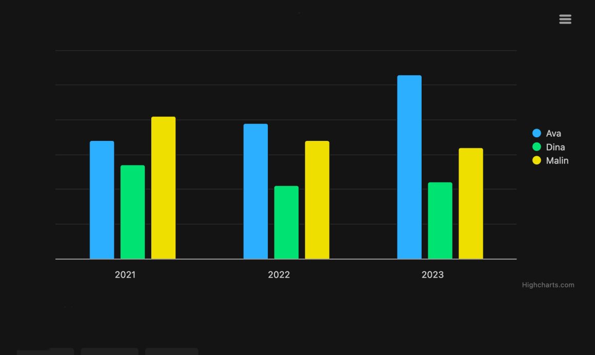
Responsive charts in action
Note that this example in addition to the base Highcharts script also includes some additional scripts, namely the Export modules (docs) and Accessibility module (docs).
Check out the full demo here in our gallery.
Step 1: Load the required files and create a container to hold the chart
<script src="https://code.highcharts.com/highcharts.js"></script>
<script src="https://code.highcharts.com/modules/exporting.js"></script>
<script src="https://code.highcharts.com/modules/export-data.js"></script>
<script src="https://code.highcharts.com/modules/accessibility.js"></script>

<div id="container"></div>
Include the core Highcharts library and optional modules for exporting and accessibility features. The container div holds the rendered chart and responds to viewport changes. The order of script tags matters because the modules depend on the core library being loaded first.
Step 2: Add some CSS to control the dimensions of the container
.highcharts-figure,
.highcharts-data-table table {
    min-width: 310px;
    max-width: 800px;
    margin: 1em auto;
}
CSS constrains the container’s dimensions and centers it on the page. Min and max widths ensure readability on tiny screens and prevent excessive stretching on desktops. The auto horizontal margin keeps the chart visually balanced regardless of the parent container width.
Step 3: Implement the JavaScript
const chart = Highcharts.chart('container', {
    chart: {
        type: 'column'
    },
    title: {
        text: 'Born persons, by girls\' name'
    },
    subtitle: {
        text: 'Resize the frame or click buttons to change appearance'
    },
    legend: {
        align: 'right',
        verticalAlign: 'middle',
        layout: 'vertical'
    },
    xAxis: {
        categories: ['2021', '2022', '2023'],
        labels: {
            x: -10
        }
    },
    yAxis: {
        allowDecimals: false,
        title: {
            text: 'Amount'
        }
    },
    series: [{
        name: 'Ava',
        data: [34, 39, 53]
    }, {
        name: 'Dina',
        data: [27, 21, 22]
    }, {
        name: 'Malin',
        data: [41, 34, 32]
    }],
    responsive: {
        rules: [{
            condition: {
                maxWidth: 500
            },
            chartOptions: {
                legend: {
                    align: 'center',
                    verticalAlign: 'bottom',
                    layout: 'horizontal'
                },
                yAxis: {
                    labels: {
                        align: 'left',
                        x: 0,
                        y: -5
                    },
                    title: {
                        text: null
                    }
                },
                subtitle: {
                    text: null
                },
                credits: {
                    enabled: false
                }
            }
        }]
    }
});

document.getElementById('small').addEventListener('click', function () {
    chart.setSize(400);
});
document.getElementById('large').addEventListener('click', function () {
    chart.setSize(600);
});
document.getElementById('auto').addEventListener('click', function () {
    chart.setSize(null);
});
The responsive configuration object defines breakpoints where layout changes. When viewport width drops below 500px, the legend repositions horizontally below the chart, and labels adjust for touch interaction. Button listeners trigger size changes programmatically, demonstrating responsive adaptation in real-time. This pattern can be extended with multiple breakpoints to handle more granular layout variations, and the same configuration works whether the chart is embedded in a React component, an Angular directive, or a plain HTML page.
Best practices for consistency
- Theme once, use everywhere: Define color palettes and typography in a single theme object, then apply it across all chart instances on all platforms.
- Test on actual devices: Emulators miss platform-specific rendering quirks. Test on real phones, tablets, and printers to catch surprises early.
- Monitor performance: Automate performance budgets and catch regressions before they reach production. Mobile devices often have slower processors and networks.
- Prioritize accessibility: Ensure color-blind users see distinctions in series, and screen readers interpret chart data correctly on all platforms.
- Version configuration alongside code: Store responsive rules and theme objects in version control. Changes to breakpoints are code changes, not configuration tweaks.
Beyond the practices listed above, teams succeeding at cross-platform charting tend to establish a design review cadence that includes engineering, design, and product stakeholders together. This prevents the common failure mode where a responsive rule looks great to the developer who wrote it but fails to meet the design intent on an actual device. Establishing shared vocabulary around breakpoints, interaction patterns, and accessibility thresholds pays dividends long after the initial implementation is complete.
It also helps to document the reasoning behind responsive decisions directly in the codebase. A brief comment explaining why a legend collapses at 500px (because below that width, typical mobile chrome plus the legend would leave less than 200px for the plot area) saves future maintainers from second-guessing or reverting deliberate choices. This discipline turns responsive rules from opaque magic numbers into self-explaining, defensible engineering decisions.
Conclusion and additional resources
Cross-platform consistency doesn’t require building charts multiple times. A unified API combined with responsive rules and export capabilities enables a single implementation that renders beautifully on web, mobile, and print. Automated testing catches inconsistencies before users do. By treating responsive design as a first-class citizen and investing in automated verification, teams deliver cohesive visual experiences across all devices while keeping maintenance overhead manageable as the product grows.
The path forward is iterative. Start by identifying the platforms that matter most to your users, define a minimum viable theme that encodes your brand, and establish a baseline set of responsive breakpoints. From there, layer on automated visual regression tests, measure performance on representative devices, and continually refine based on real user feedback. Over time, this approach compounds: each new chart benefits from the infrastructure and conventions already in place, and the marginal cost of adding a new visualization drops substantially.
- Documentation – Getting started with Highcharts
- Demo/example section
- Highcharts API reference
- Highcharts® Core product page


Leave a Reply