
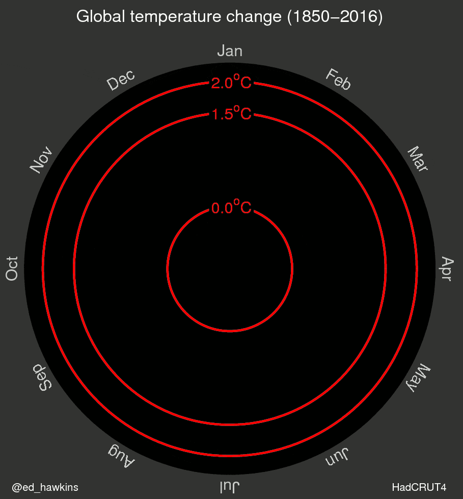
Wile E. Coyote is not the only one running in circles. Recently, this animated gif of the earth’s gradual temperature rise made its way across the web.
Important topic. Important data.
However, is this the best way to bring the data to life?
Some sites like Gizmodo made a reference to this animation as “One of the Most Convincing Climate Change Visualizations We’ve Ever Seen.” Mmmm… OK! A kind of click-bait IMHO, but at least the title said visualization 🙂
But for me, animations aren’t always the best choice. I remember a quote, sadly, I don’t remember the author, maybe/surely was Alberto Cairo (If you know it please tell me who was!)
“Animations force the user to compare what they see with what they remember (saw).”
Another thing I don’t like about this spiral, is how the density of data at the end of the animation obscures information about the incremental change of speed along the time axis.
DATA & PACKAGES
We’ll use the data provide by hrbrmstr in his repo. Bob Rudis made a beautiful representation of the data via ggplot2 and D3 using ageom_segment/column range viz.
About the packages: Here we’ll use a lot of dplyr, tidyr, purrr for the data manipulation, for the colors we’ll use viridis, lastly I’ll use highcharter for charts.
library("highcharter")
library("readr")
library("dplyr")
library("tidyr")
library("lubridate")
library("purrr")
library("viridis")
options(
  highcharter.theme = hc_theme_darkunica(
    chart  = list(
      style = list(fontFamily = "Roboto Condensed"),
      backgroundColor = "#323331"
    ),
    yAxis = list(
      gridLineColor = "#B71C1C",
      labels = list(format = "{value} C", useHTML = TRUE)
    ),
    plotOptions = list(series = list(showInLegend = FALSE))
  )
)
df <- read_csv("https://raw.githubusercontent.com/hrbrmstr/hadcrut/master/data/temps.csv")
df <- df %>%
  mutate(date = ymd(year_mon),
         tmpstmp = datetime_to_timestamp(date),
         year = year(date),
         month = month(date, label = TRUE),
         color_m = colorize(median, viridis(10, option = "B")),
         color_m = hex_to_rgba(color_m, 0.65))
dfcolyrs <- df %>%
  group_by(year) %>%
  summarise(median = median(median)) %>%
  ungroup() %>%
  mutate(color_y = colorize(median, viridis(10, option = "B")),
         color_y = hex_to_rgba(color_y, 0.65)) %>%
  select(-median)
df <- left_join(df, dfcolyrs, by = "year")
The data is ready. Let’s go!
| year_mon | median | lower | upper | year | decade | month | date | tmpstmp | color_m | color_y |
|---|---|---|---|---|---|---|---|---|---|---|
| 1850-01-01 | -0.702 | -1.102 | -0.299 | 1850 | 1850 | Jan | 1850-01-01 | -3.786826e+12 | rgba(2,1,10,0.65) | rgba(87,16,107,0.65) |
| 1850-02-01 | -0.284 | -0.675 | 0.114 | 1850 | 1850 | Feb | 1850-02-01 | -3.784147e+12 | rgba(107,23,108,0.65) | rgba(87,16,107,0.65) |
| 1850-03-01 | -0.732 | -1.080 | -0.383 | 1850 | 1850 | Mar | 1850-03-01 | -3.781728e+12 | rgba(1,0,8,0.65) | rgba(87,16,107,0.65) |
| 1850-04-01 | -0.570 | -0.903 | -0.237 | 1850 | 1850 | Apr | 1850-04-01 | -3.779050e+12 | rgba(9,4,26,0.65) | rgba(87,16,107,0.65) |
| 1850-05-01 | -0.325 | -0.662 | 0.006 | 1850 | 1850 | May | 1850-05-01 | -3.776458e+12 | rgba(84,15,107,0.65) | rgba(87,16,107,0.65) |
| 1850-06-01 | -0.213 | -0.515 | 0.084 | 1850 | 1850 | Jun | 1850-06-01 | -3.773779e+12 | rgba(148,38,100,0.65) | rgba(87,16,107,0.65) |
SPIRAL
First of all let’s try to replicate the chart/gif/animation. Here we’ll construct a list of series to use with hc_add_series_list function.
lsseries <- df %>%
  group_by(year) %>%
  do(
    data = .$median,
    color = first(.$color_y)) %>%
  mutate(name = year) %>%
  list.parse3()
hc1 <- highchart() %>%
  hc_chart(polar = TRUE) %>%
  hc_plotOptions(
    series = list(
      marker = list(enabled = FALSE),
      animation = TRUE,
      pointIntervalUnit = "month")
  ) %>%
  hc_legend(enabled = FALSE) %>%
  hc_xAxis(type = "datetime", min = 0, max = 365 * 24 * 36e5,
           labels = list(format = "{value:%B}")) %>%
  hc_tooltip(headerFormat = "{point.key}",
             xDateFormat = "%B",
             pointFormat = " {series.name}: {point.y}") %>%
  hc_add_series_list(lsseries)
hc1
Ok!
(Without the glitz of the animation component, this doesn’t work that well…)
If we want replicate the animation part, we must hide all of the series using transparency.
lsseries2 <- df %>%
  group_by(year) %>%
  do(
    data = .$median,
    color = "transparent",
    enableMouseTracking = FALSE,
    color2 = first(.$color_y)) %>%
  mutate(name = year) %>%
  list.parse3()
Then, using a little of JavaScript, we can add color to each series one by one.
hc11 <- highchart() %>%
  hc_chart(polar = TRUE) %>%
  hc_plotOptions(series = list(
    marker = list(enabled = FALSE),
    animation = TRUE,
    pointIntervalUnit = "month")) %>%
  hc_legend(enabled = FALSE) %>%
  hc_title(text = "Animated Spiral") %>%
  hc_xAxis(type = "datetime", min = 0, max = 365 * 24 * 36e5,
           labels = list(format = "{value:%B}")) %>%
  hc_tooltip(headerFormat = "{point.key}", xDateFormat = "%B",
             pointFormat = " {series.name}: {point.y}") %>%
  hc_add_series_list(lsseries2) %>%
  hc_chart(
    events = list(
      load = JS("
                function() {
                console.log('ready');
                var duration = 16 * 1000
                var delta = duration/this.series.length;
                var delay = 2000;

                this.series.map(function(e){
                setTimeout(function() {
                e.update({color: e.options.color2, enableMouseTracking: true});
                e.chart.setTitle({text: e.name})
                }, delay)
                delay = delay + delta;
                });

                }
                ")
      )
      )
And, voilà!.
hc11To see (replay) the animation effect, click on the “Javascript” tab in the above chart, and then click “Result”.
SEASONAL PLOT
Do we need polar coordinates here? I don’t know! Let’s back to the euclidean space and see what happened:
hc2 <- hc1 %>%
  hc_chart(polar = FALSE, type = "spline") %>%
  hc_xAxis(max = (365 - 1) * 24 * 36e5) %>%
  hc_yAxis(tickPositions = c(-1.5, 0, 1.5, 2))
hc2
Yummy! Multi-colored spaghetti!
(Food for thought: It is not so clear what happened over the years…)
HEAT MAP
Here we put the years in xAxis, and month in yAxis:
m <- df %>%
  select(year, month, median) %>%
  spread(year, median) %>%
  select(-month) %>%
  as.matrix()
rownames(m) <- month.abb
hc3 <- hchart(m) %>%
  hc_colorAxis(
    stops = color_stops(10, viridis(10, option = "B")),
    min = -1, max = 1
  ) %>%
  hc_yAxis(
    title = list(text = NULL),
    tickPositions = FALSE,
    labels = list(format = "{value}", useHTML = TRUE)
  )
hc3
If you look closely, you’ll realize that this is not your video card going bad. In fact, with the color scale used, we can see how the series values increase. However, it is not so easy to quantify the incremental change.
LINE / TIME SERIES
Back to basics. Let’s try the most simple chart, representing the data as a time series.
dsts <- df %>%
  mutate(name = paste(decade, month)) %>%
  select(x = tmpstmp, y = median, name)
hc4 <- highchart() %>%
  hc_xAxis(type = "datetime") %>%
  hc_yAxis(tickPositions = c(-1.5, 0, 1.5, 2)) %>%
  hc_add_series_df(dsts, name = "Global Temperature",
                   type = "line", color = hex_to_rgba(viridis(10, option = "B")[7]),
                   lineWidth = 1,
                   states = list(hover = list(lineWidth = 1)),
                   shadow = FALSE)
hc4
Perhaps it is that simple. What do you think?
COLUMN RANGE
Let’s add information about the confidence interval as well as well as the media information, using a color same as hrbrmstr did.
With highcharter it’s easy. Just define the dataframe with x, low, high and color and add it to a highchart object with the hc_add_series_dffunction.
dsts <- df %>%
  mutate(name = paste(decade, month)) %>%
  select(x = tmpstmp, y = median, name)
hc4 <- highchart() %>%
  hc_xAxis(type = "datetime") %>%
  hc_yAxis(tickPositions = c(-1.5, 0, 1.5, 2)) %>%
  hc_add_series_df(dsts, name = "Global Temperature",
                   type = "line", color = hex_to_rgba(viridis(10, option = "B")[7]),
                   lineWidth = 1,
                   states = list(hover = list(lineWidth = 1)),
                   shadow = FALSE)
hc4
(IMHO) This is a really way to show what we want to say:
- With a time series chart it is easy to compare the time cohorts with each other.
- The color, in particular the last yellowish part, adds importance, and guides our eyes to the anomalous part of the chart as a reference-point for comparison.
Do you have other or better ways to represent this data? Surely there must be more to it than this!


Leave a Reply