Bar charts over a time series
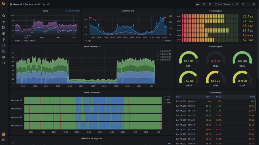
Is it possible to create a bar chart similar to the image below for Server CPU usage? I basically want each bar to represent a server over a time period horizontally. Each time slice will be either green (ping reply) or red (ping missed). I prefer the time slices more thick so users can hover over that slice easily and get detailed metrics for that event similar to the thickness of the chart in the top right for "Free disk space". Is this possible with highcharts?
Re: Bar charts over a time series
Hello eeldivad,
Welcome to our forum and thanks for contacting us with your question!
Each of these charts can be easily created with Highcharts. I'm talking about styling too. Please check our demo section to get general idea and learn about different series types: https://www.highcharts.com/demo
When it comes to Serwer CPU usage chart it can be achieved in multiple ways but I would suggest column or bar series.
Feel free to ask any further questions.
Regards!
Mateusz Bernacik
Highcharts Developer
Highcharts Developer
Re: Bar charts over a time series
Hi thank you for replying. I looked at the demo for Column/bar series but don't see anything that would give me what I need. Could you point to a specific chart demo that you think would be a good starting point for the "Server CPU usage" chart above?
I'm guessing this might be the best one to start with?
https://www.highcharts.com/demo/column- ... dark-unica
I'm guessing this might be the best one to start with?
https://www.highcharts.com/demo/column- ... dark-unica
Re: Bar charts over a time series
https://jsfiddle.net/eeldivad/2m0apk5b/2/
I tried using the column chart and this is as far as I can get. I'm trying to show signed and missed blocks for set of servers. So the x-axis are the blocks on a blockchain. I want to show each block and red or green blocks depending on if a server missed or signed the block. I'm unable to figure out how this can be achieved with this chart and series which was modified from an example. Any experts have any ideas or can give me a good starting point? It took me half an hour just to figure out how to orient the chart horizontally. I found out i had to use the inverted: true option. Please see my jsfiddle and feel free to modify as necessary. I just need a good starting point. thx
I tried using the column chart and this is as far as I can get. I'm trying to show signed and missed blocks for set of servers. So the x-axis are the blocks on a blockchain. I want to show each block and red or green blocks depending on if a server missed or signed the block. I'm unable to figure out how this can be achieved with this chart and series which was modified from an example. Any experts have any ideas or can give me a good starting point? It took me half an hour just to figure out how to orient the chart horizontally. I found out i had to use the inverted: true option. Please see my jsfiddle and feel free to modify as necessary. I just need a good starting point. thx
Re: Bar charts over a time series
Hello eeldivad,
You can definitely use inverted stacked column chart, or in other words bar chart, but I think simple column chart would be better here. I was thinking about something like this: https://jsfiddle.net/BlackLabel/ytom69cj/
Also the chart implementation and series choice might depend on the format of the data that you have.
Let me know what do you think about it and what would you like to change. Also feel free to ask any further questions!
Regards!
Mateusz Bernacik
Highcharts Developer
Highcharts Developer