I'm trying to create a Cohort Analysis using highcharts. My idea was to use a heatmap as a starting point.
Below is a sample I created:
https://jsfiddle.net/o231at7z/
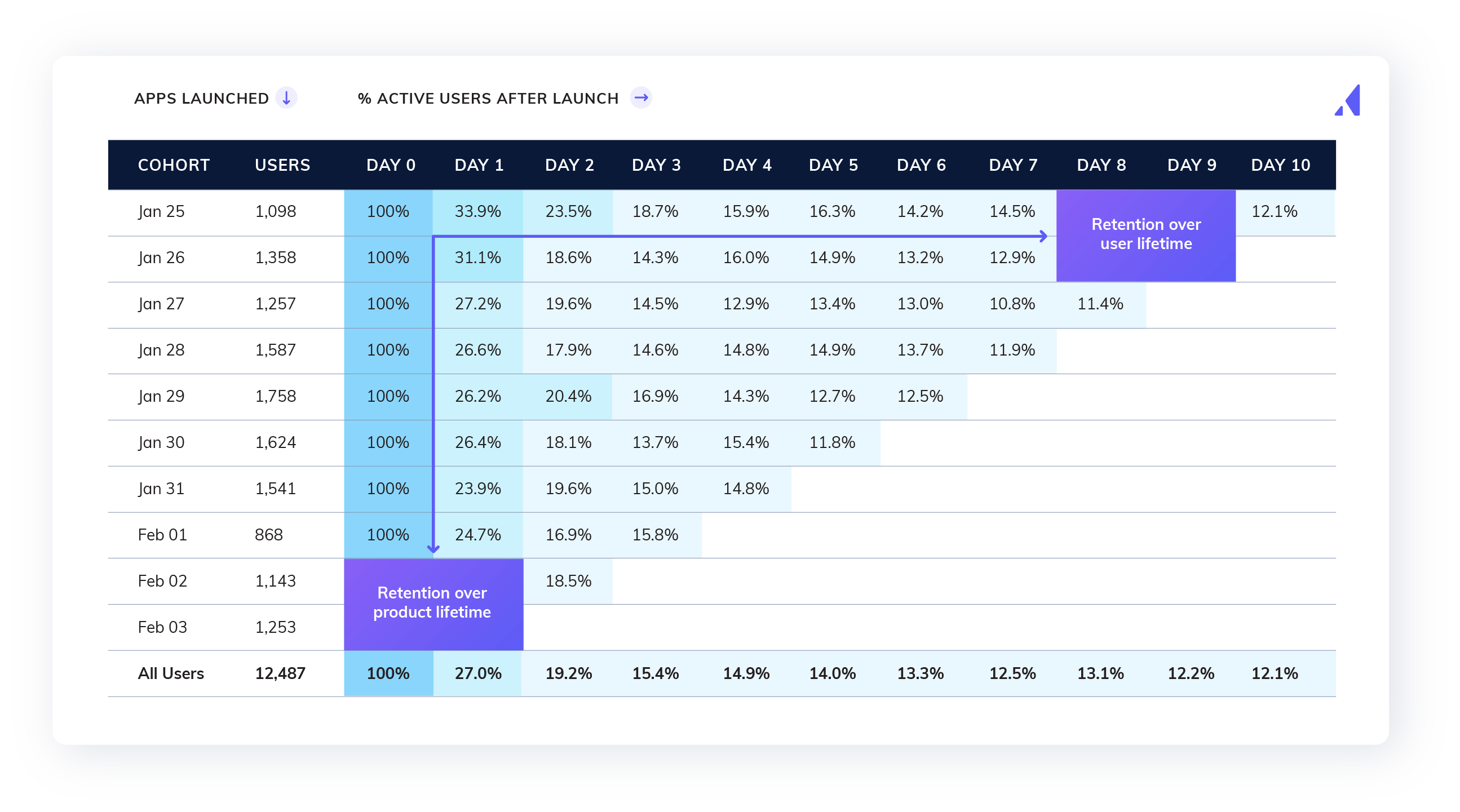
And below is the result I'm trying to achieve. Now I'm stuck, I'm not sure how to add that top row with the days, nor the columns to the left with the days and number of users.
Is it possible to customize heatmap in such way? Or is there another easier approach to this?