Good morning,
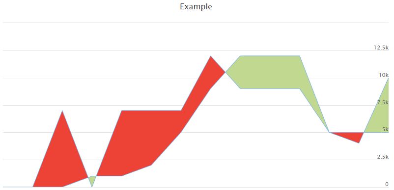
My graph has two lines. I would like the color to change when the value is positive or negative. Like in this example.
https://www.meteo-jarny.com/Images/Foru ... que/00.JPG
Here's the fiddle to my example, which is that my chart data is taken from a database.
https://jsfiddle.net/JP5401/g8dvzaLs/2/
I know that my two series (dnorme and dmean) must be grouped to be able to make this graph, but I have no idea how to do it.
I hope you can help me.
Re: Different color area between two lines
Good morning,
I made good progress, using an example that I modified, I was able to do what I wanted.
But there are still some issues that I can't resolve.
I can't put the date in the tooltip, nor on xAxis. I created a 'let date' line, but I don't know how to insert it in my code. The rangeSelector is not working and I have no idea why.
Here is my example: https://jsfiddle.net/JP5401/pbv0gusx/3/
Could someone help me.

Re: Different color area between two lines
Good afternoon,
I think that the problem here may be the fact that instead of the date you have passed the index to the data array.
Demo: https://jsfiddle.net/BlackLabel/dv7wobyt/
Let me know if that was what you were looking for
Best regards!
I think that the problem here may be the fact that instead of the date you have passed the index to the data array.
Demo: https://jsfiddle.net/BlackLabel/dv7wobyt/
Let me know if that was what you were looking for
Best regards!
Dawid Draguła
Highcharts Developer
Highcharts Developer
Re: Different color area between two lines
Good morning,
Yeah that's exactly what I was looking for but couldn't find a solution.
I see the changes you made to my example.
Thanks a lot for your help.
Best regards!
Yeah that's exactly what I was looking for but couldn't find a solution.
I see the changes you made to my example.
Thanks a lot for your help.
Best regards!
Re: Different color area between two lines
You're welcome!
If I may clarify any issues/matters I am available at your convenience.
Best regards!
If I may clarify any issues/matters I am available at your convenience.
Best regards!
Dawid Draguła
Highcharts Developer
Highcharts Developer
Re: Different color area between two lines
Good morning,
I come back to you because I noticed small bugs following the modifications of my example. I saw these small bugs when zooming in on certain areas of the graph as can be seen in the screenshot.
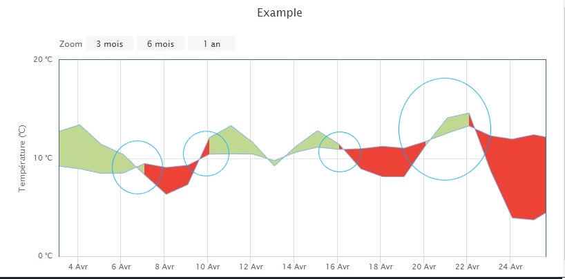
I looked on my example before modification, I did not have these small problems
Here is my example https://jsfiddle.net/JP5401/pbv0gusx/3/
And yours after modifications https://jsfiddle.net/BlackLabel/dv7wobyt/
I tried to find why I have problems at the crossing of the lines, but I do not see where the problem comes from.
Can you help me solve them?
I come back to you because I noticed small bugs following the modifications of my example. I saw these small bugs when zooming in on certain areas of the graph as can be seen in the screenshot.
I looked on my example before modification, I did not have these small problems
Here is my example https://jsfiddle.net/JP5401/pbv0gusx/3/
And yours after modifications https://jsfiddle.net/BlackLabel/dv7wobyt/
I tried to find why I have problems at the crossing of the lines, but I do not see where the problem comes from.
Can you help me solve them?
Re: Different color area between two lines
Good morning,
Oh yeah, you're right!
All because I rounded the values in zones to the given dates. I'm posting a revised demo below.
Demo: https://jsfiddle.net/BlackLabel/mgboz957/
I hope everything works as it should now.
Best regards!
Oh yeah, you're right!
All because I rounded the values in zones to the given dates. I'm posting a revised demo below.
Demo: https://jsfiddle.net/BlackLabel/mgboz957/
I hope everything works as it should now.
Best regards!
Dawid Draguła
Highcharts Developer
Highcharts Developer
Re: Different color area between two lines
That's perfect, thank you very much.
I still have a little question. How I change the color of the lines that are in light blue on your example.
That is to say the color of 'let income' and 'let outcome'.
I would like different colors
I still have a little question. How I change the color of the lines that are in light blue on your example.
That is to say the color of 'let income' and 'let outcome'.
I would like different colors
Re: Different color area between two lines
You're welcome!
You can add two new line series and edit the formatter.
Demo: https://jsfiddle.net/BlackLabel/39o5efgs/
In case of any further questions, feel free to contact us again.
Best regards!
You can add two new line series and edit the formatter.
Demo: https://jsfiddle.net/BlackLabel/39o5efgs/
In case of any further questions, feel free to contact us again.
Best regards!
Dawid Draguła
Highcharts Developer
Highcharts Developer
Re: Different color area between two lines
Good morning,
I had tried to make some modifications to achieve my goals, but I did not succeed.
With your example I see what part of the code you have modified and I realize that it is beyond my skills.
Thank you very much for your precious help.
Best regards!
I had tried to make some modifications to achieve my goals, but I did not succeed.
With your example I see what part of the code you have modified and I realize that it is beyond my skills.
Thank you very much for your precious help.
Best regards!
Re: Different color area between two lines
You're welcome, I'm here to help.
Therefore, if you can explain what exactly you don't understand, maybe I can explain it to you in a clearer way.
Kind regards
Therefore, if you can explain what exactly you don't understand, maybe I can explain it to you in a clearer way.
Kind regards
Dawid Draguła
Highcharts Developer
Highcharts Developer
Re: Different color area between two lines
After some color changes in the axes, I just noticed a bug, but it doesn't appear in your last example. I don't understand. This bug is located at the end of the chart in the last five days as shown in the screenshot.
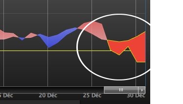
In my violin, it's not the same colors of lines, but you can clearly see that there is a small problem. The last area should be blue, not red.
I hope my translation is correct, because I am French.
My example: https://jsfiddle.net/JP5401/rj7qm8ew/5/
In my violin, it's not the same colors of lines, but you can clearly see that there is a small problem. The last area should be blue, not red.
I hope my translation is correct, because I am French.
My example: https://jsfiddle.net/JP5401/rj7qm8ew/5/
Re: Different color area between two lines
Hi,
Try this way, instead of setting a specific range value of the last zones, set it to Infinity.
Demo: https://jsfiddle.net/BlackLabel/gsyqua26/
Does everything work now?
Try this way, instead of setting a specific range value of the last zones, set it to Infinity.
Demo: https://jsfiddle.net/BlackLabel/gsyqua26/
Does everything work now?
Dawid Draguła
Highcharts Developer
Highcharts Developer
Re: Different color area between two lines
No it's not good, moreover in your example, it's not correct either, we can see it very well at the end of the chart, over the last five days.
Re: Different color area between two lines
But what exactly is the problem? Is it the fill colour of the last zone?
https://jsfiddle.net/BlackLabel/79a64ozy/
https://jsfiddle.net/BlackLabel/79a64ozy/
Dawid Draguła
Highcharts Developer
Highcharts Developer