
One of the best things I’ve done to date to grow the number of subscribers to my website has been creating a community page where I exposed my website stats. Why? New visitors are looking for good quality content, and are therefore looking for immediate cues to “worthiness” or they will leave. Equally important: existing users get their choice validated and behavior reinforced as well.
Let me give you a little background. One day, I was talking to a friend of mine, who had visited my website, and he asked me, “Hey, how is your website doing?” He was under the impression that he was one of my first visitors. When I told him about the amount of traffic that my website was getting, he was surprised. He had no idea.
This is a real problem, and one a lot of bloggers struggle with, at least at the beginning. It is hard to get traffic, and those visitors that do come to the website leave quickly, if they find no indication that other people have found it useful, interesting, helpful, etc. It is hard to get them to return, or subscribe, and it’s hard to keep the traffic numbers steady.
This problem really struck me: How could I show people that my website is the real deal? I decided that I should make my website more transparent, and find a way to show the user that there is a diverse community behind it and that it is growing. Thankfully, HighCharts offered the solution.
HOW TO USE BUILD TRUST AND TRANSPARENCY WITH YOUR WEBSITE VISITORS
The set-up works as follows: Google Sheets add-on grabs Google Analytics data for my website from GA API, and outputs it into tables in Google Sheets. Visualizations in Highcharts Cloud use data from Google Sheets and embedded, dashboard-style, on the community page.
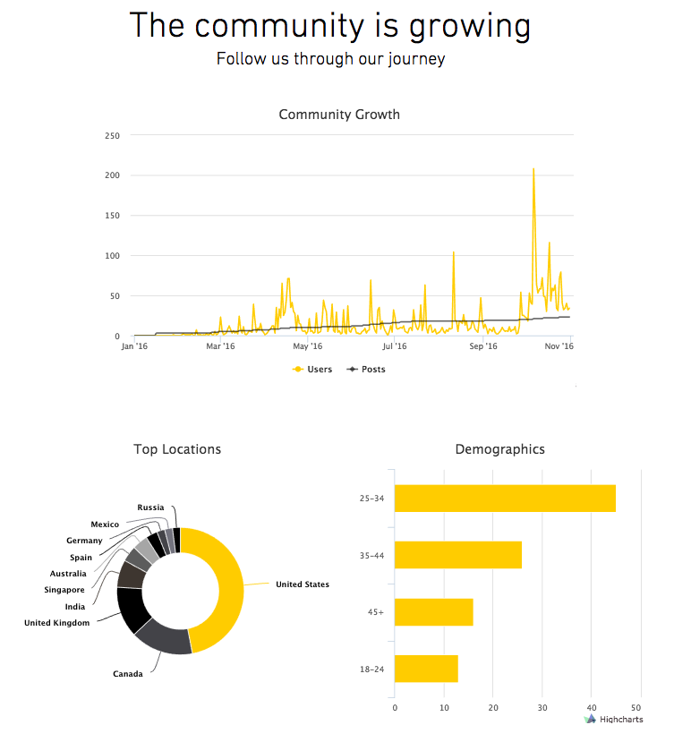
Here is what the final dashboard looks like:
Let’s dive into the details on how to make this all happen. It’s a lot easier than you may think.
STEP 1: PREPARE THE DATA
First, create a new Google sheet. Go to the menu and select ‘Get Add-Ons’. Search for “Google Analytics”. A few add-ons will pop up. I’ve tried Google Analytics and Analytics Canvas, and both are great. Using the add-on of your choice, select the Google Analytics account that holds your data. Select the dimensions and metrics that you want to display.
Using Google Analytics is completely optional. You can also create a dataset in Excel, to include any data you want, and just copy and paste it into HighCharts.
There is one thing to keep in mind here: your charts shouldn’t look like you are bragging. Select your data carefully. Pick something that your users will be able to identify with. I’ve intentionally included country and age because these enable my users to identify generically with each other – everyone, after all, has an age group and a country that they belong to.
STEP 2: BUILD YOUR CHARTS
Building embeddable charts is easy in HighCharts Cloud. In fact, I don’t feel like I need to explain how it works, but I’ll do it anyway!
If you haven’t already, create a HighCharts Cloud account. Once you’ve logged in, click on the New tab at the top of the screen.
The process of creating a chart includes four steps:
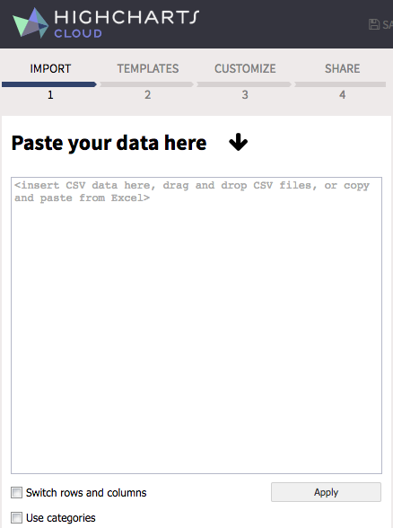
- Data import
You can copy and paste your data from a CSV file or an Excel file. You can also use Google Sheet Import (available for advanced plan users), or create a table right in the browser.
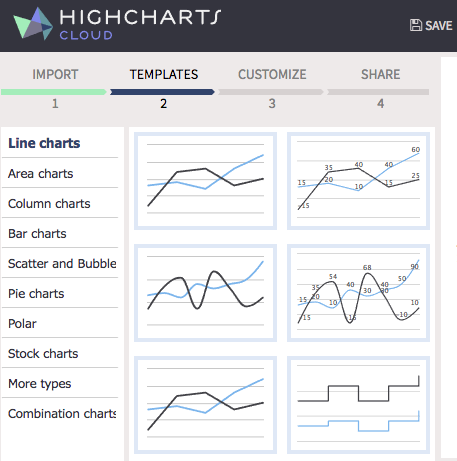
- Template selection
HighCharts offers a great selection of prebuilt charts that you can use. It includes line charts, area charts, bar charts, polar charts, and my personal favorite – combination charts.
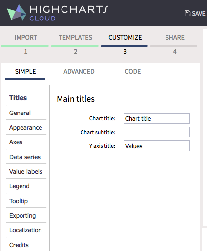
- Customization
You can customize every aspect of your chart: titles, appearance, labels, tooltips and more. You can even select your brand colors and fonts.
- Share
You will need to save your work before you share it.
STEP 3: EMBED YOUR CHARTS
Finally, select how you would like to share your chart. HighCharts offers direct posting to Twitter, Facebook, Google +, or LinkedIn. But the best way to share your data visualization is to embed it on your site using the code that HighCharts generates.
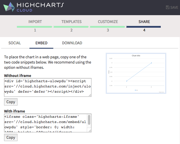
Go to your website. If you have a WordPress site, simply paste the code that HighCharts provided, anywhere on your page. If you are using a blogging tool that doesn’t recognize HTML code, head for the iframe embed feature. When you publish your website, the charts will appear on the webpage. That’s it!
The beauty of this is that all the charts are interactive – your website visitors will be able to click and hover over, to learn more. This will also increase time spent on the site.
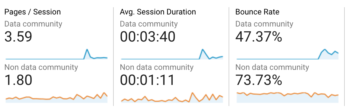
Just take a look at the screenshot above. It compares the website performance between two user segments: those who visited data community page, and those who didn’t. Spending time on building the data visualization paid off. I was able to double user engagement KPIs.
Editor note:
It may also be worth mentioning that there are other ways to embed these charts to your site, depending on your technical skill level. The newly released Highcharts Editor lets you install a chart editor as a WordPress, TinyMCE or CKEditor plugin (with more integrations coming). Developers may also skip the editor part completely and use the Highcharts JavaScript library directly in combination with the data module.
—————
About the Author
Olga is a data professional and analytics junkie. She writes about analytics tactics, visualization tricks and all things data on her blog olgatsubiks.com.
Follow Olga on Twitter: @OlgaTsubiks.
Comments
There are no comments on this post
Want to leave a comment?
Comments are moderated. They will publish only if they add to the discussion in a constructive way. Please be polite.